1
Nike Adapt X Watch
↳ 019
↳ 019
Studio
↳ Character (NY)
↳ Character (NY)
Role
↳ Design Director
↳ Design Director
Reaching down for your shoes or grabbing your phone isn’t an option when you’re in a constant state of shift. Being able to quickly adjust and fine tune your fit on the fly, unlocks a new level of control for the Adapt consumer.
We worked closely with the Nike Digital Innovation team to translate how this experience comes to life through function and form on the Apple Watch, to deliver the ultimate level of control for on-the-go adjustments.
*3D sneaker asset provided by the Nike Brand Experience team.
We worked closely with the Nike Digital Innovation team to translate how this experience comes to life through function and form on the Apple Watch, to deliver the ultimate level of control for on-the-go adjustments.
*3D sneaker asset provided by the Nike Brand Experience team.
↳ User Problem
As a user, I would like the ability to adjust and fine tune the fit of my shoe using the watch, so that I don’t have to open the app.
↳ Experience Principles
Glanceable
1. Information is readily available to the user. 2. Interactions should occur quickly, and over a short period of time. 3. Communicate information clearly and without added distraction.
Responsive
1. Minimize the time it takes to launch and load new screens. 2. Respond to user interactions with speed and accuracy. 3. Keep snapshot up-to-date with relevant information.
Actionable
1. Be thoughtful about the information that is presented. 2. Regularly update key information. 3. Consider the complication design.
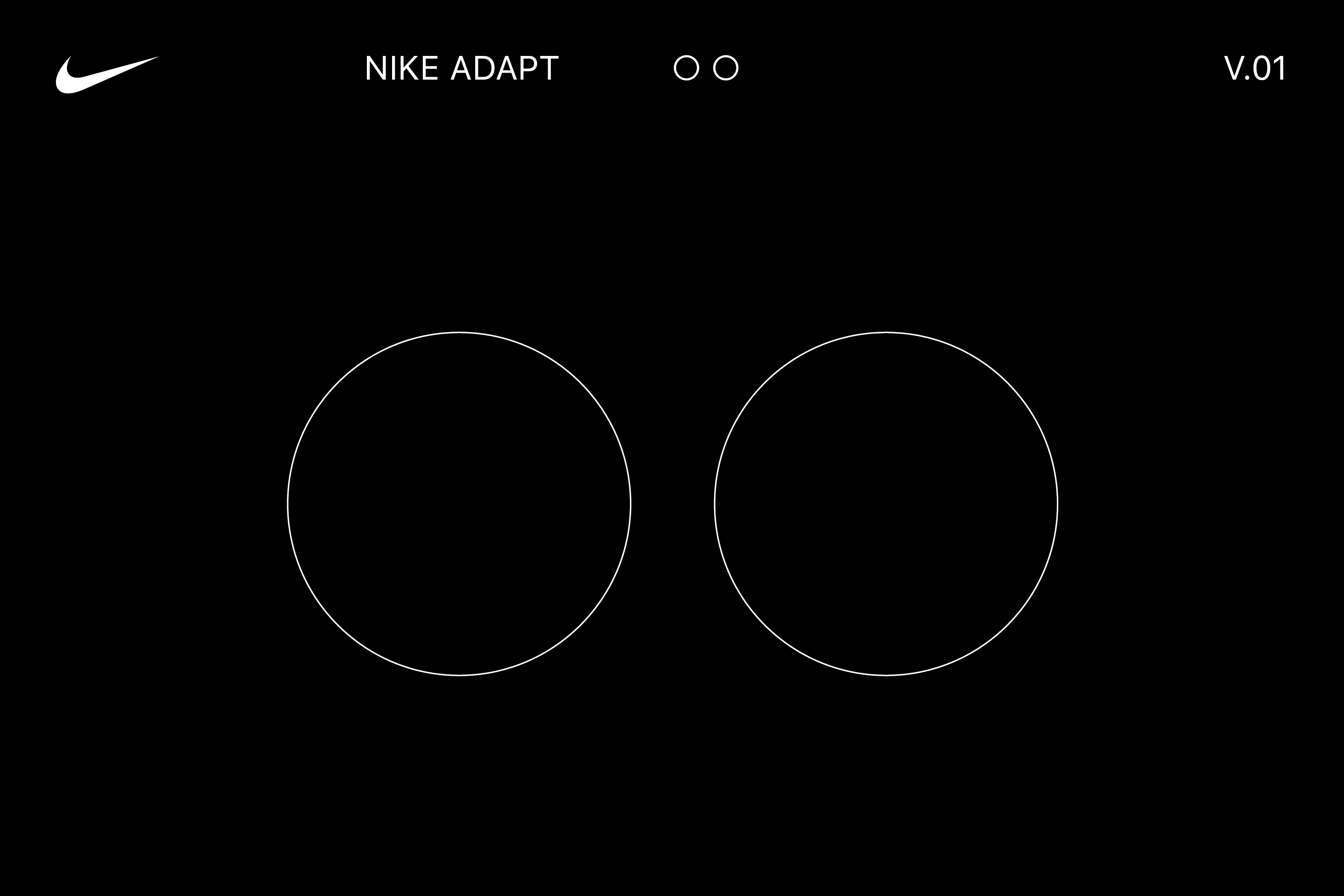
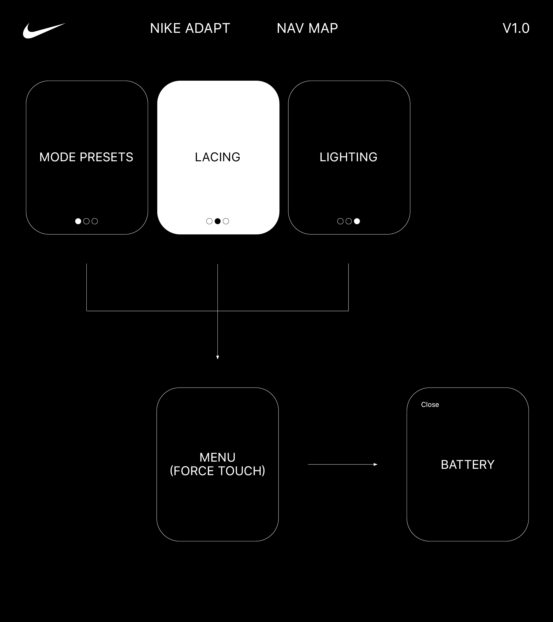
↳ Navigation
Guided by our experience principles and knowing what key functionalities we had to solve for, our next steps were to explore a range of navigation options, both hierarchical and page-based.
We arrived at a slightly customized structure that was both highly intuitive and efficient:
↳ All Lacing functions are contained within the p.2 landing screen, with Mode Presets located on p.1 and Lighting on p.3.
↳ Users can access Quick Release and Lights Off functions via a force touch menu as well as Battery levels via an additional modal screen that appears when activated.
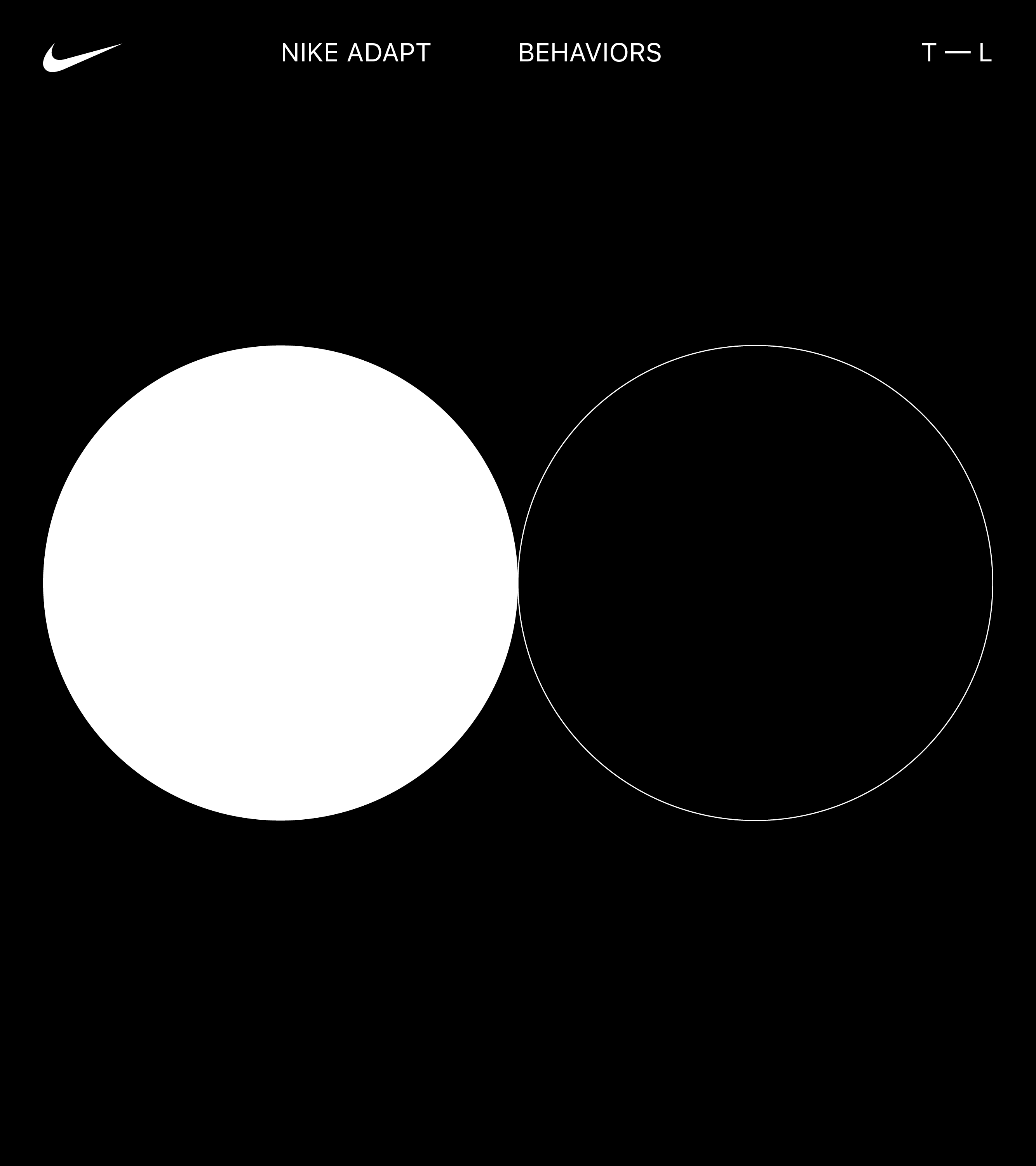
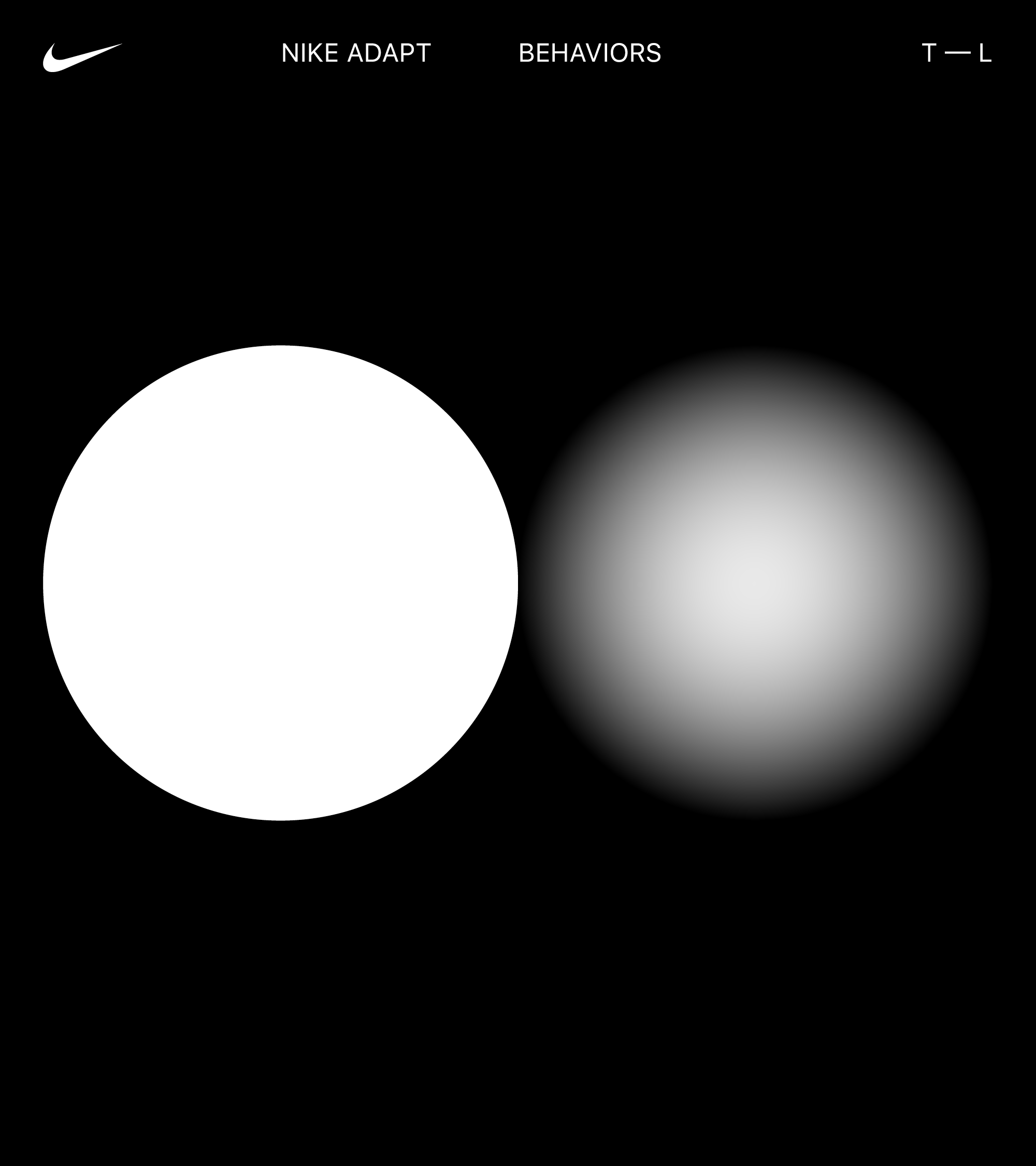
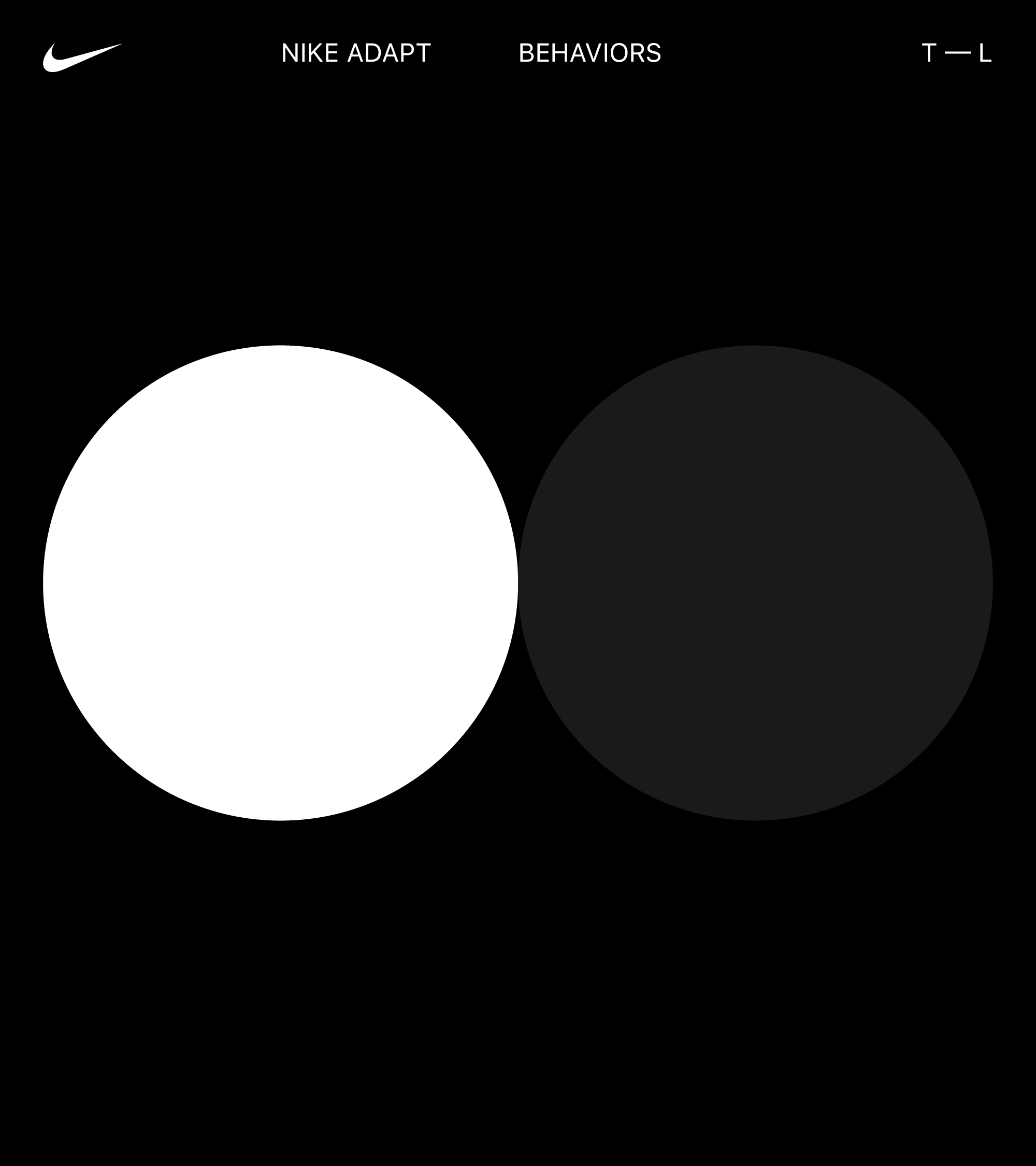
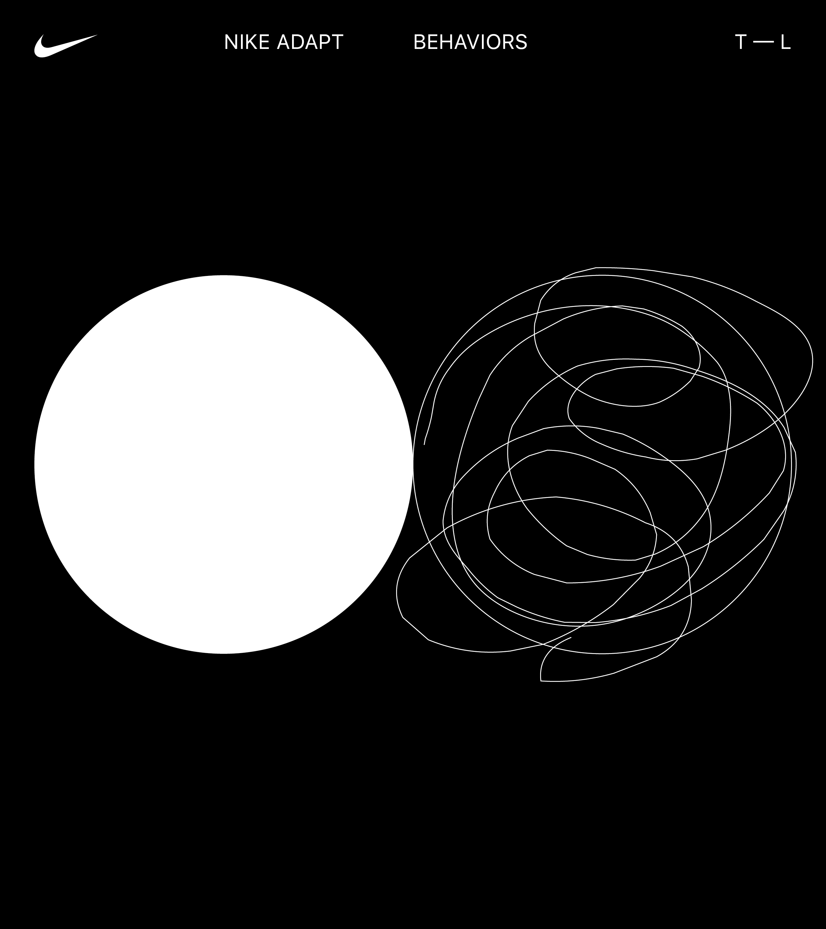
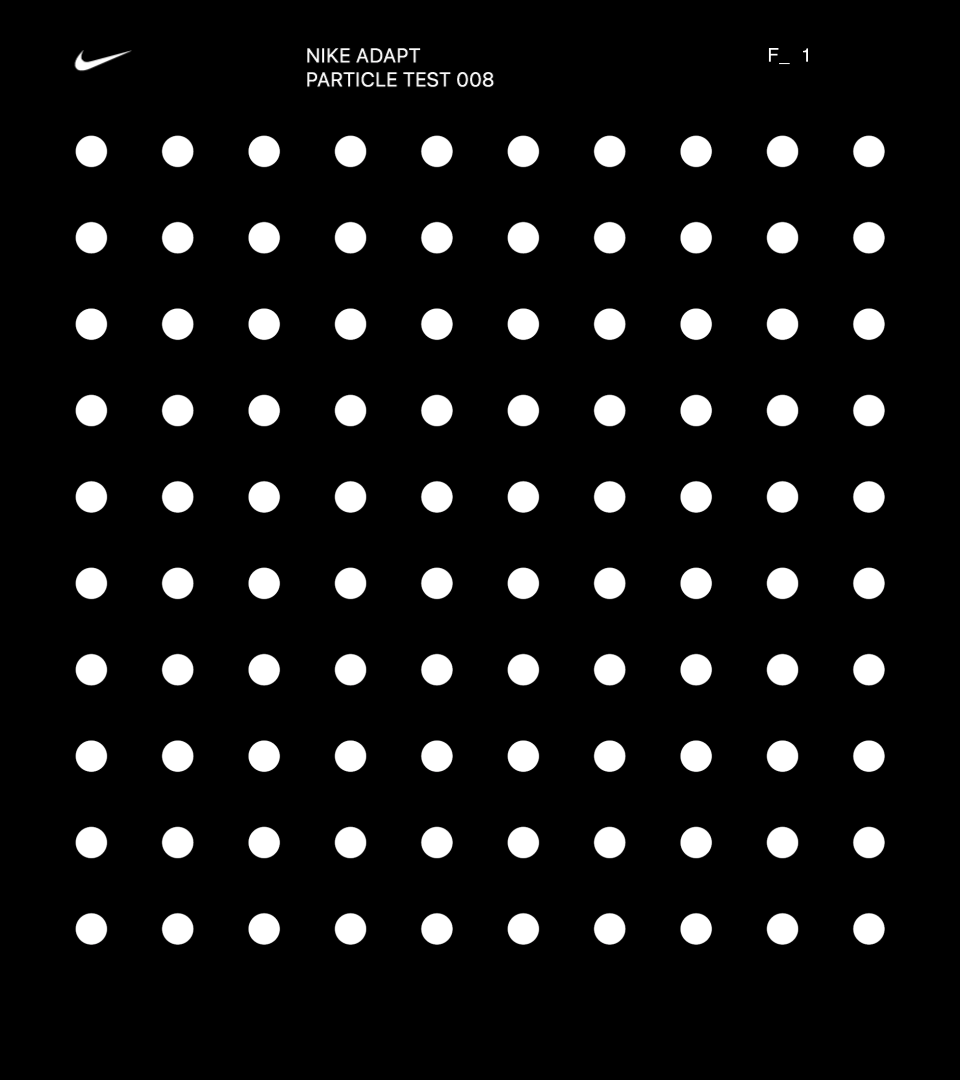
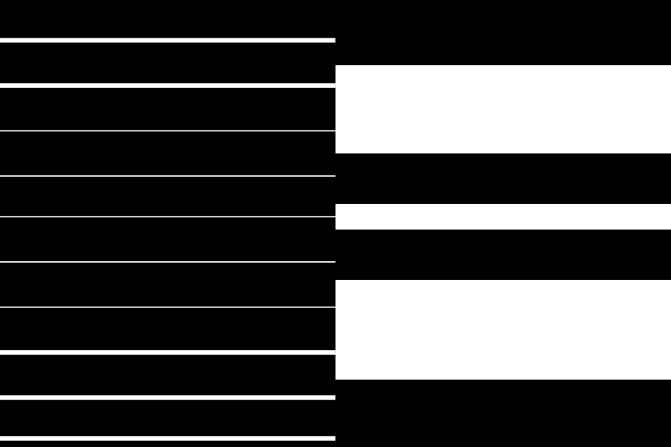
↳ Visualizing Behaviors
Before diving into design directions, and to inspire our design thinking / making, we did a quick exploratory in visualizing the behavior of Tight — Loose.


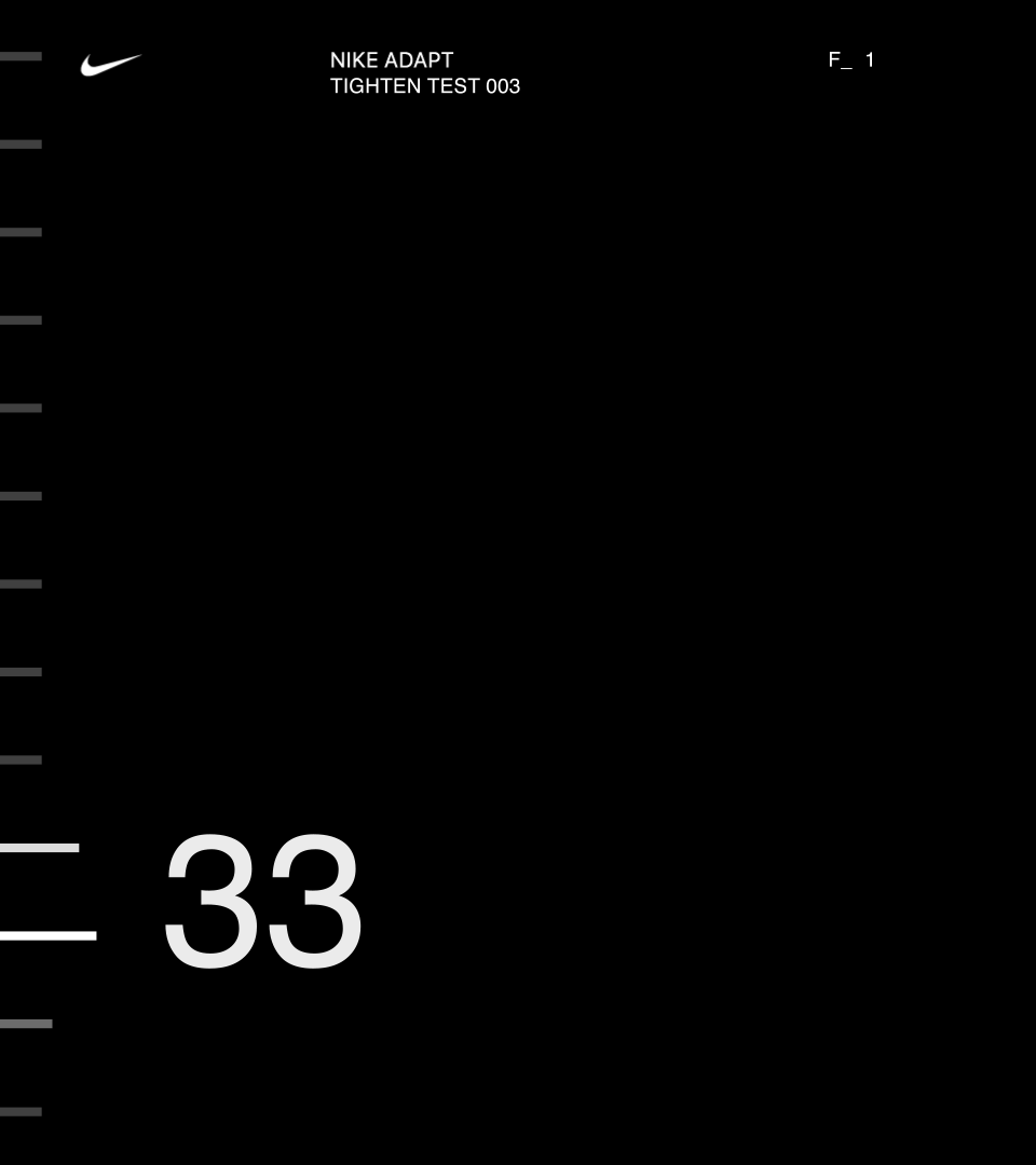
↳ Design Expressions
With our navigation locked, we explored three overarching visual expressions:
1. Metrical
2. Representational
3. Hybrid
1. Metrical
2. Representational
3. Hybrid
1. Metrical
Within this territory, we embrace the Apple Watch’s timepiece ancestry as a functional instrument, utilizing precise metrics and measurements as our guide.
By emphasizing data using large numerical elements, the visualizations adopt a more performance-based approach.
Themes:
·Functional
·Precise
·Numerical


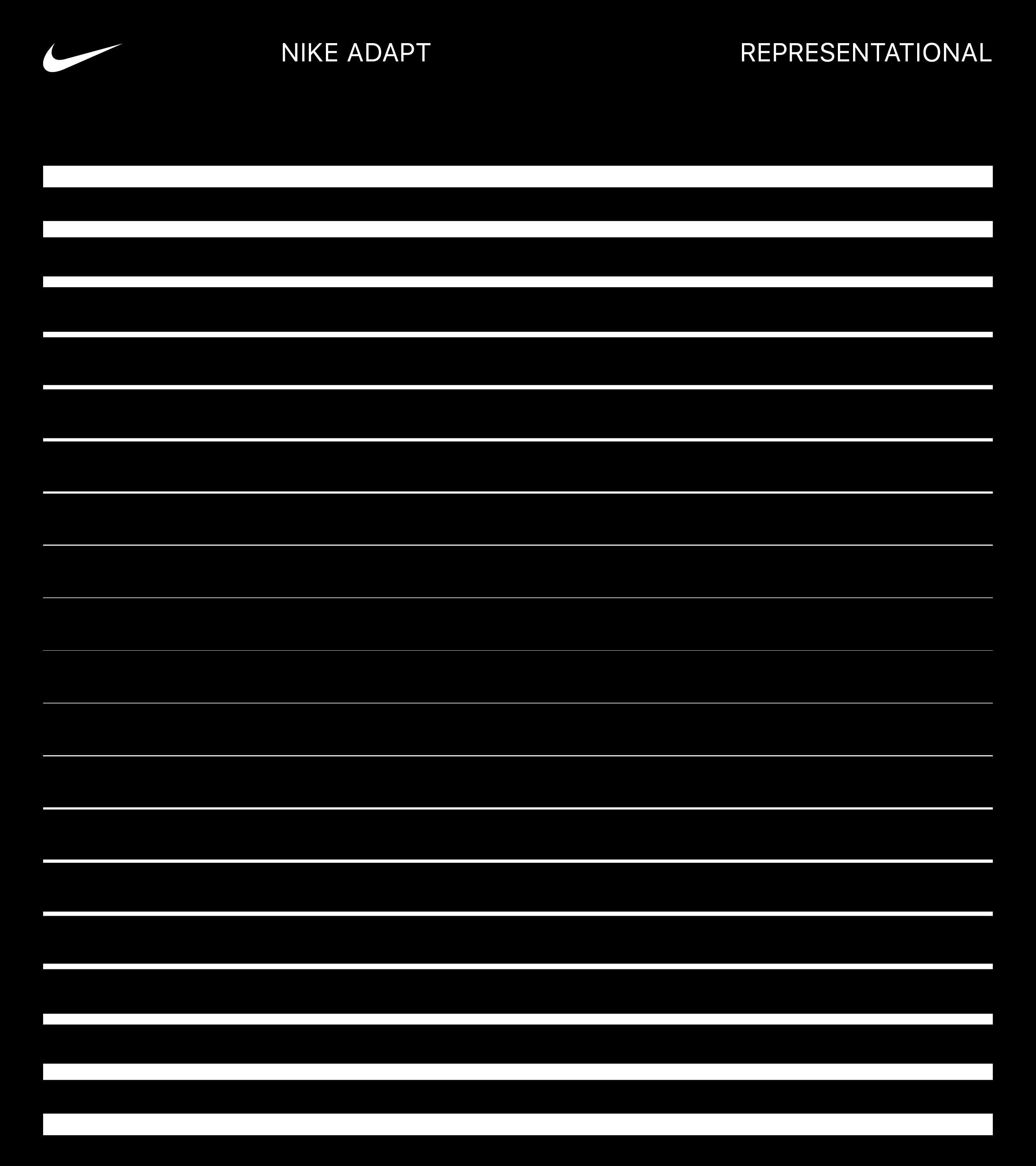
2. Representational
This territory explores the physical and realistic qualities of pressure to represent the tightening and loosening of the shoe.
By relying less on numerals, these explorations are more lifestyle oriented.
Themes:
·Realistic
·Demonstrative
·Human
This territory explores the physical and realistic qualities of pressure to represent the tightening and loosening of the shoe.
By relying less on numerals, these explorations are more lifestyle oriented.
Themes:
·Realistic
·Demonstrative
·Human


3. Hybrid
This hybrid territory illustrates the tightening and loosening of the shoe in a way that combines representational and metrical qualities.
The emphasis on each quality shifts depending where you are in the interaction flow of the Apple Watch app.
Themes:
·Realistic
·Functional
This hybrid territory illustrates the tightening and loosening of the shoe in a way that combines representational and metrical qualities.
The emphasis on each quality shifts depending where you are in the interaction flow of the Apple Watch app.
Themes:
·Realistic
·Functional
↳ Motion Tests
An exploratory into how behaviors could come to life through motion. Interface test animations by Joe Wright.


↳ Final Product
We delivered a simple, efficient, and visually consistent solution, that felt in line with the Nike Adapt mobile app and larger brand system.

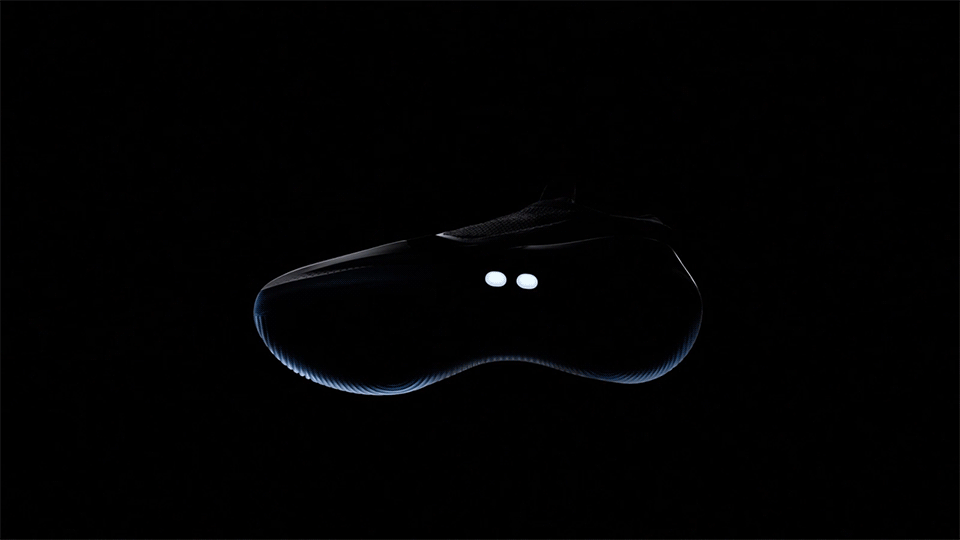
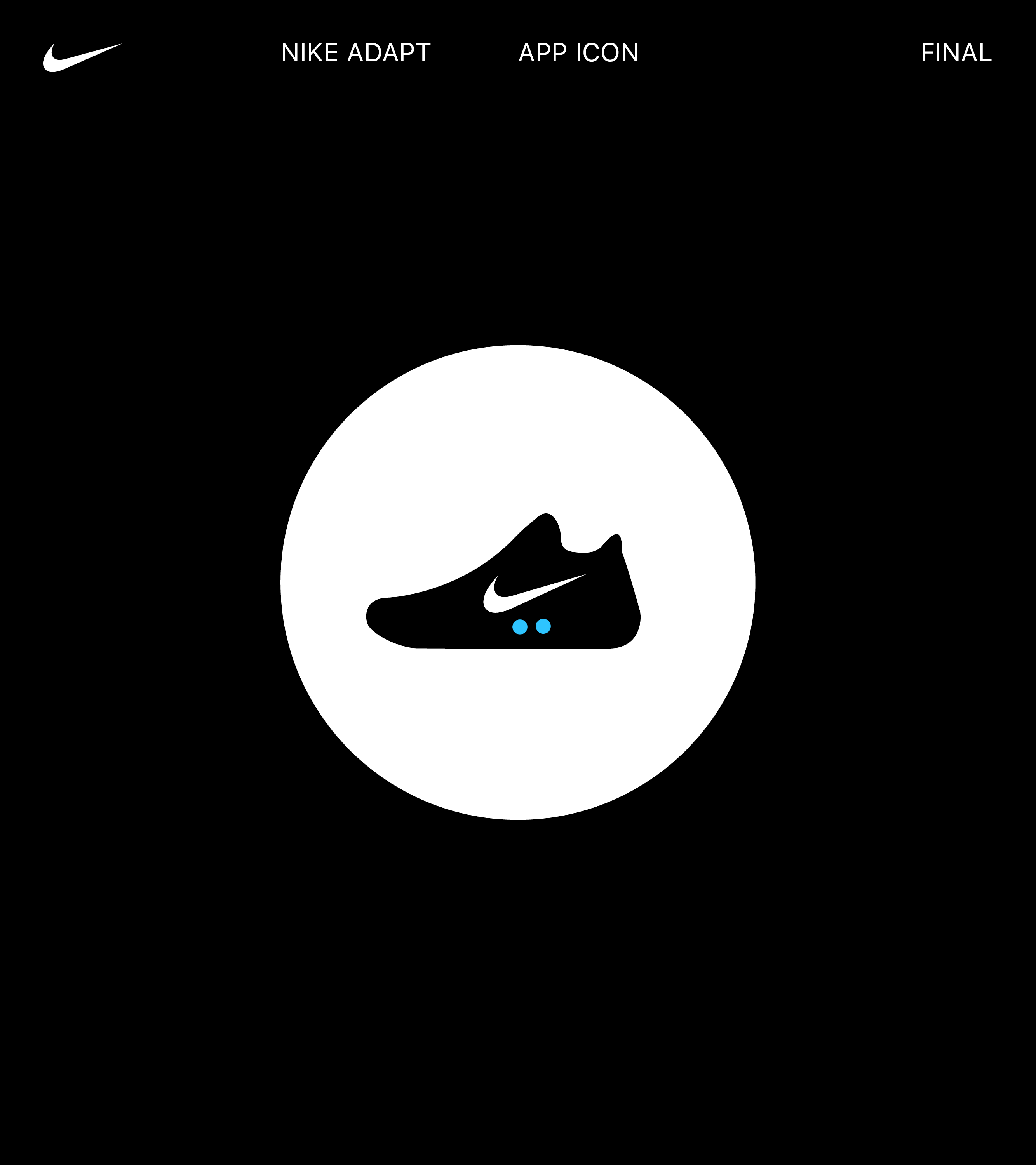
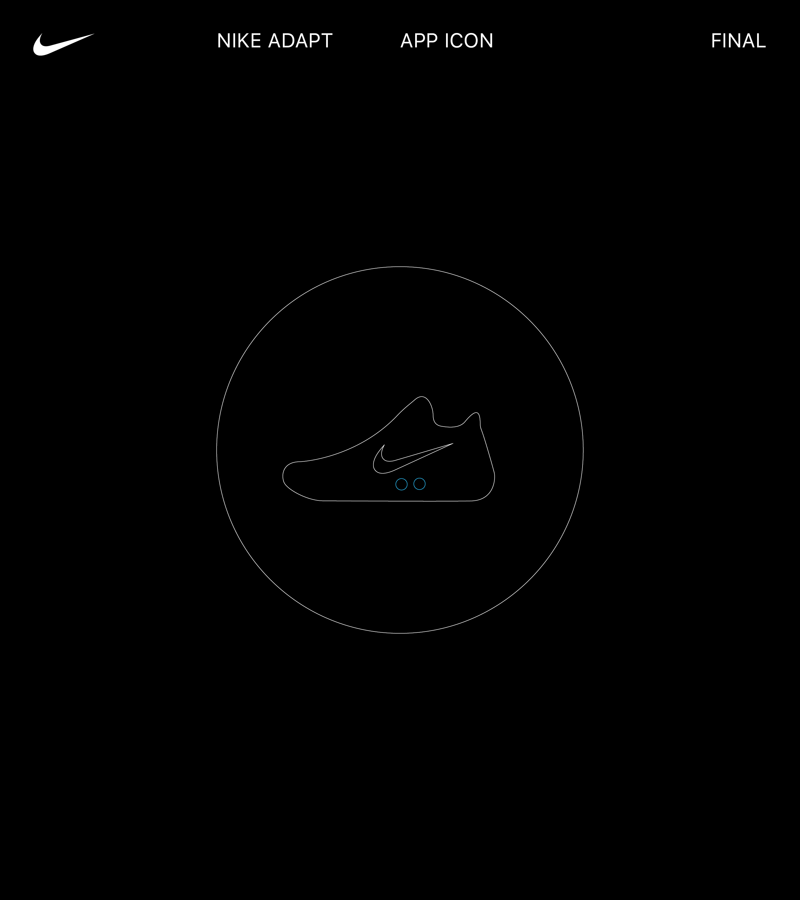
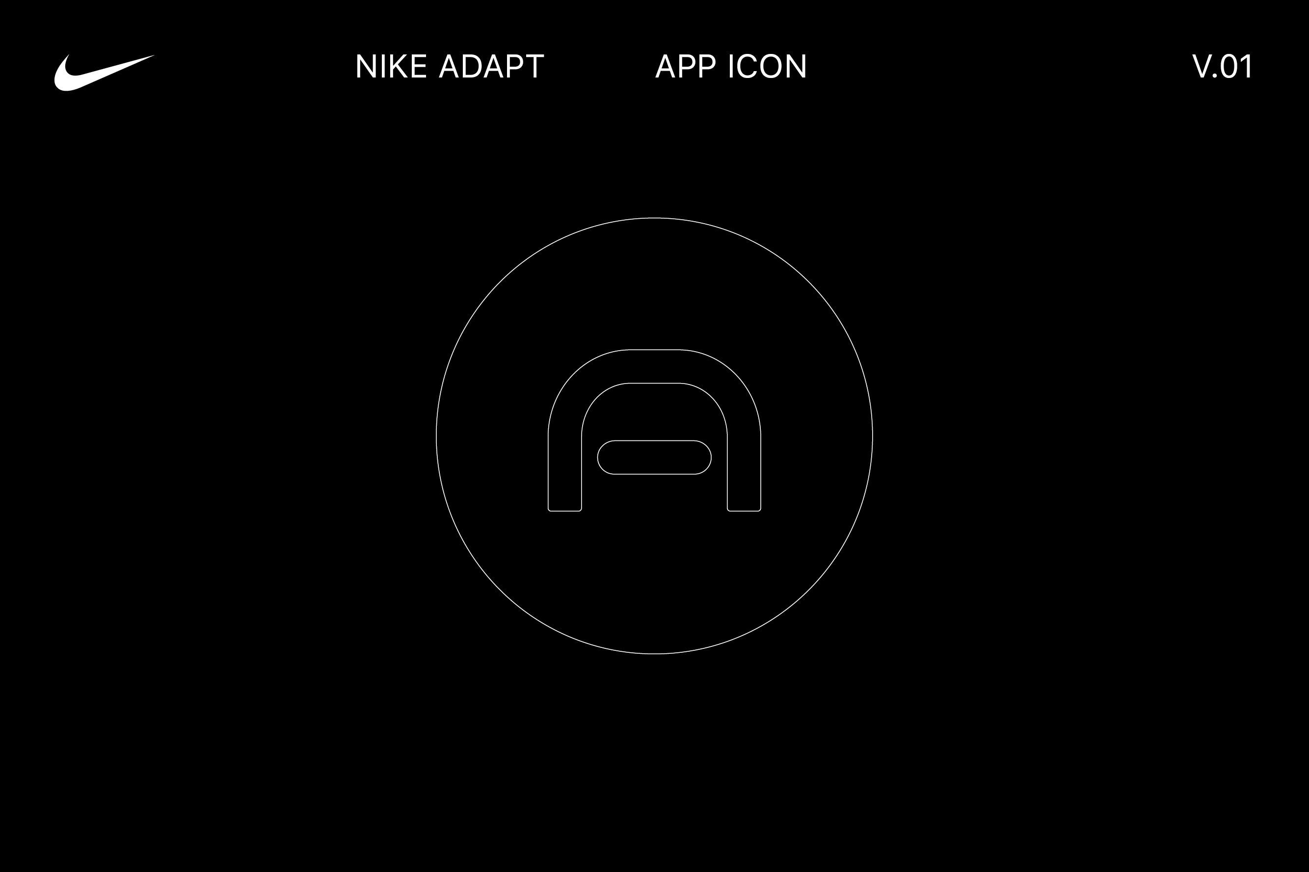
↳ Apple Watch App Icon
Finally, we created the Apple Watch app icon — a silhouette of the Nike Adapt BB sneaker that would change depending on what shoe model the user is controlling.


Team
↳ Nike Digital Innovation, Virgilio Santos, Manuel Dilone, Junki Hong, Joe Wright, Cris Mascort, Teri Kaplan
↳ Nike Digital Innovation, Virgilio Santos, Manuel Dilone, Junki Hong, Joe Wright, Cris Mascort, Teri Kaplan