Hello!
My name is Gera Frascaroli.
My name is Gera Frascaroli.
Last Update
↳ April 20 2020
Optimized for
↳ Chrome
↳ Desktop (Full-Screen)
↳ Mobile (Landscape)
↳ April 20 2020
Optimized for
↳ Chrome
↳ Desktop (Full-Screen)
↳ Mobile (Landscape)
I’ve had the good fortune of working on global campaigns, commercials, brand identities, digital products and experiences, network rebrands and title sequences, for some of the world's most loved brands, in collaboration with some of the world’s most awesome people.
If you’d like to work together or just have a chat, feel free to email me.
If you’d like to work together or just have a chat, feel free to email me.
Education
University of NSW
College of Fine Arts (COFA)
Masters (Digital Media)
↳ 🎓 2009
University of Sydney
B.A. of Arts (Anthropology)
↳ 🎓 2006
University of NSW
College of Fine Arts (COFA)
Masters (Digital Media)
↳ 🎓 2009
University of Sydney
B.A. of Arts (Anthropology)
↳ 🎓 2006
Recent History
Google (New York)
May 2021 - Present
↳ Design
Character (New York)
Oct. 2018 - Aug. 2020
↳ Design Direction
R/GA (New York)
Oct. 2015 - May 2018
↳ Design Direction
Rokkan (New York)
Sep. 2014 - Oct. 2015
↳ Design
The Mill (New York)
May 2012 - Aug. 2014
↳ Design, Motion
BigStar (New York)
Sep. 2010 - Apr. 2012
↳ Design, Motion
Past Clients
Nike
Instagram
Google
Samsung
Netflix
Converse
Facebook
MTV
Nike
Samsung
Netflix
Converse
MTV
1
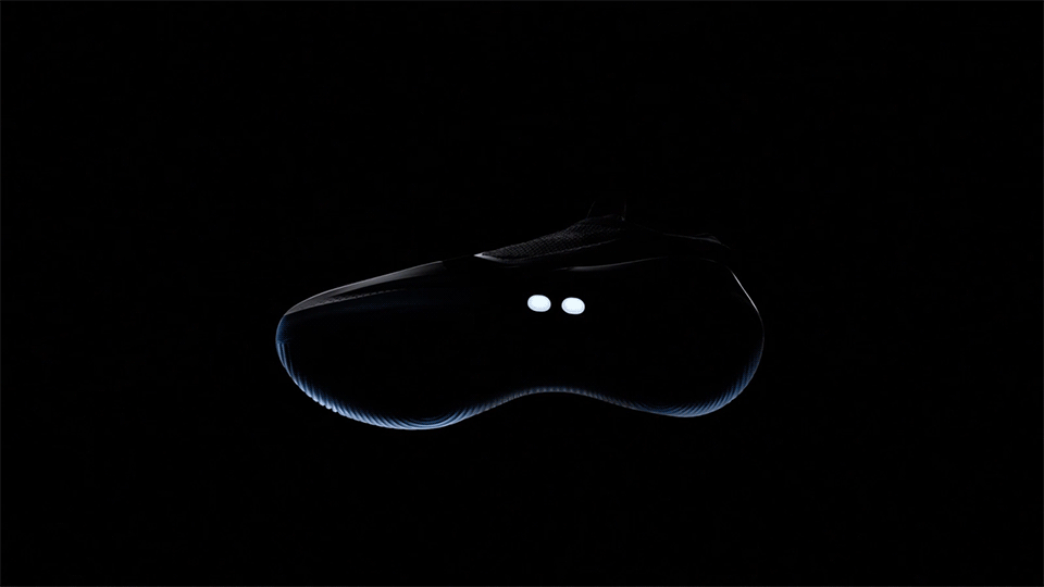
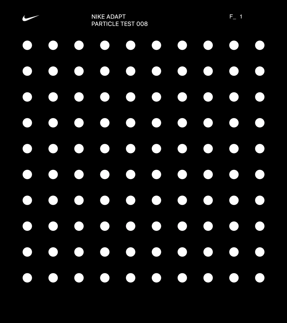
Nike Adapt X Watch
↳ 019
↳ 019
Studio
↳ Character (NY)
↳ Character (NY)
Role
↳ Design Director
↳ Design Director
Reaching down for your shoes or grabbing your phone isn’t an option when you’re in a constant state of shift. Being able to quickly adjust and fine tune your fit on the fly, unlocks a new level of control for the Adapt consumer.
We worked closely with the Nike Digital Innovation team to translate how this experience comes to life through function and form on the Apple Watch, to deliver the ultimate level of control for on-the-go adjustments.
*3D sneaker asset provided by the Nike Brand Experience team.
We worked closely with the Nike Digital Innovation team to translate how this experience comes to life through function and form on the Apple Watch, to deliver the ultimate level of control for on-the-go adjustments.
*3D sneaker asset provided by the Nike Brand Experience team.
↳ User Problem
As a user, I would like the ability to adjust and fine tune the fit of my shoe using the watch, so that I don’t have to open the app.
↳ Experience Principles
Glanceable
1. Information is readily available to the user. 2. Interactions should occur quickly, and over a short period of time. 3. Communicate information clearly and without added distraction.
Responsive
1. Minimize the time it takes to launch and load new screens. 2. Respond to user interactions with speed and accuracy. 3. Keep snapshot up-to-date with relevant information.
Actionable
1. Be thoughtful about the information that is presented. 2. Regularly update key information. 3. Consider the complication design.
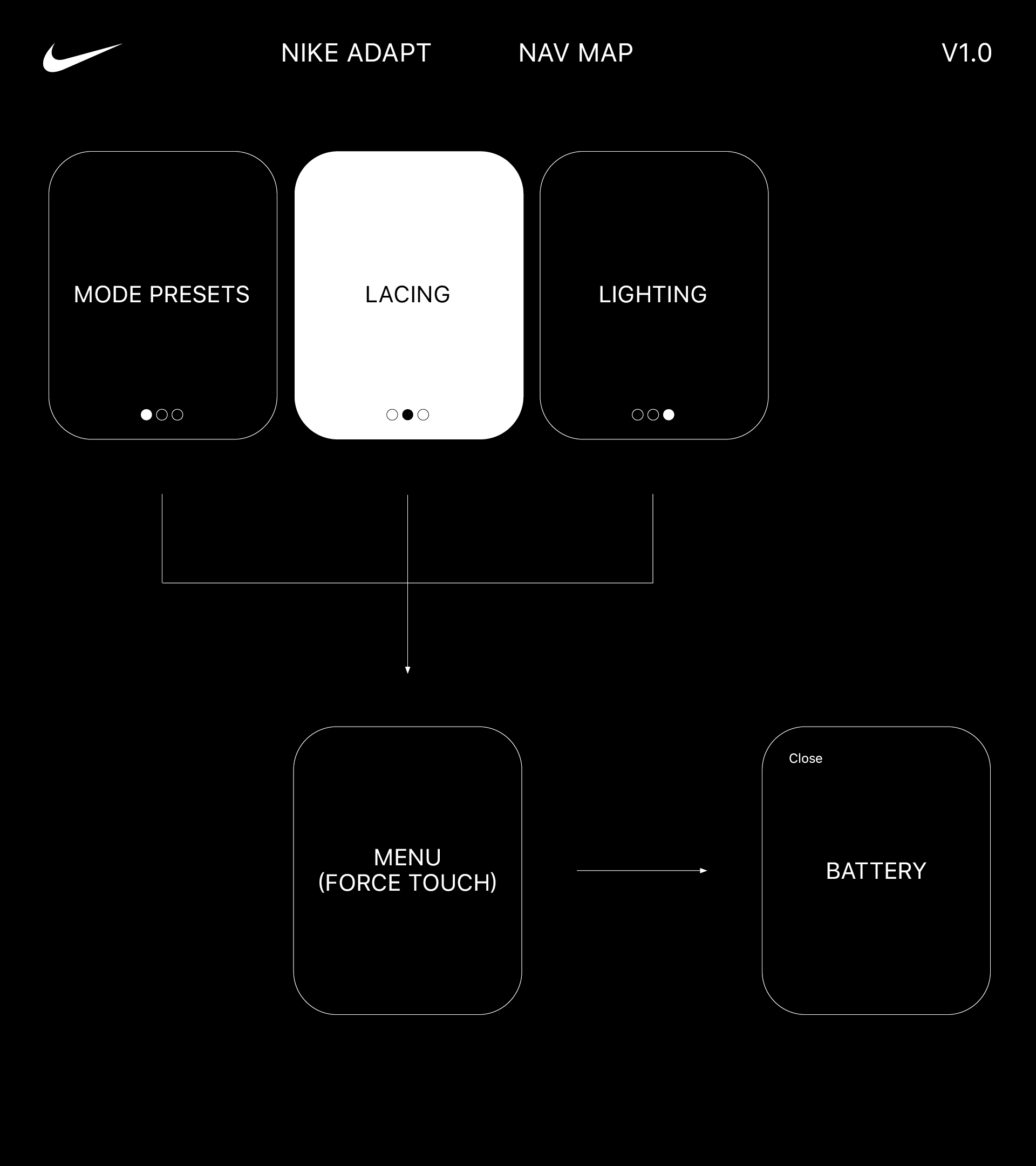
↳ Navigation
Guided by our experience principles and knowing what key functionalities we had to solve for, our next steps were to explore a range of navigation options, both hierarchical and page-based.
We arrived at a slightly customized structure that was both highly intuitive and efficient:
↳ All Lacing functions are contained within the p.2 landing screen, with Mode Presets located on p.1 and Lighting on p.3.
↳ Users can access Quick Release and Lights Off functions via a force touch menu as well as Battery levels via an additional modal screen that appears when activated.
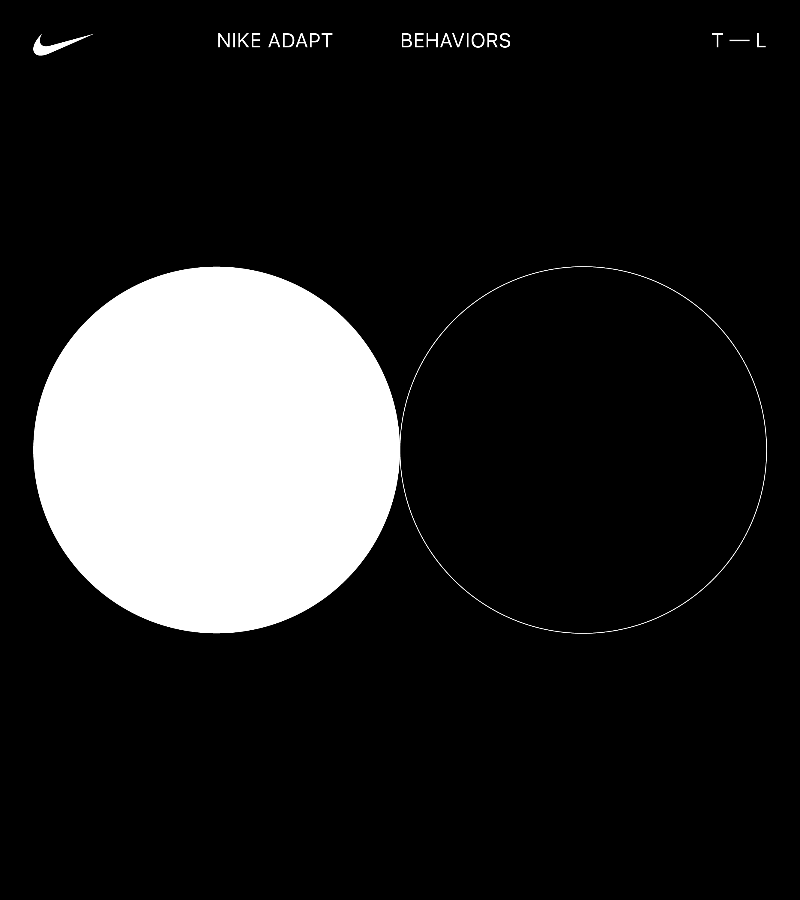
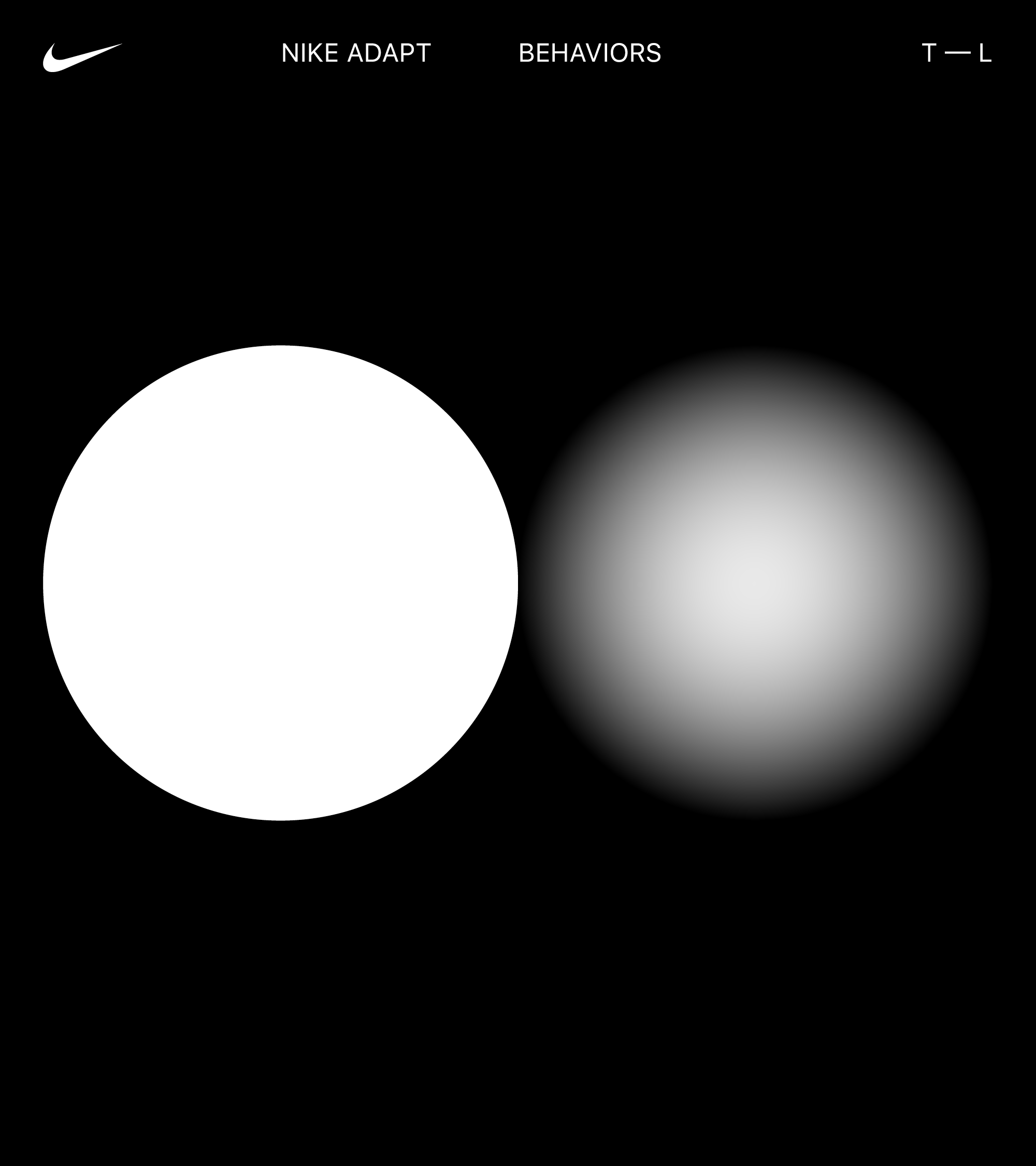
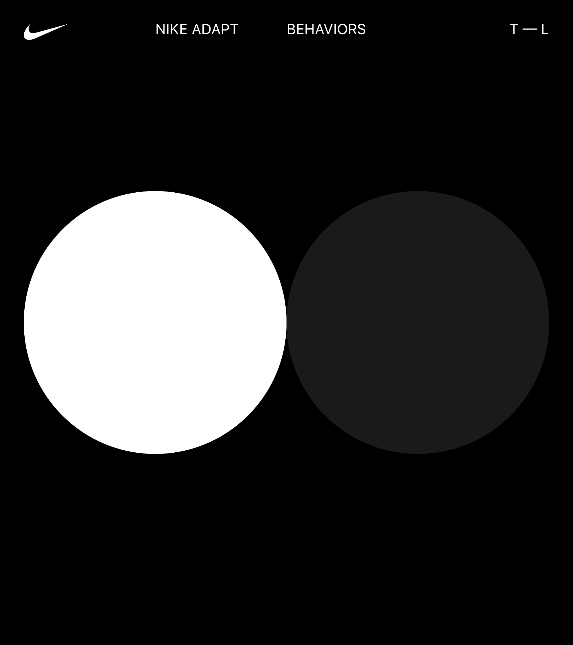
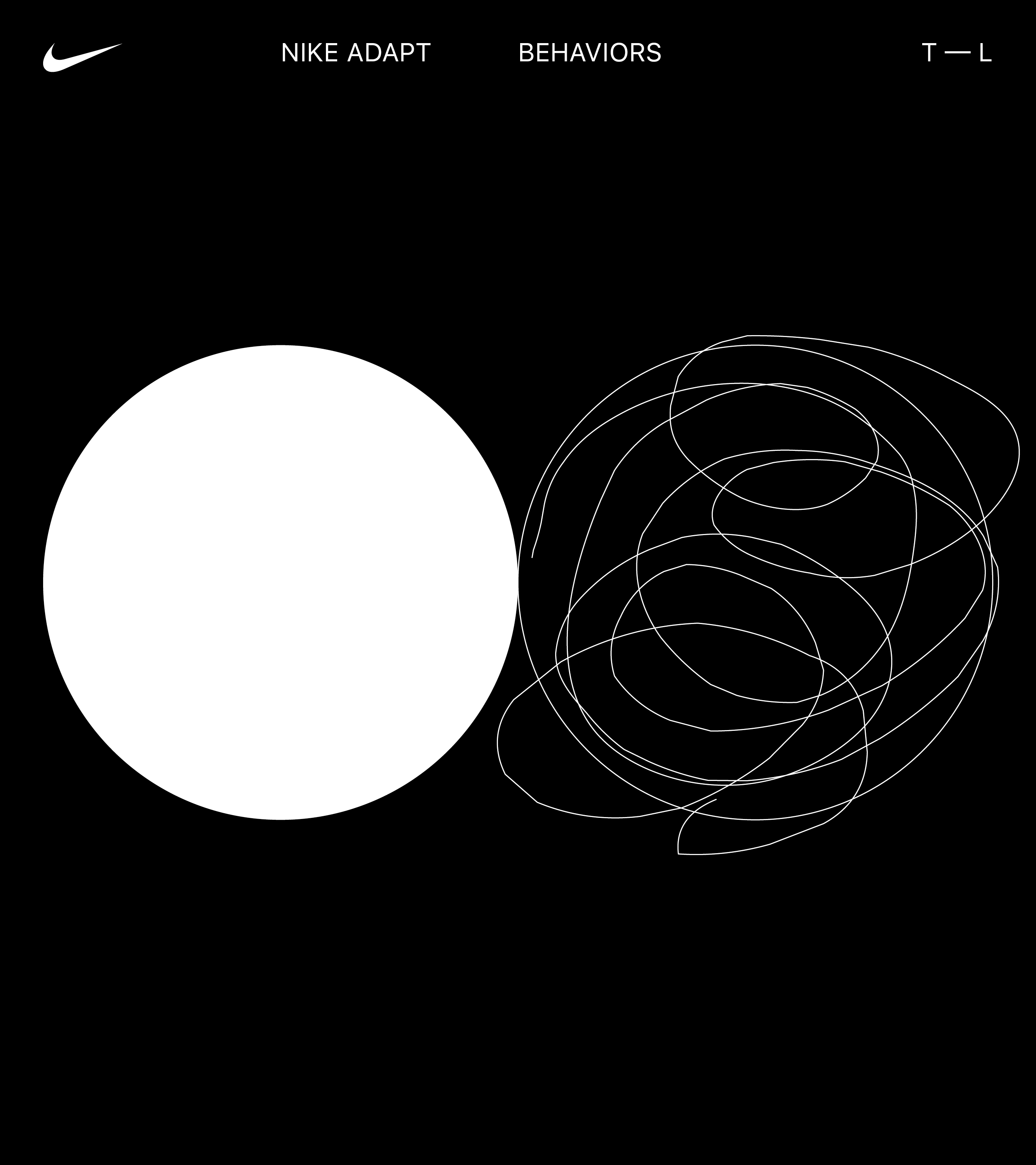
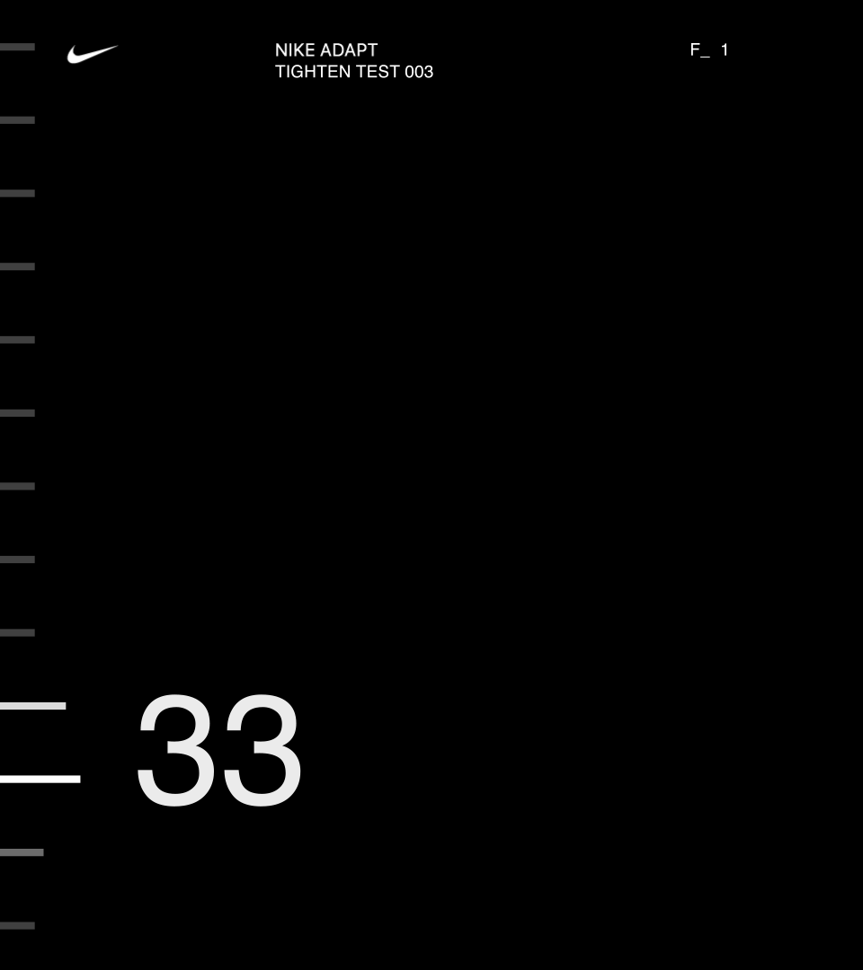
↳ Visualizing Behaviors
Before diving into design directions, and to inspire our design thinking / making, we did a quick exploratory in visualizing the behavior of Tight — Loose.


↳ Design Expressions
With our navigation locked, we explored three overarching visual expressions:
1. Metrical
2. Representational
3. Hybrid
1. Metrical
2. Representational
3. Hybrid
1. Metrical
Within this territory, we embrace the Apple Watch’s timepiece ancestry as a functional instrument, utilizing precise metrics and measurements as our guide.
By emphasizing data using large numerical elements, the visualizations adopt a more performance-based approach.
Themes:
·Functional
·Precise
·Numerical


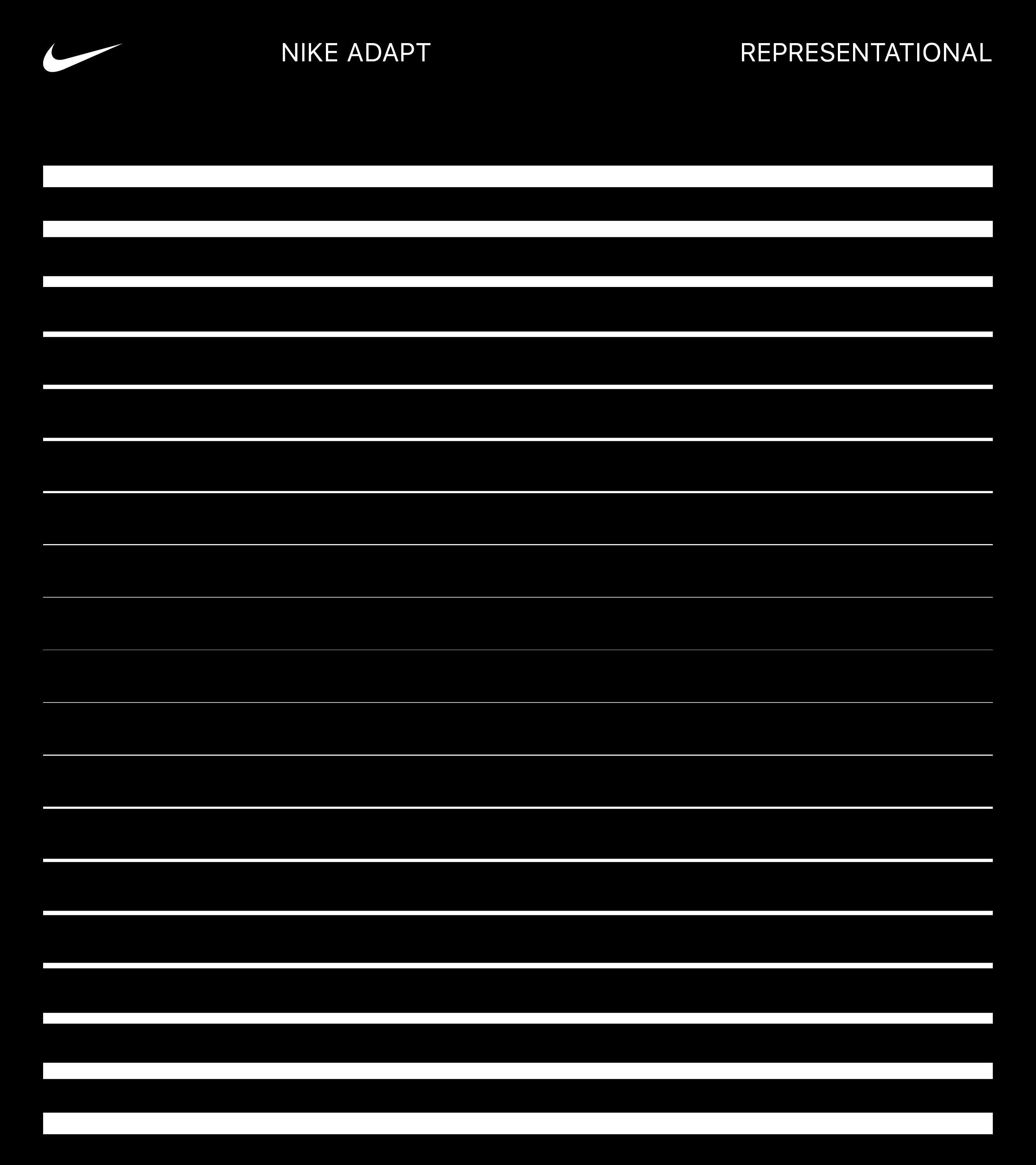
2. Representational
This territory explores the physical and realistic qualities of pressure to represent the tightening and loosening of the shoe.
By relying less on numerals, these explorations are more lifestyle oriented.
Themes:
·Realistic
·Demonstrative
·Human
This territory explores the physical and realistic qualities of pressure to represent the tightening and loosening of the shoe.
By relying less on numerals, these explorations are more lifestyle oriented.
Themes:
·Realistic
·Demonstrative
·Human


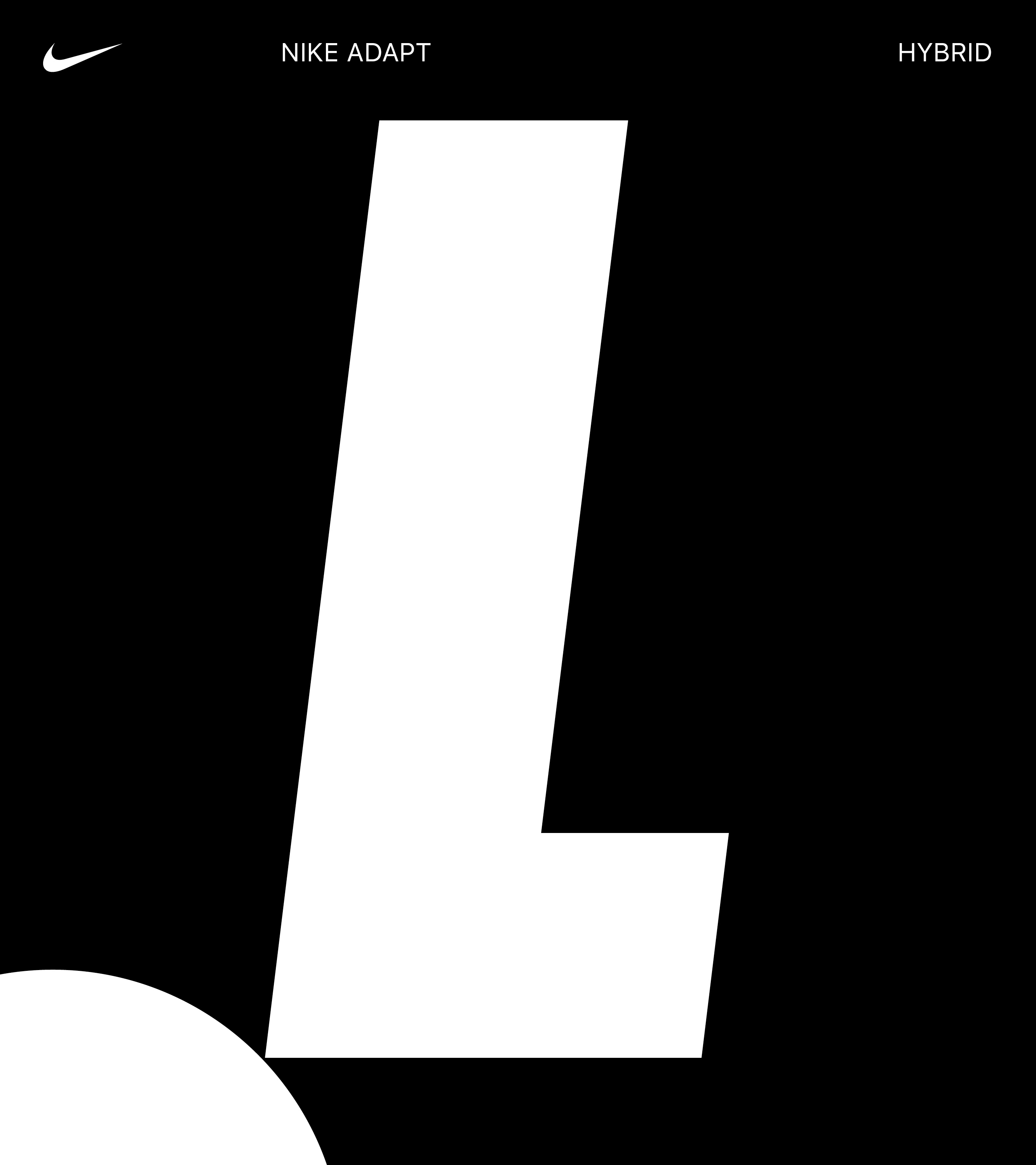
3. Hybrid
This hybrid territory illustrates the tightening and loosening of the shoe in a way that combines representational and metrical qualities.
The emphasis on each quality shifts depending where you are in the interaction flow of the Apple Watch app.
Themes:
·Realistic
·Functional
This hybrid territory illustrates the tightening and loosening of the shoe in a way that combines representational and metrical qualities.
The emphasis on each quality shifts depending where you are in the interaction flow of the Apple Watch app.
Themes:
·Realistic
·Functional
↳ Motion Tests
An exploratory into how behaviors could come to life through motion. Interface test animations by Joe Wright.
↳ Final Product
We delivered a simple, efficient, and visually consistent solution, that felt in line with the Nike Adapt mobile app and larger brand system.

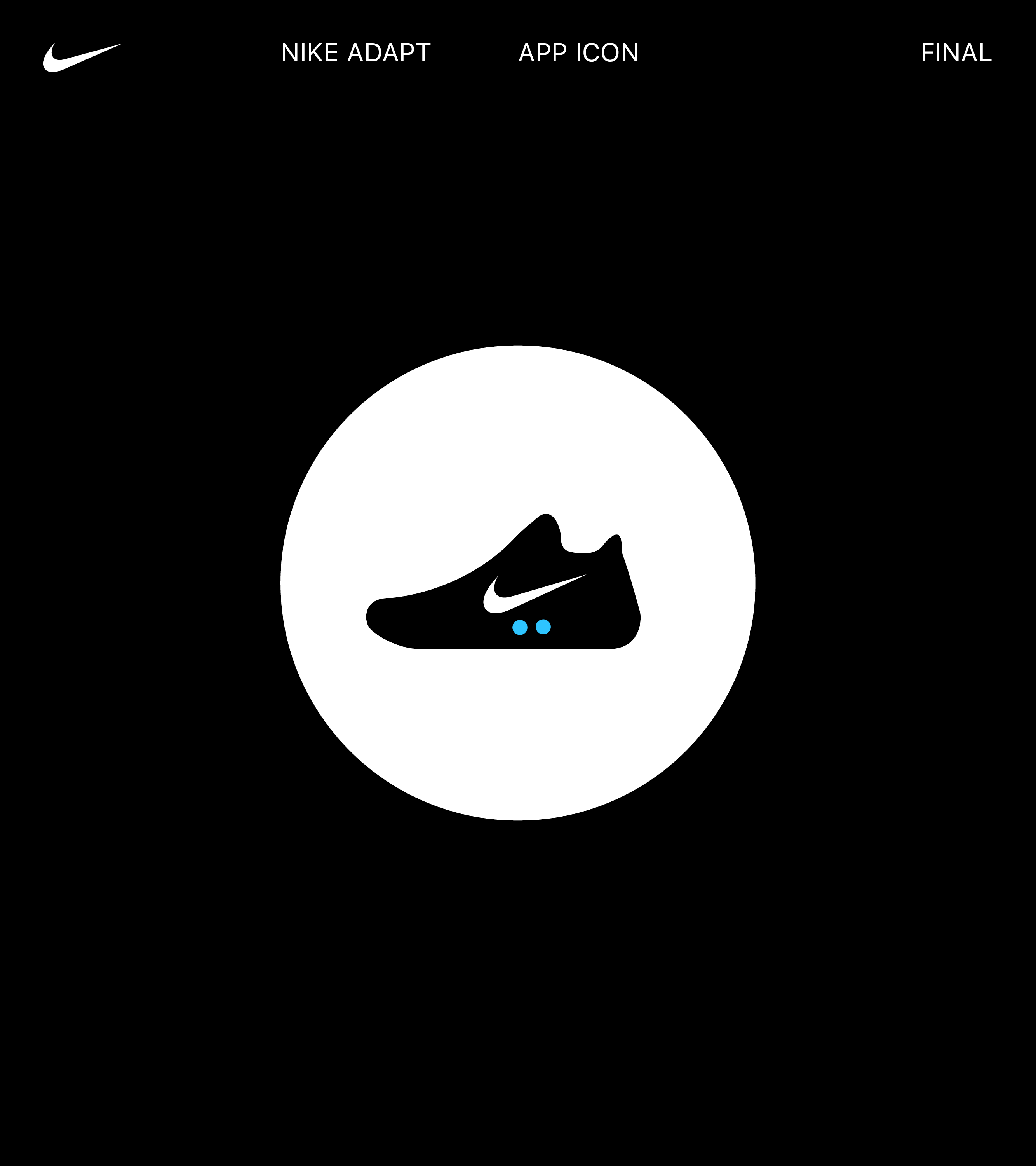
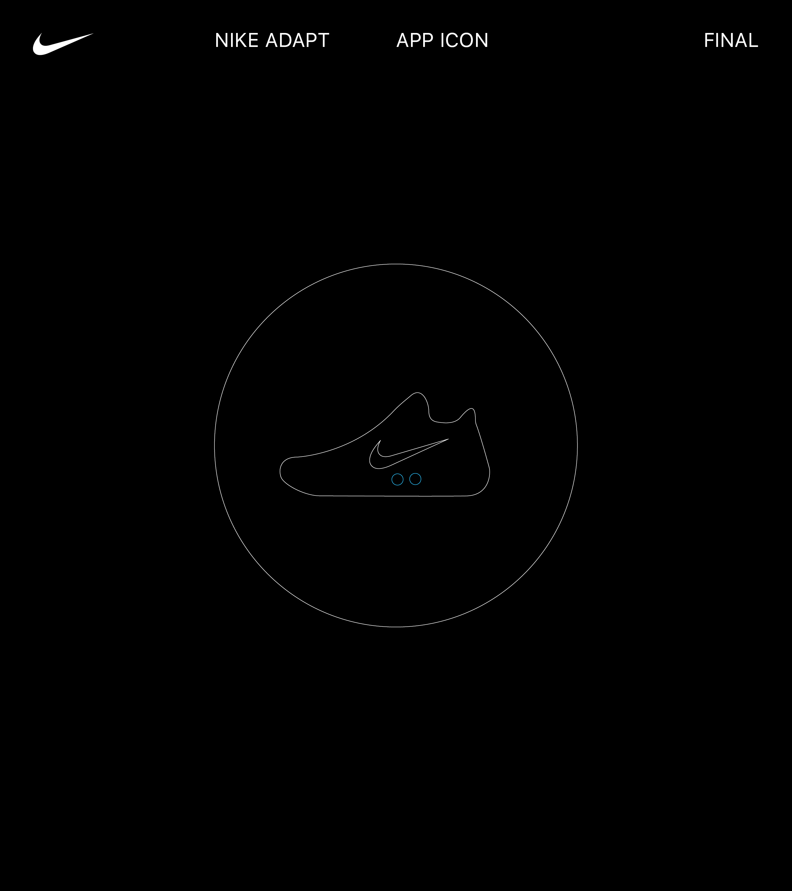
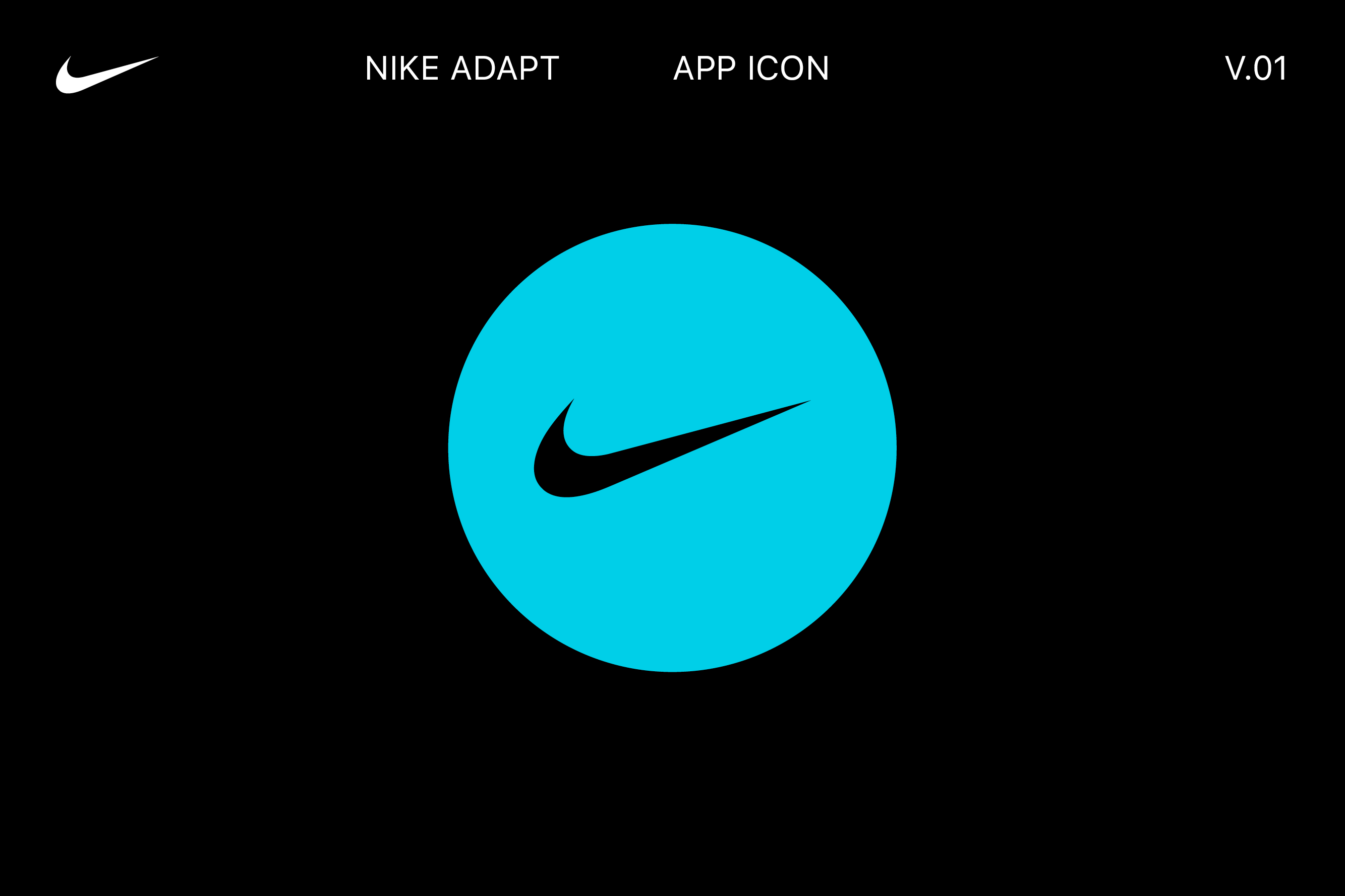
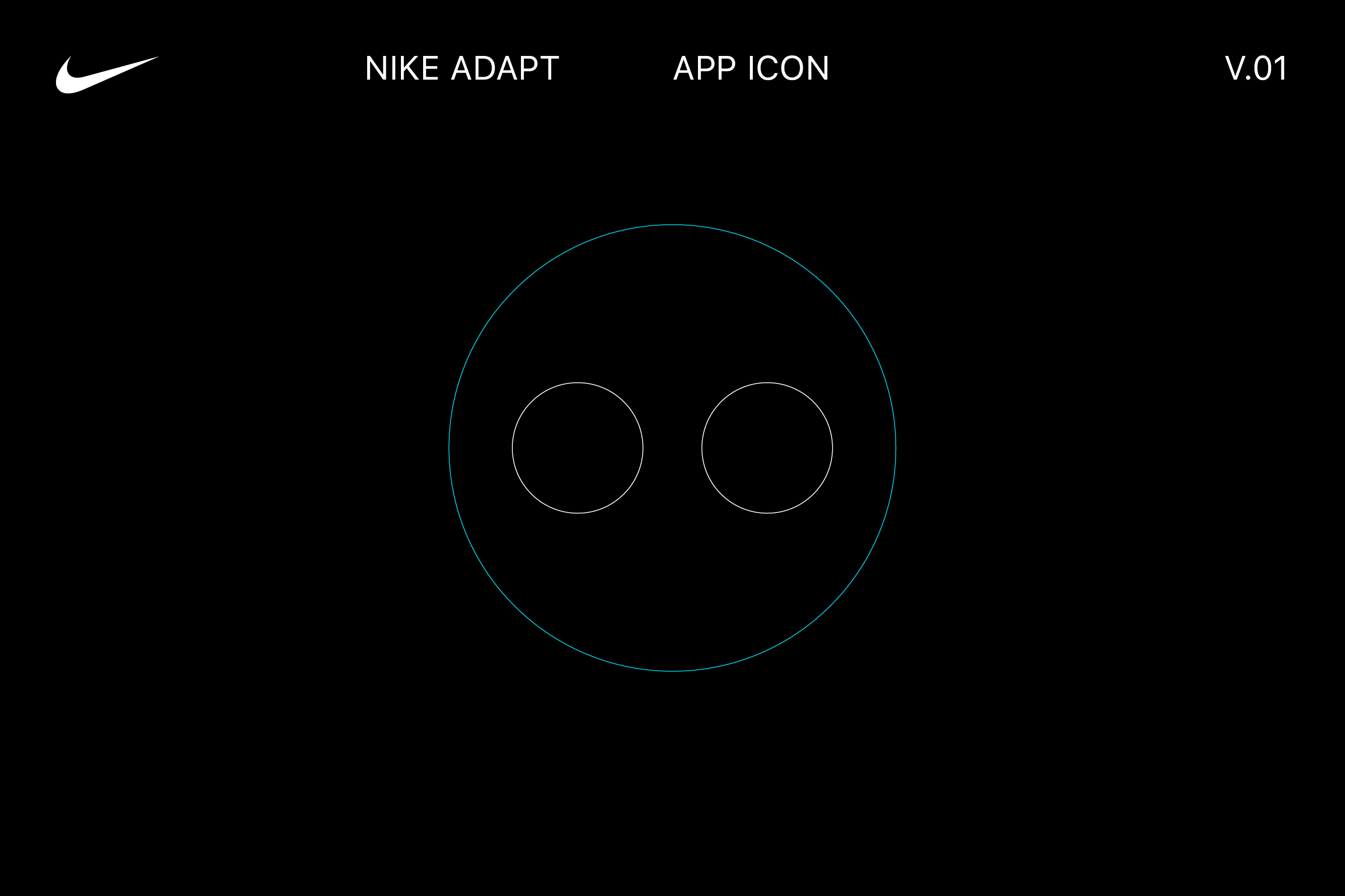
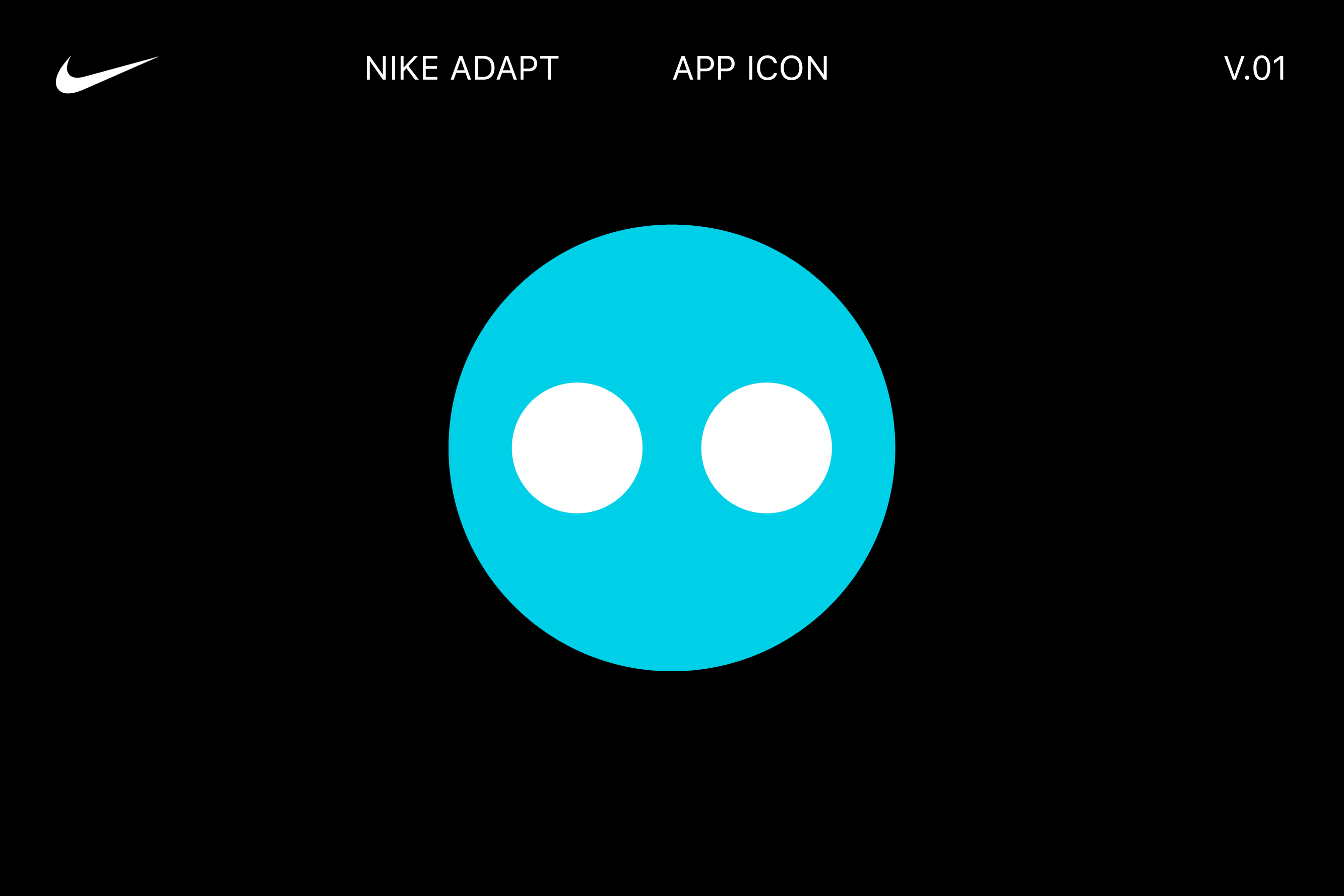
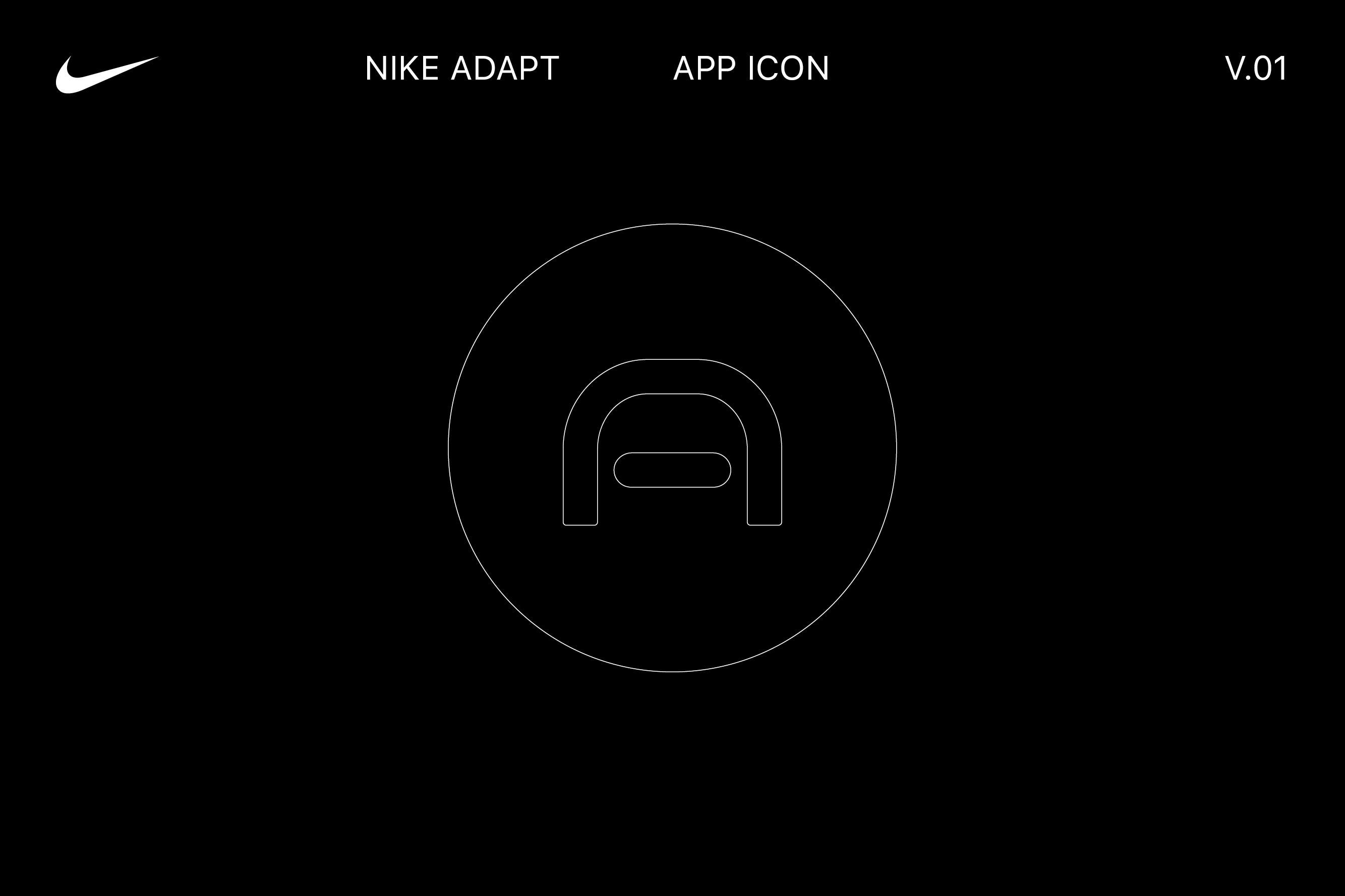
↳ Apple Watch App Icon
Finally, we created the Apple Watch app icon — a silhouette of the Nike Adapt BB sneaker that would change depending on what shoe model the user is controlling.


Team
↳ Nike Digital Innovation, Virgilio Santos, Manuel Dilone, Junki Hong, Joe Wright, Cris Mascort, Teri Kaplan
↳ Nike Digital Innovation, Virgilio Santos, Manuel Dilone, Junki Hong, Joe Wright, Cris Mascort, Teri Kaplan
2
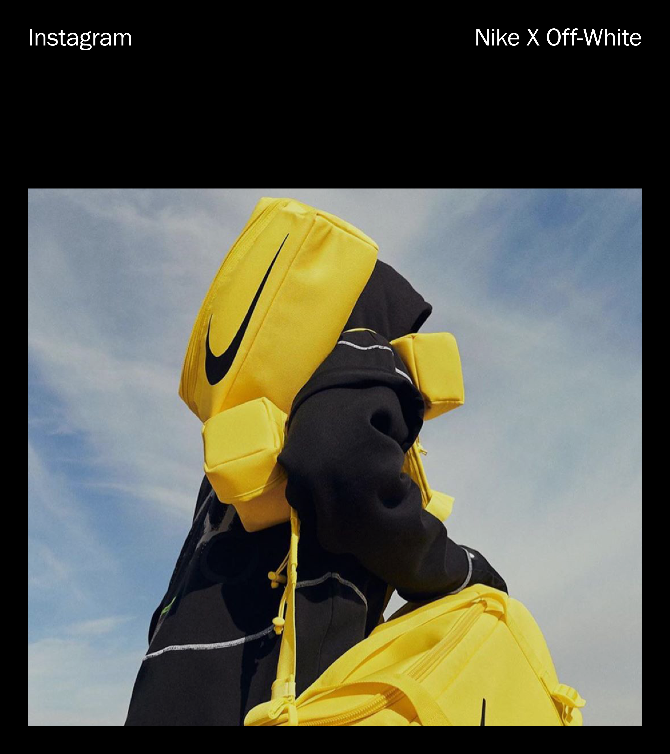
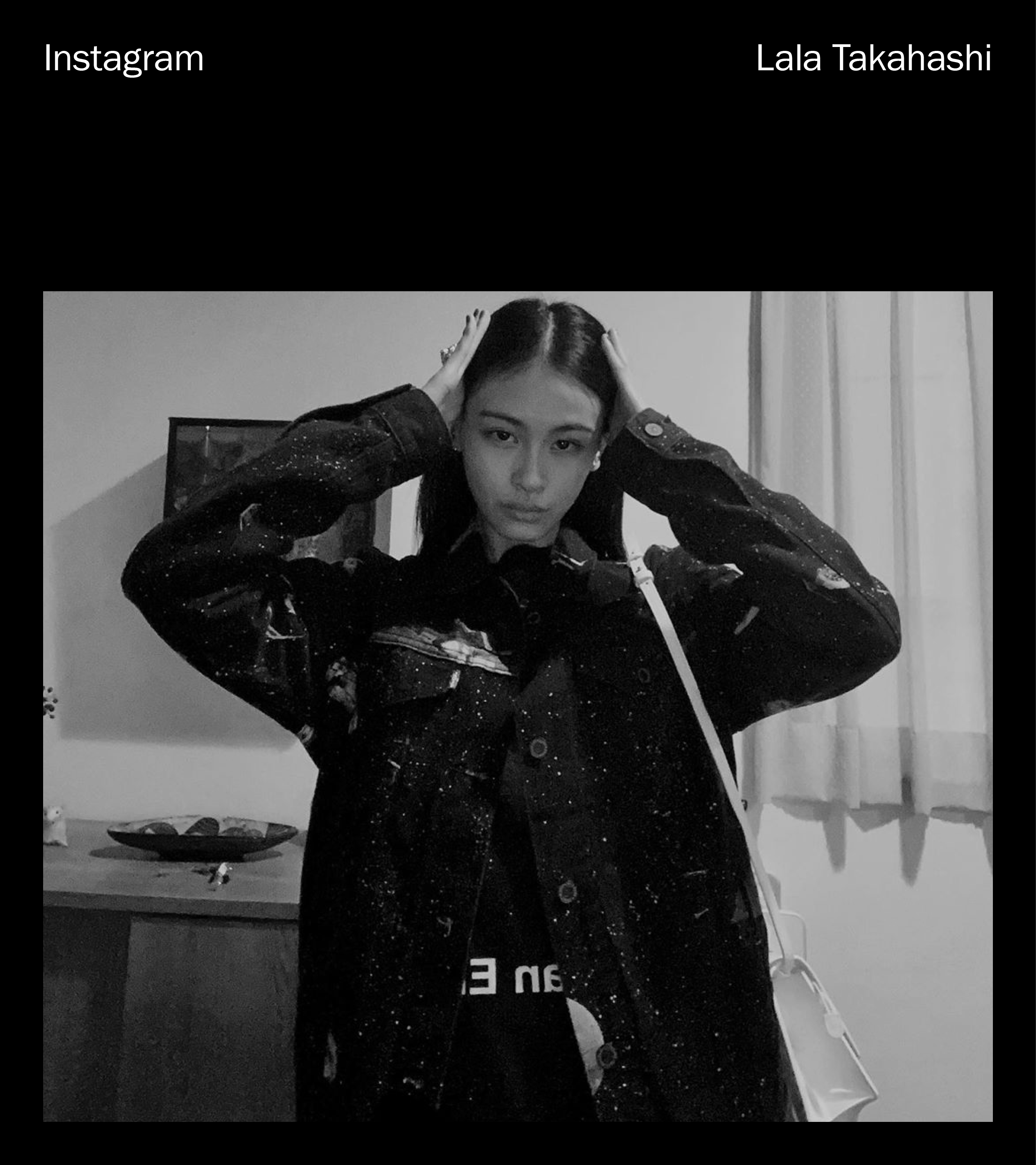
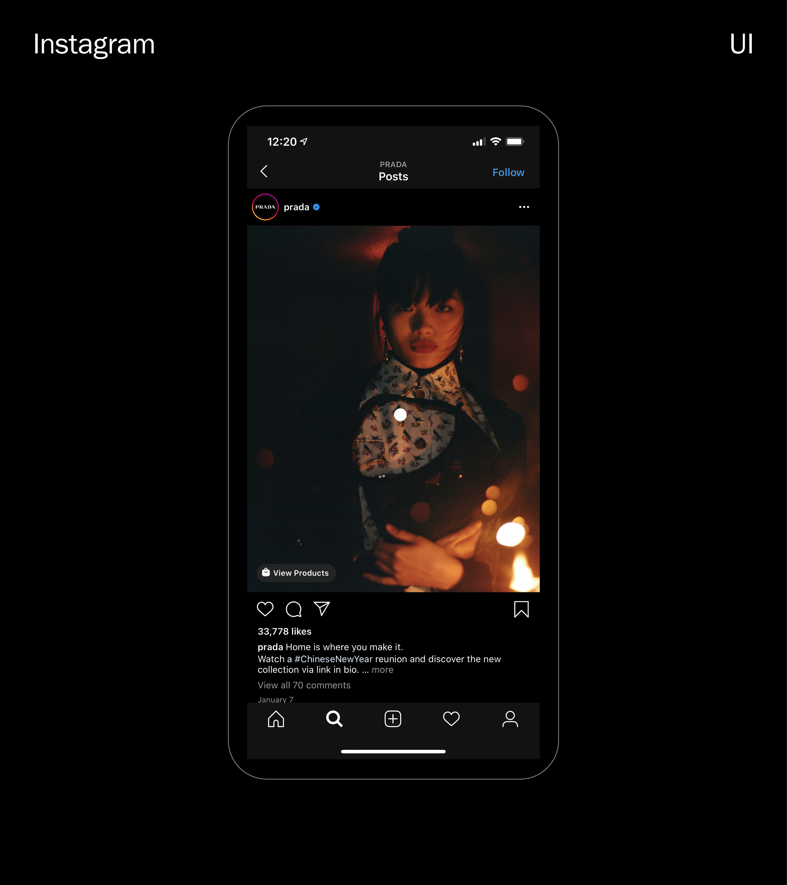
Instagram Shopping
↳ 018 — 019
↳ 018 — 019
Studio
↳ Character (NY)
↳ Character (NY)
Role
↳ Design Director
↳ Design Director
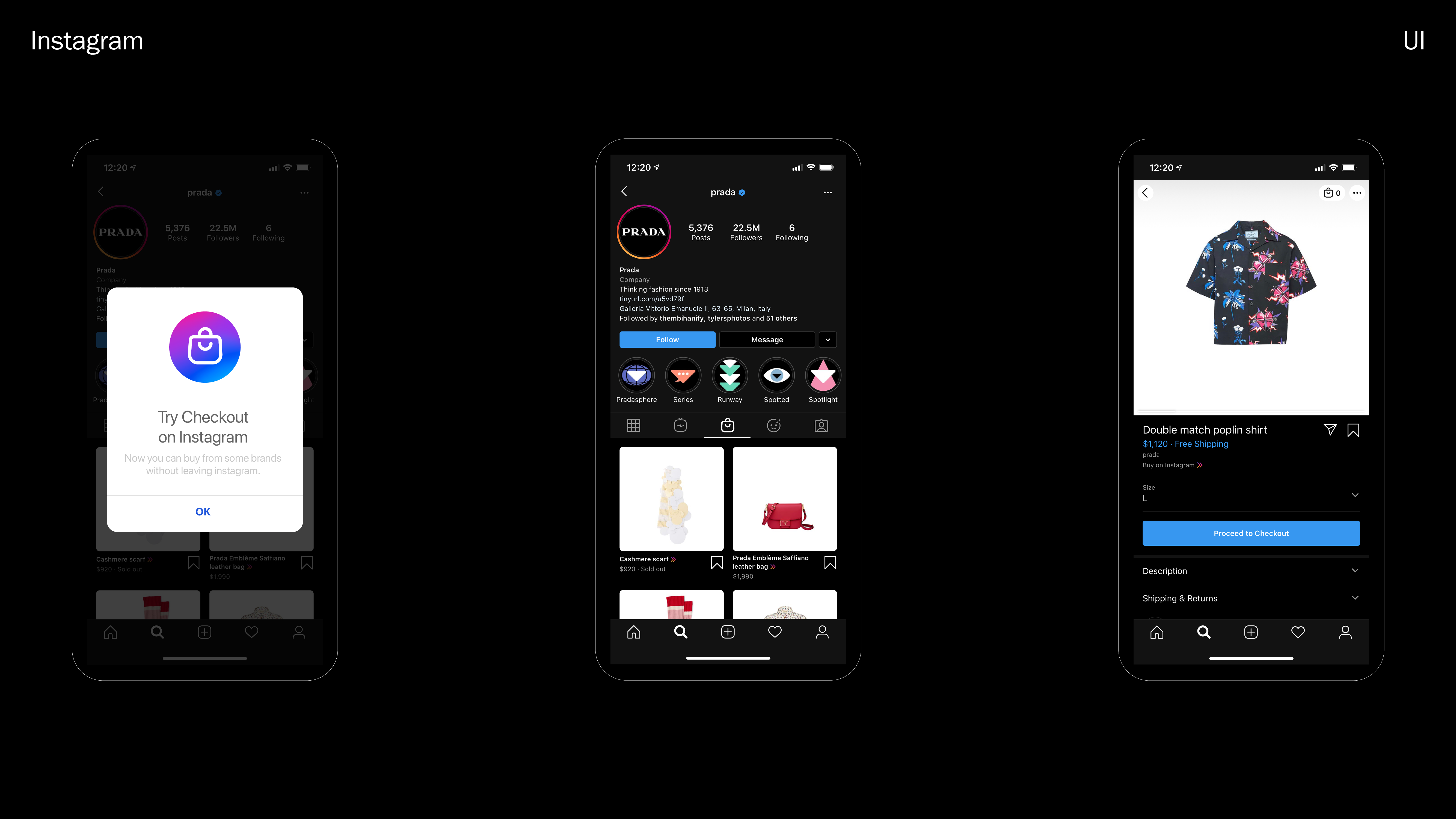
Together with Instagram, we helped shape a new vision of shopping: discovering, saving, sharing, and buying the products we love.


↳ Project Objectives
Instagram is poised to alter the trajectory of how people shop. Our core objectives included the following:
Define → a new brand that positions Instagram as the main destination for shopping.
Expand → the shopping ecosystem
of Instagram, within app, and with
a standalone app.
Engage → new-to-work women into
this new Instagram experience,
while aiming for long term scalability.
Define → a new brand that positions Instagram as the main destination for shopping.
Expand → the shopping ecosystem
of Instagram, within app, and with
a standalone app.
Engage → new-to-work women into
this new Instagram experience,
while aiming for long term scalability.
↳ Brand Mission
Bringing you closer to the people and things you love.


↳ Brand Values
1. Keep it simple. 2. Be surprising and fun. 3. Inspire creativity. 4. Be inclusive of the community. 5. Prioritize diversity.

↳ Brand Attitudes
Our attitudes are inspired from Instagram, while bringing new dimensions to the brand.
1. Identity
2. Community
3. Creativity
4. Inclusivity
1. Identity
2. Community
3. Creativity
4. Inclusivity


1. Identity
↳ Helps me define and express a space that communicates who I am and what I care about.
Themes
· Taste
· Vision
· Individuality
2. Community
↳ Helps me connect with people I follow, friends, and brands in an easy and fun way.
Themes
· Community
· Relationship
· Trust
↳ Helps me define and express a space that communicates who I am and what I care about.
Themes
· Taste
· Vision
· Individuality
2. Community
↳ Helps me connect with people I follow, friends, and brands in an easy and fun way.
Themes
· Community
· Relationship
· Trust
3. Creativity
↳ Helps me be inspired by people and brands I admire and inspire others who follow me.
Themes
· Wonder
· Amusement
· Emotion
4. Inclusivity
↳ Helps me feel like I am seen and heard and find people who widen my perspective.
Themes
· Divesity
· Intersection
· Univerality
↳ Helps me be inspired by people and brands I admire and inspire others who follow me.
Themes
· Wonder
· Amusement
· Emotion
4. Inclusivity
↳ Helps me feel like I am seen and heard and find people who widen my perspective.
Themes
· Divesity
· Intersection
· Univerality
System Foundations
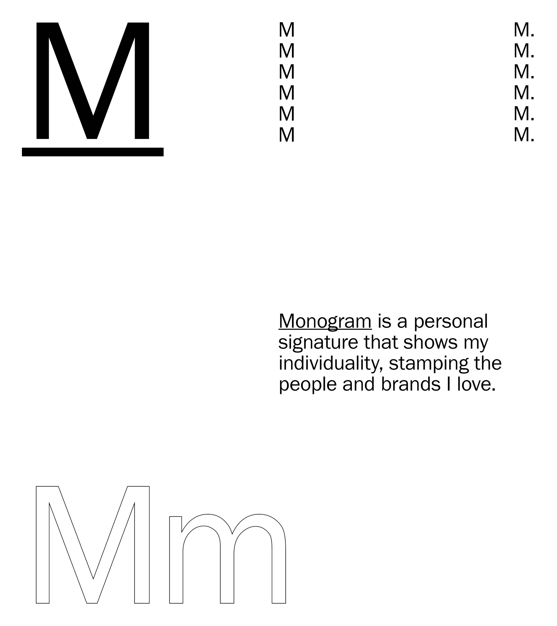
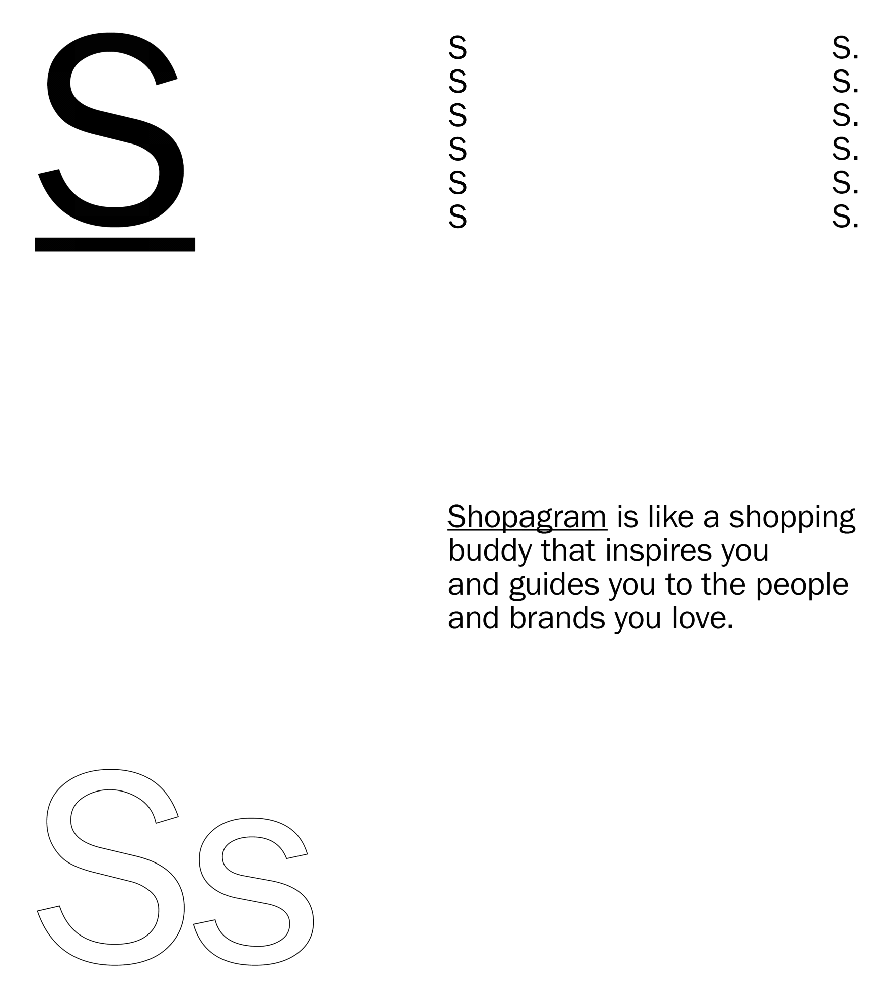
↳ Naming
↳ Naming
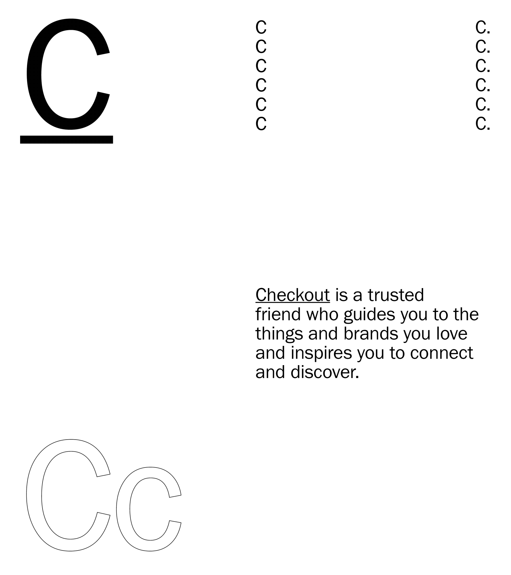
With our objectives and strategic foundations locked, we proceeded to do a deep dive on naming for this new shopping experience.
Instagram Checkout (Check@ut) came out as the winner and worked on a couple levels, signifying the begining (i.e. checking out and getting inspired by an influencer, brand or product on Instagram), and end (where the user literally proceeds to purchase via checkout) of the customer journey.*
* May 2020 Update — Now refered to as “Facebook Shops”.
↳ Temperature Gradient
Instagram is represented by a broad color spectrum.

↳ Temperature Gradient
If IGTV is the warm beginning of the discovery journey...
Warm Discovery
↳ Emotional
Warm Discovery
↳ Emotional

↳ Temperature Gradient
...Instagram Shopping the cool end of it.
Cool Reality
↳ Transactional
Cool Reality
↳ Transactional

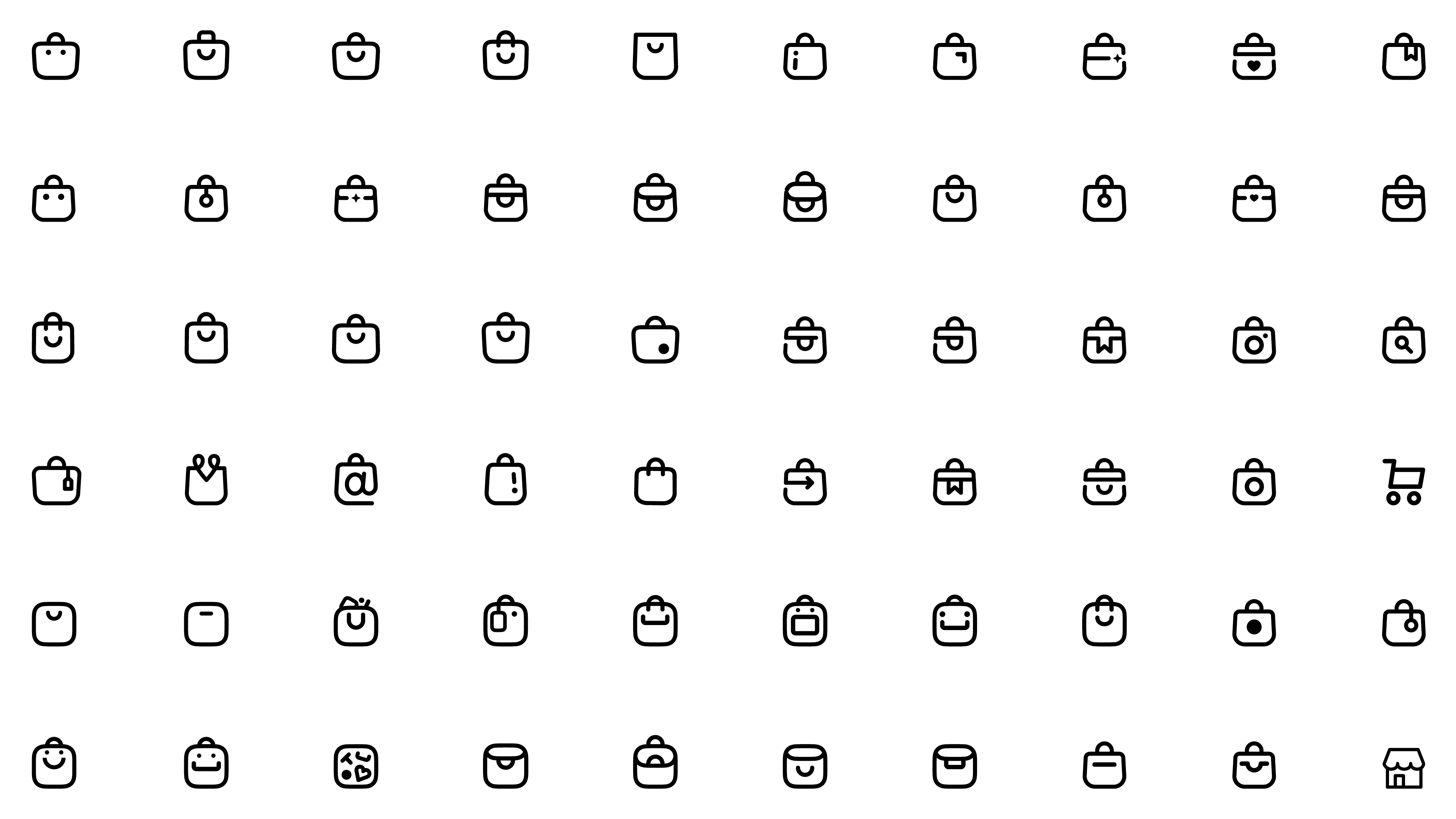
↳ Icon Development
During the exploratory phase, we stress tested our icons against the following principles 1. Make it owneable. 2. Keep it simple. 3. Ensure scalability.
Below is a small sample of the icon exploratory process. We created close to 1,000 shopping-centric icons and variants.
Below is a small sample of the icon exploratory process. We created close to 1,000 shopping-centric icons and variants.
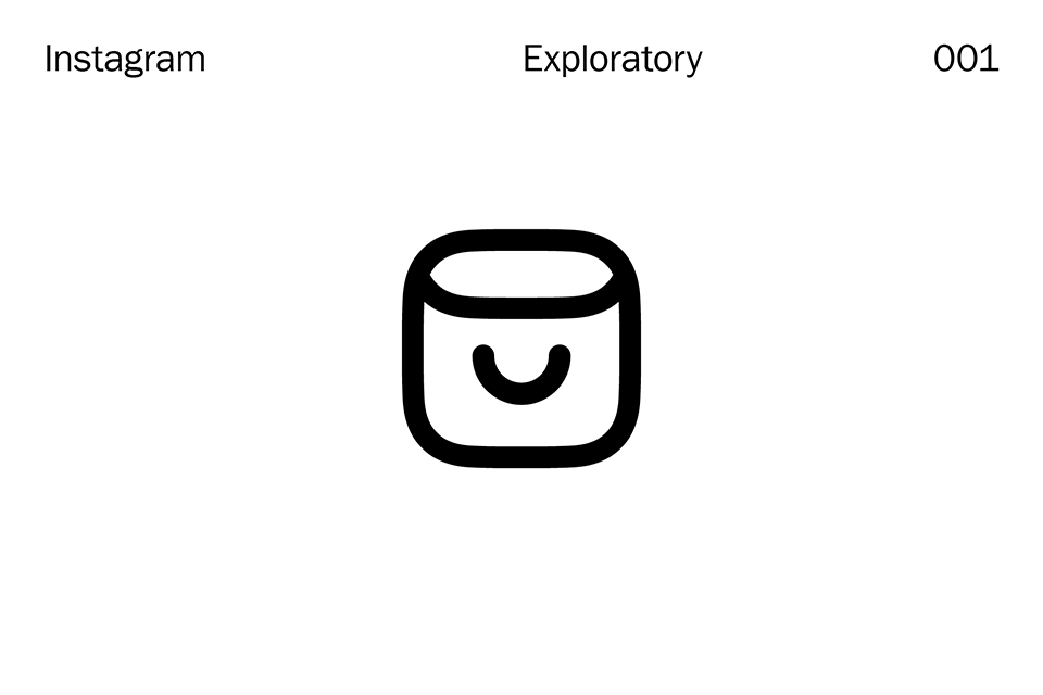
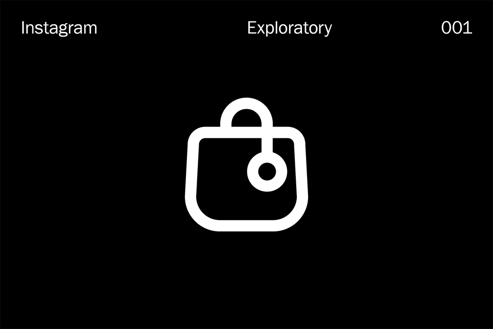
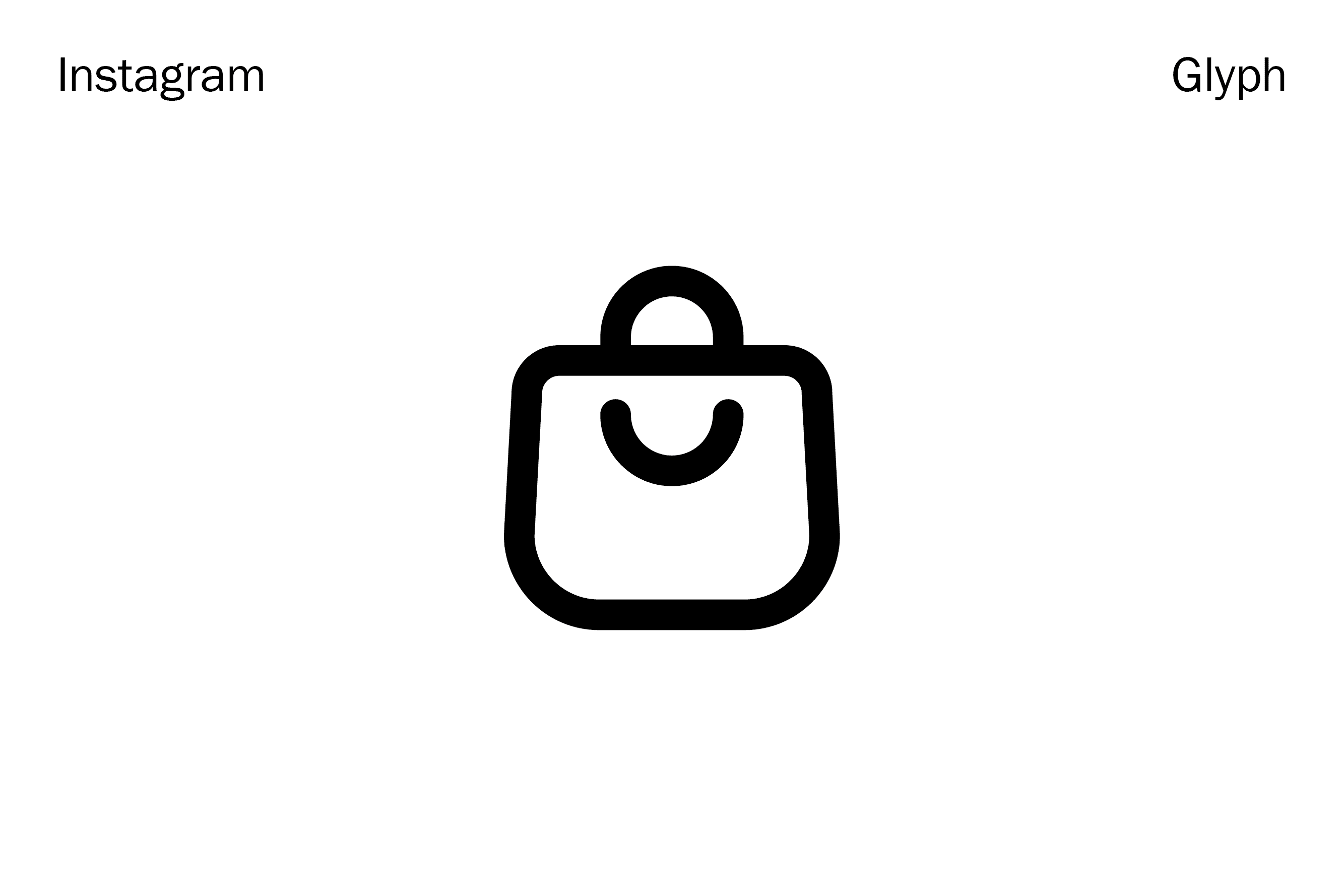
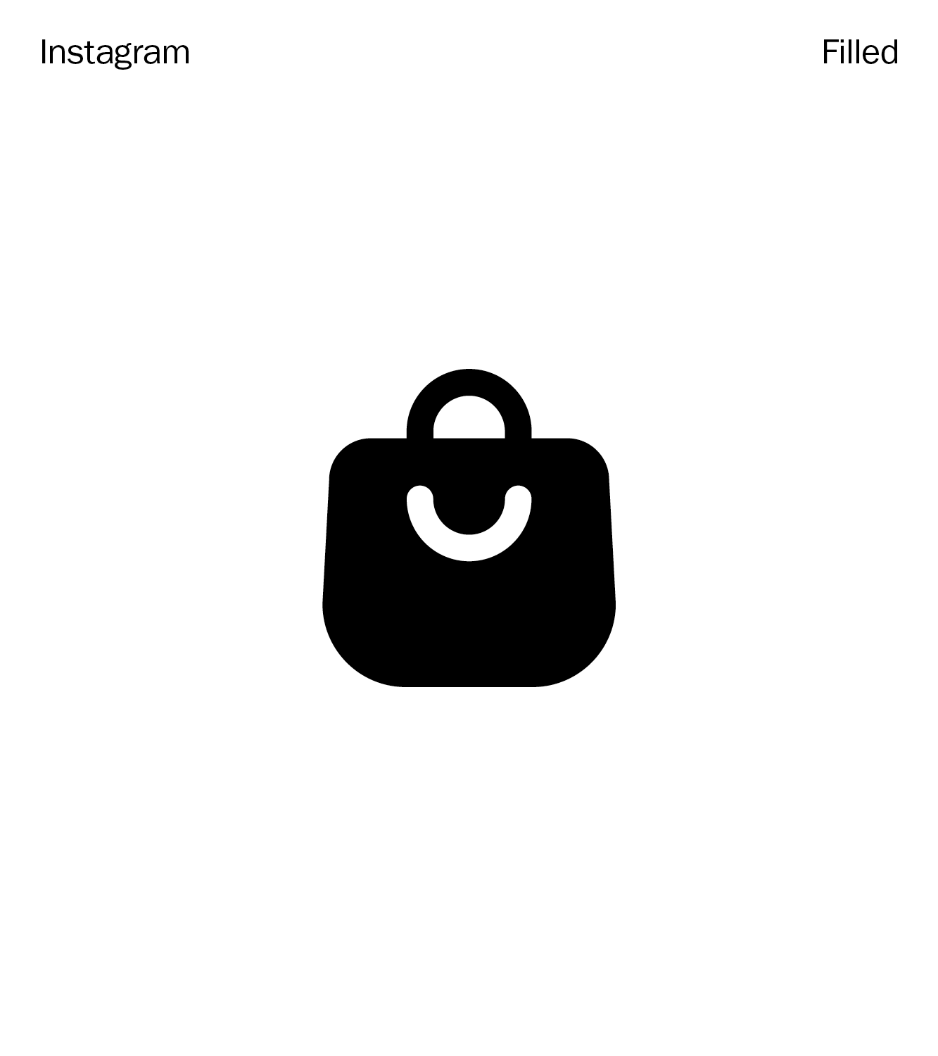
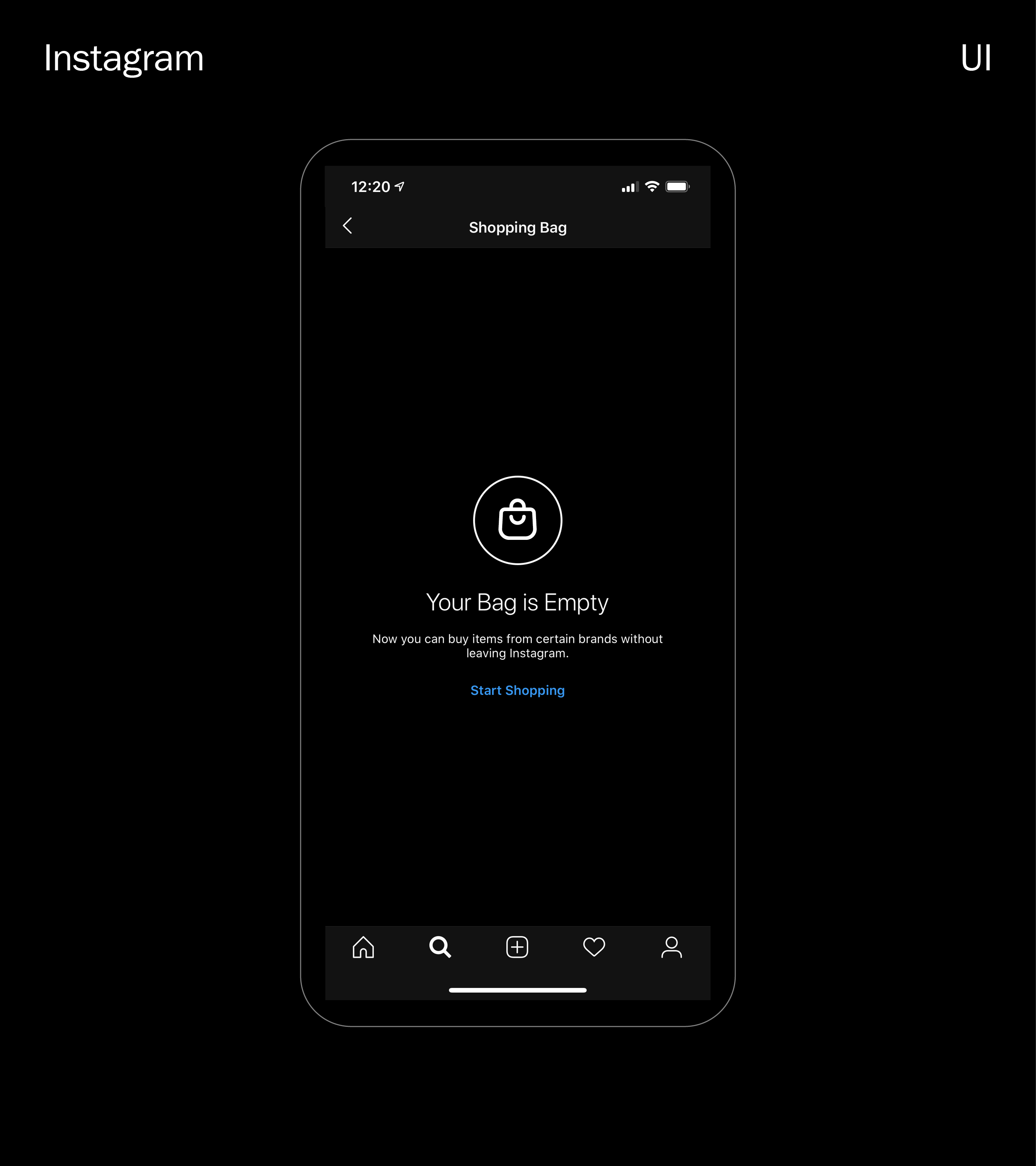
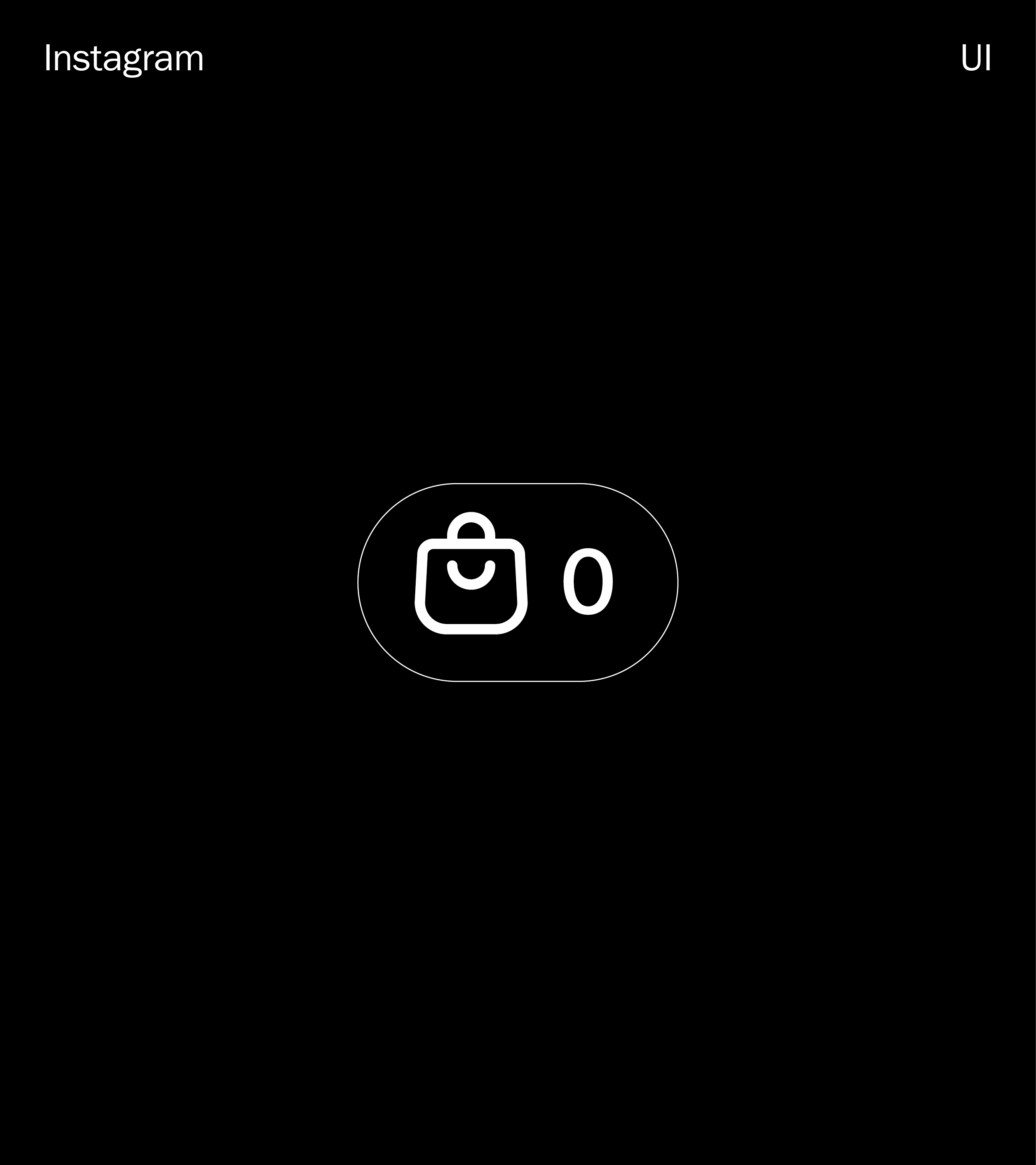
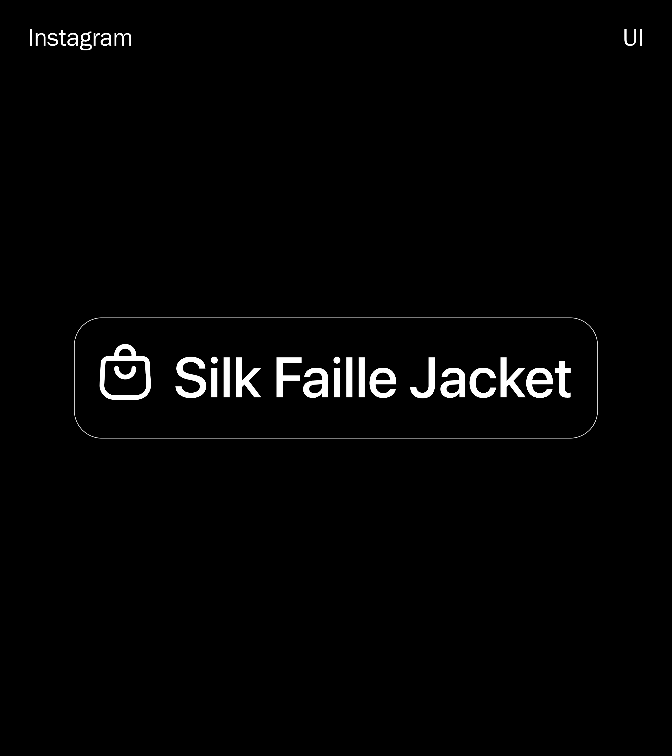
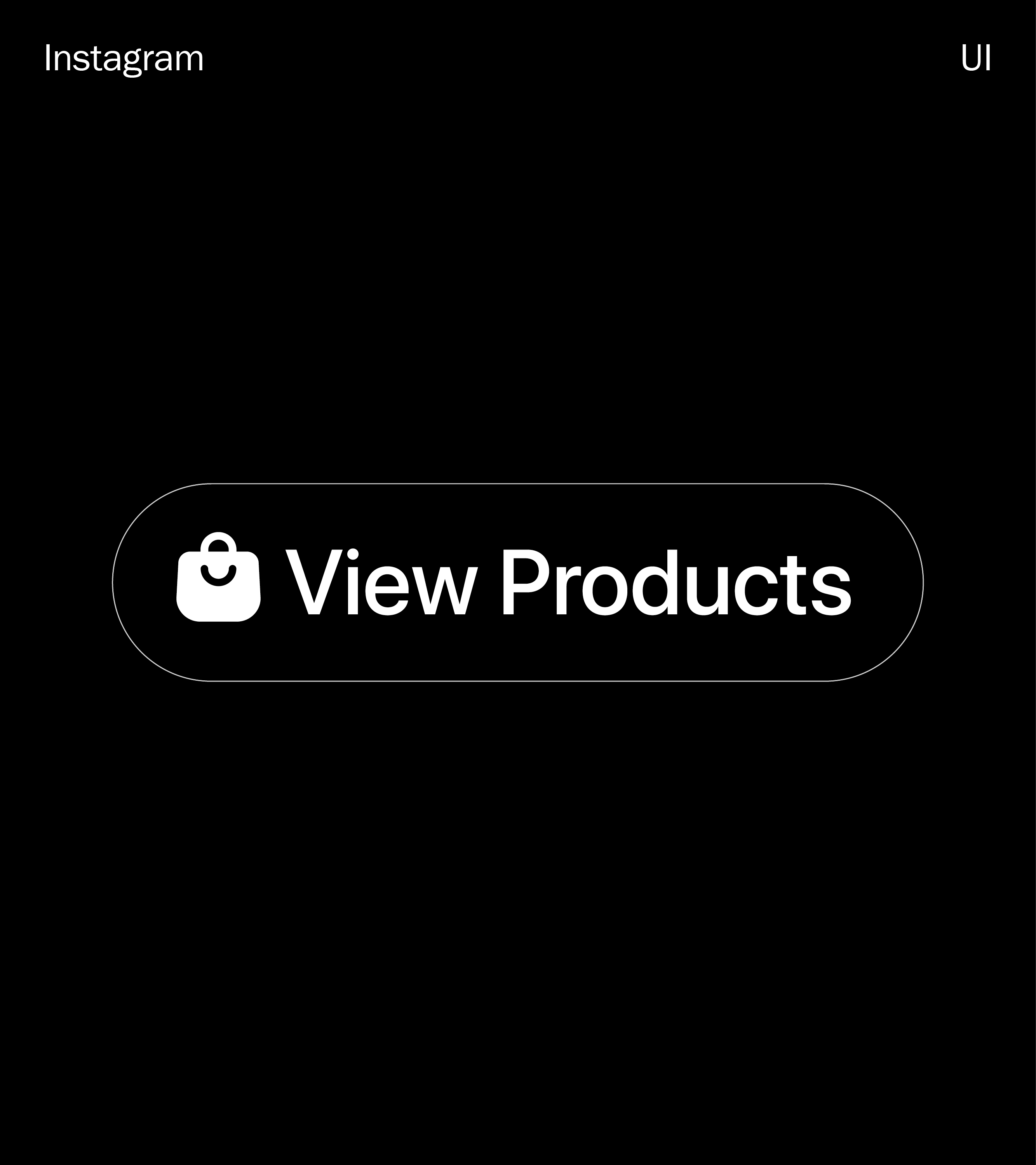
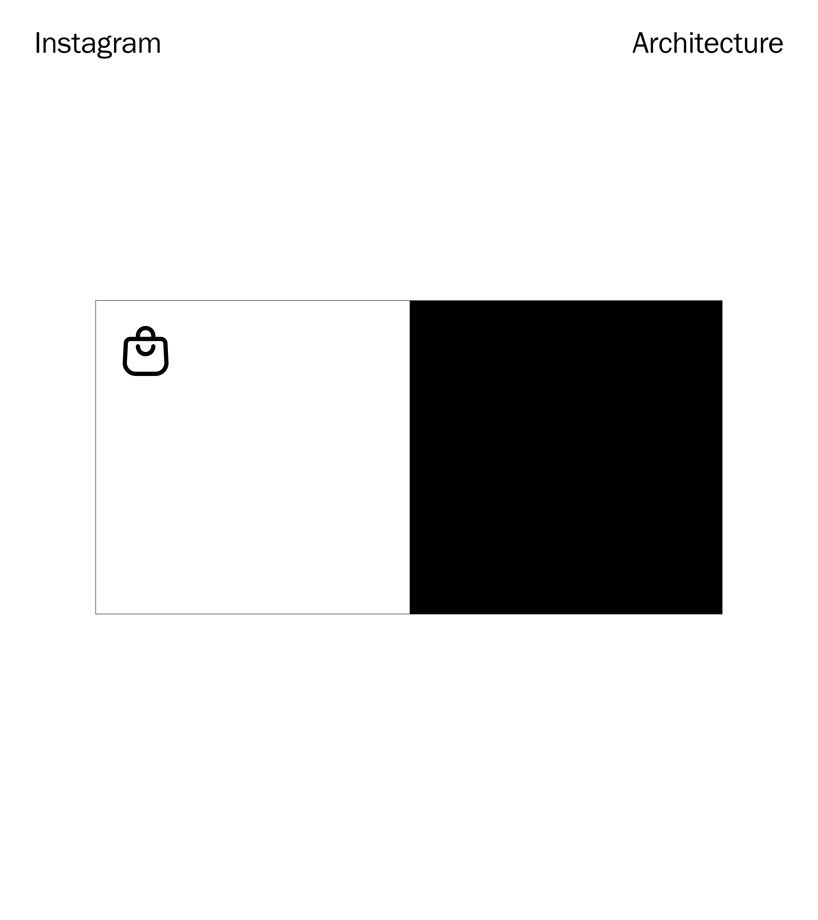
↳ Instagram Checkout Icon
After several rounds of rigorous exploratory, refinement and global user testing, we aligned on our beloved smiley Checkout bag.


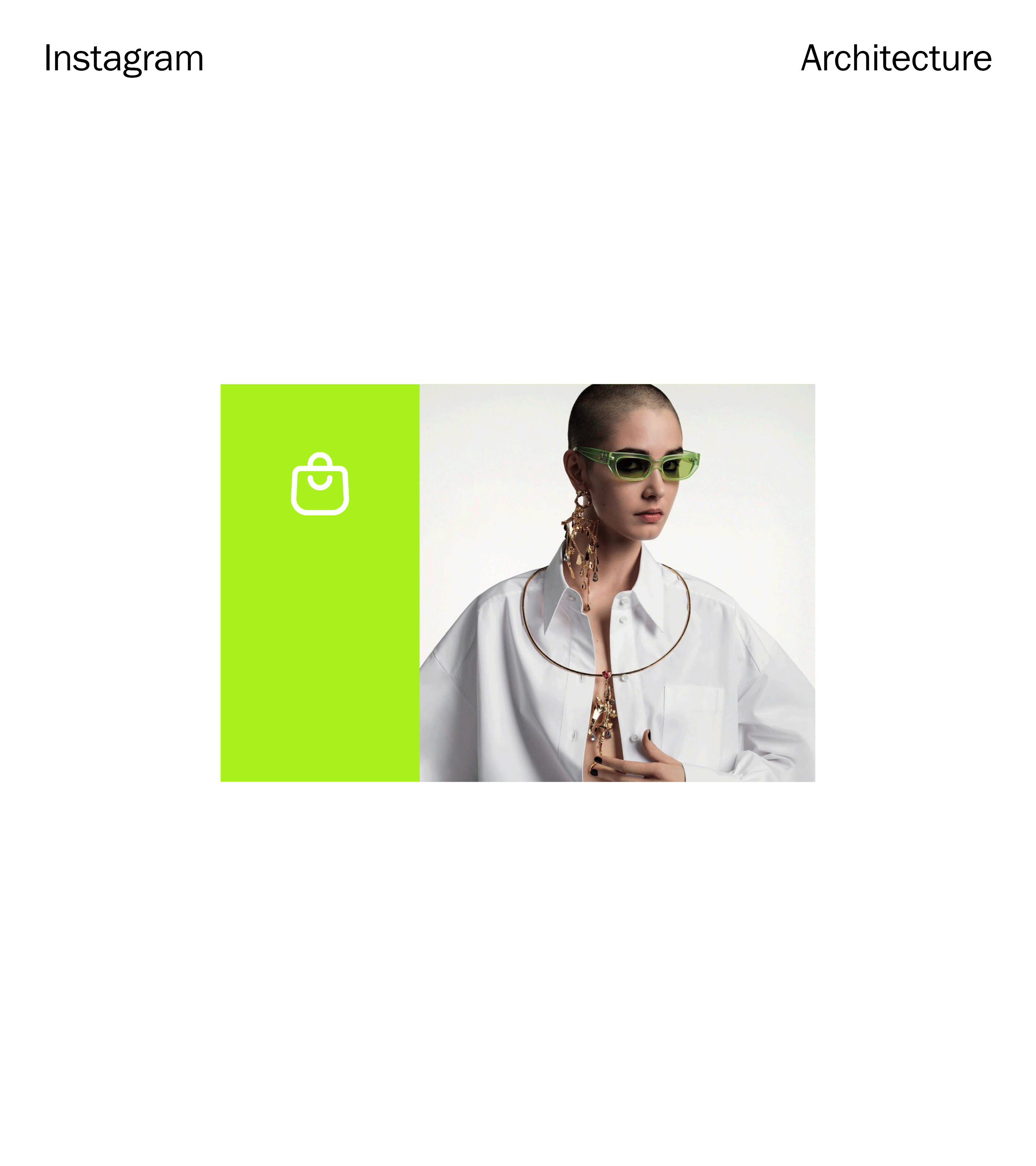
↳ Interface
The glyph was tested in various states and scales, across multiple key touchpoints within the Instagram Checkout experience.


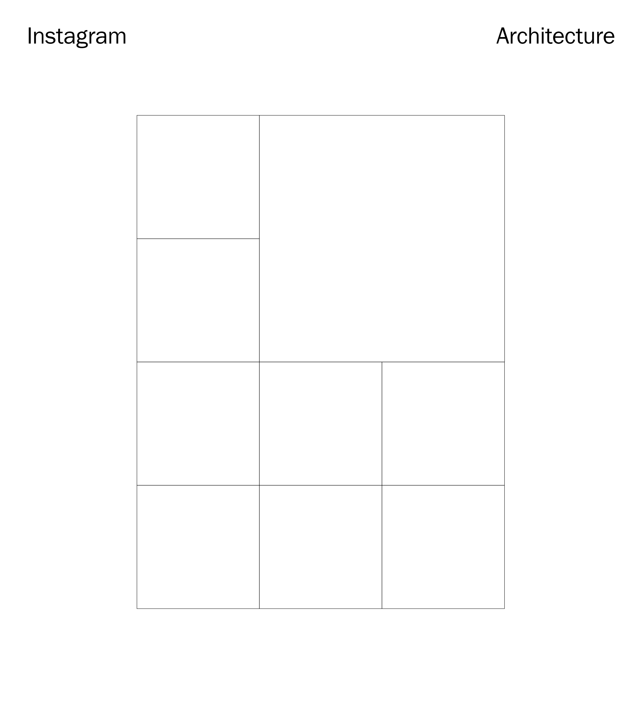
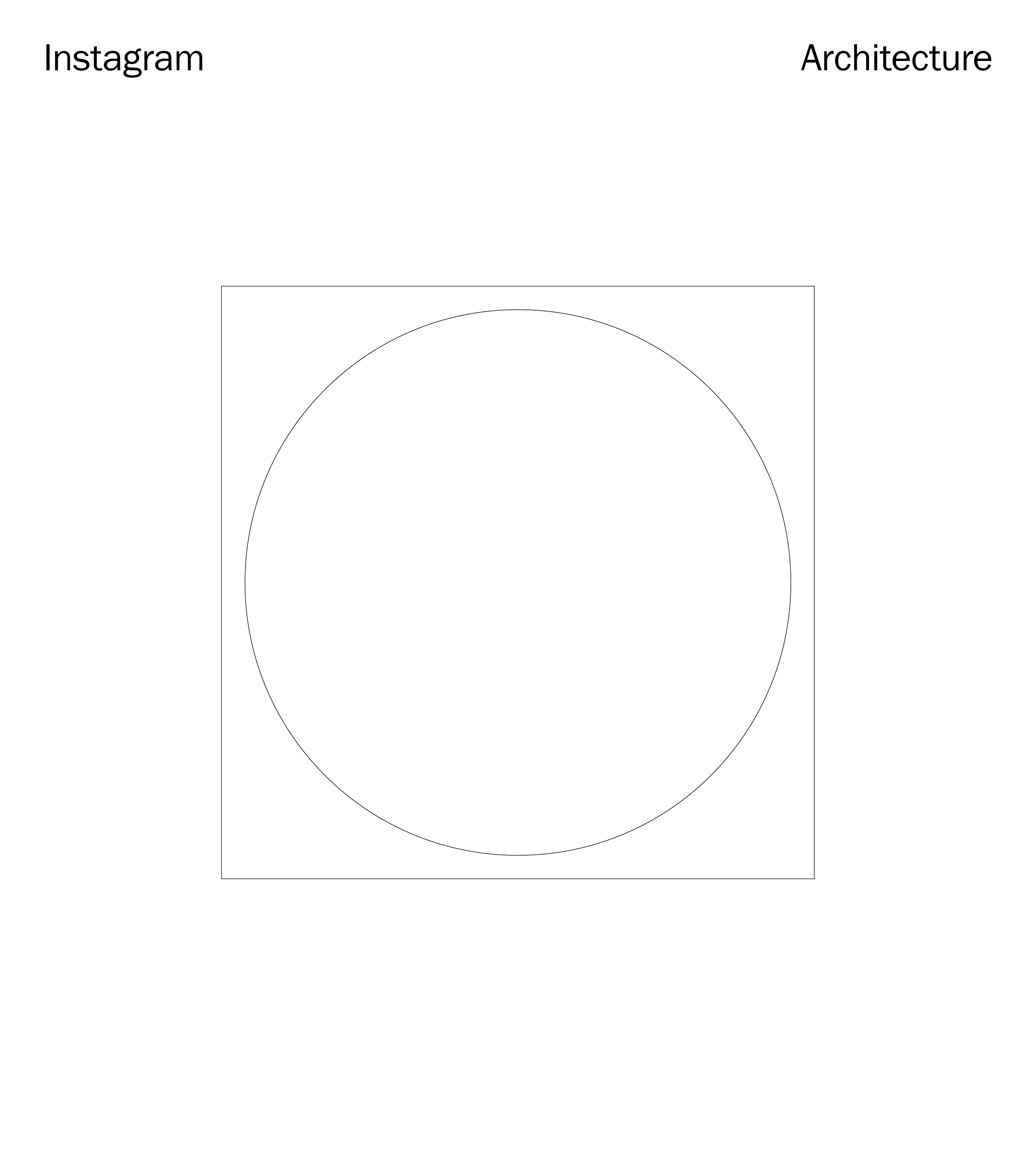
↳ Exploratory — System Architecture
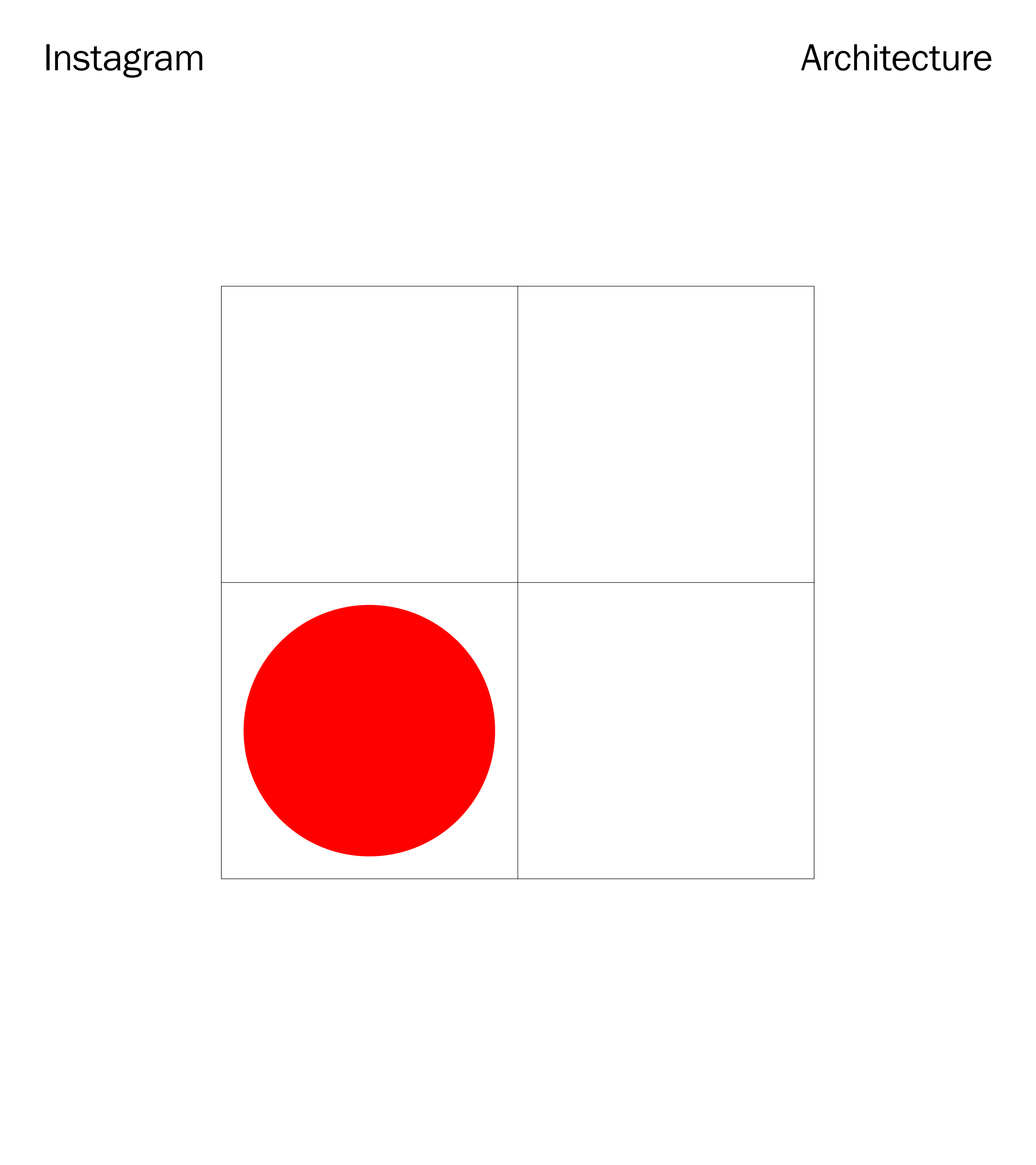
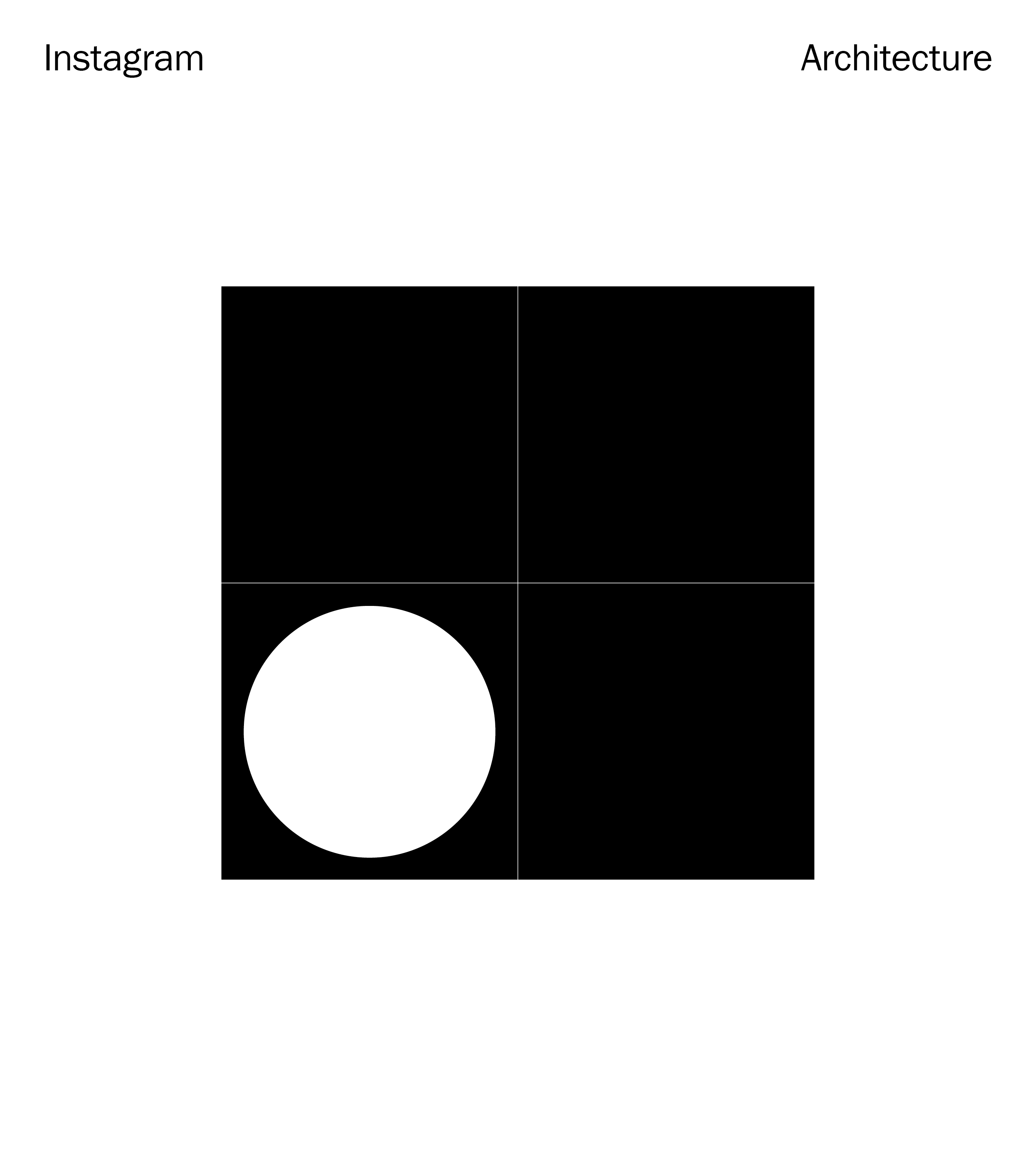
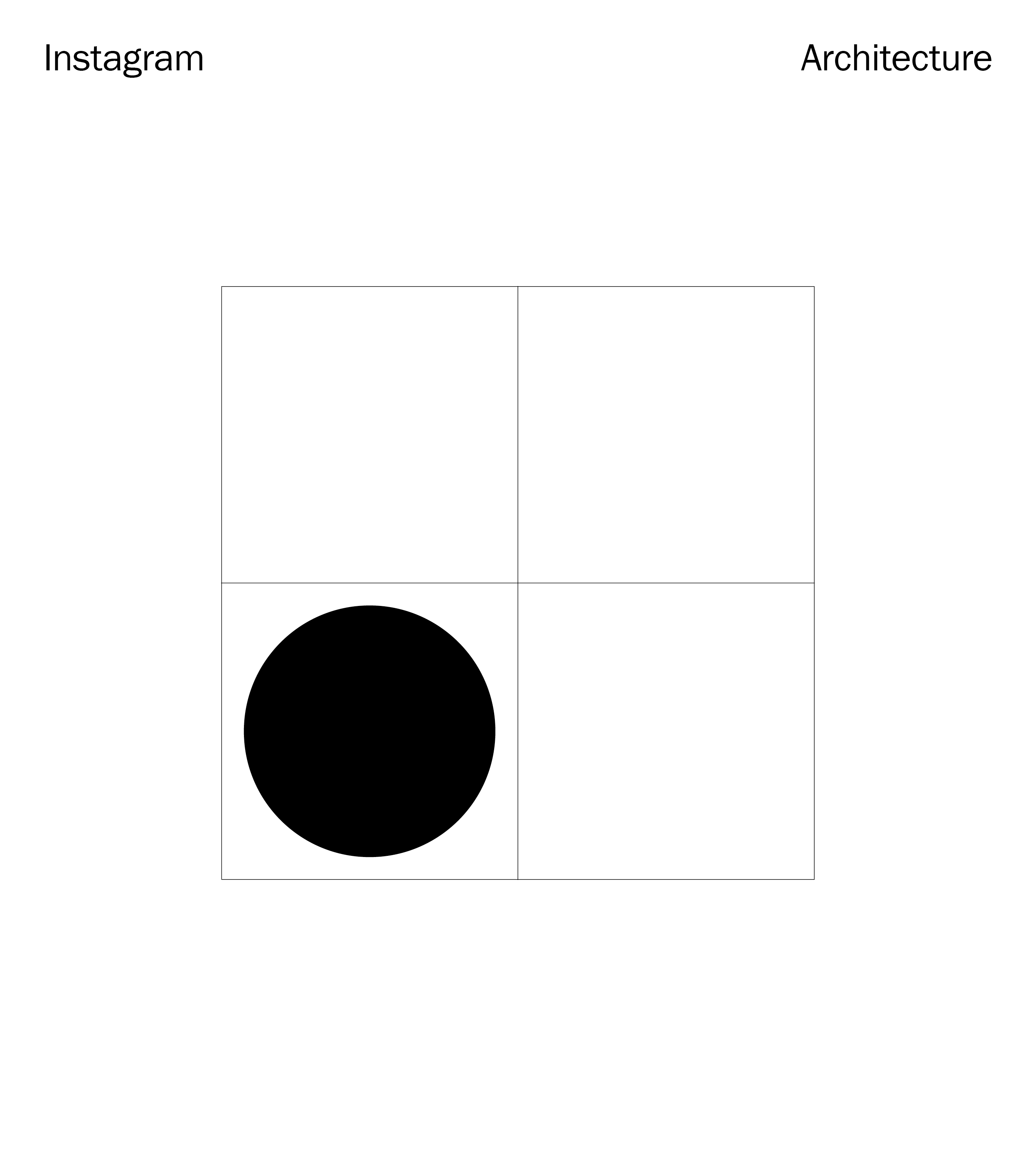
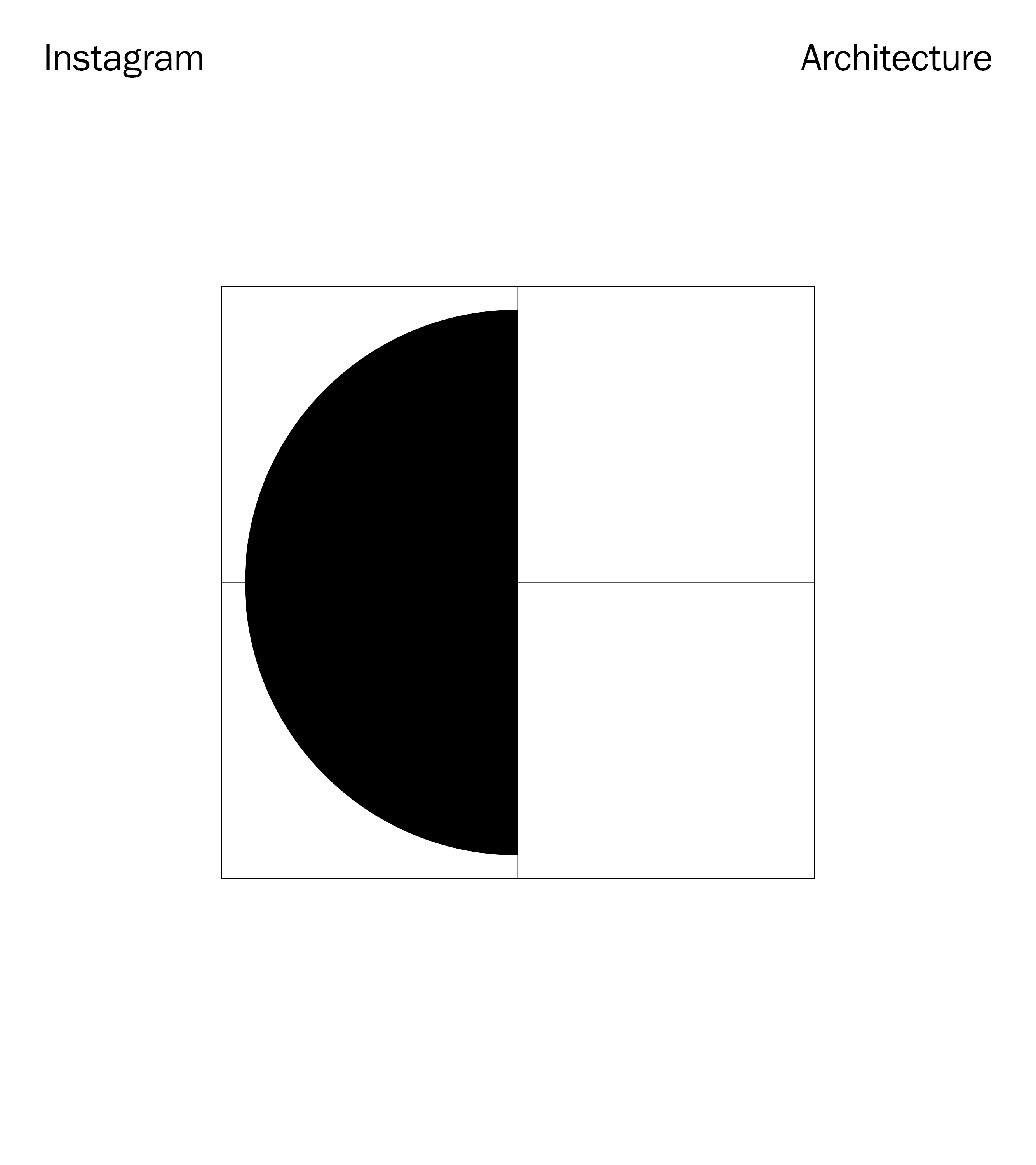
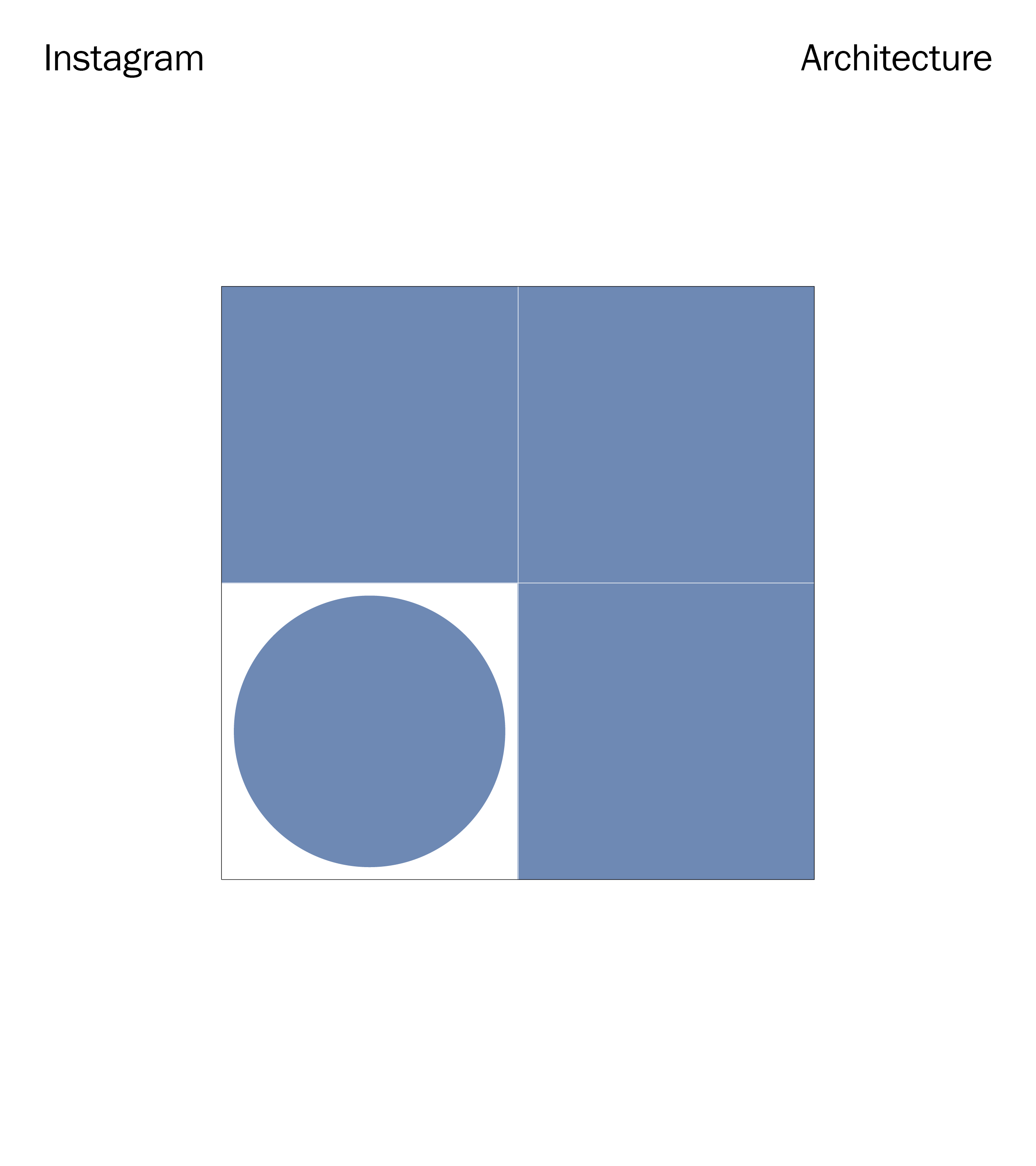
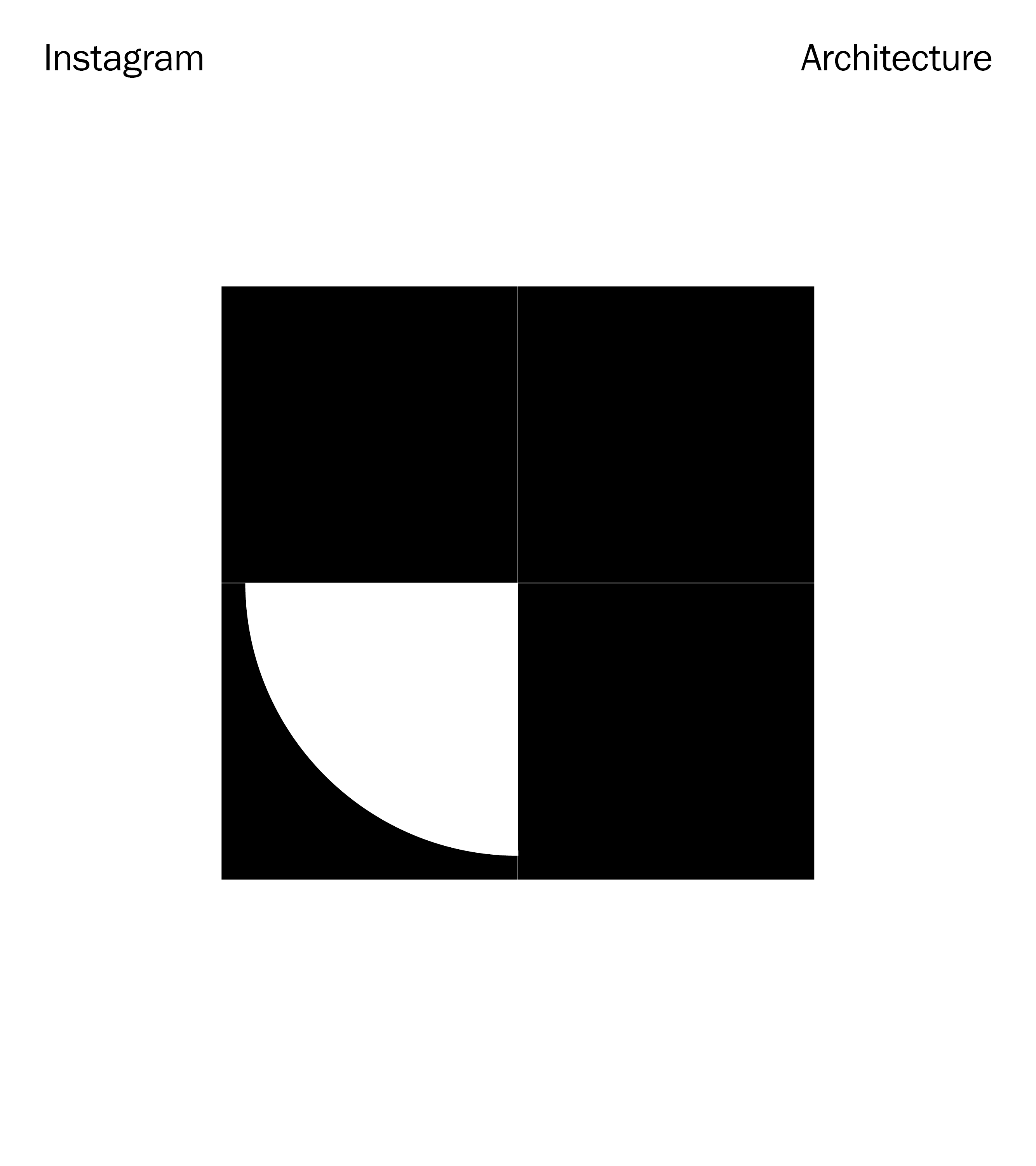
We developed a responsive, modular grid system based off the Instagram Search & Explore section grid, and leveraged the Instagram shopping dot as foundations for the brand’s identity system.


↳ Exploratory — The Handle
Taking cues from the @ handles prevalence in culture as a representation of one’s identity on social, we explored how a brand or influencer could use the Instagram Checkout bag logo handle itself and transform it into an expressive and iconic visual signature on their Instagram Stories and posts when raising awareness for their Checkout store.


↳ Exploratory — Brand Guidelines
Finally, we created a set of mini brand guidelines that summarized the core strategic, verbal and visual rules for Instagram Checkout.
![]()
![]()
![]()


Team
↳ Instagram Global Brand Design, Manuel Dilone, Virgilio Santos, Shu-Yu Hsiao, Junki Hong, Johnny Lee, Pete Macia, Teri Kaplan
↳ Instagram Global Brand Design, Manuel Dilone, Virgilio Santos, Shu-Yu Hsiao, Junki Hong, Johnny Lee, Pete Macia, Teri Kaplan
3
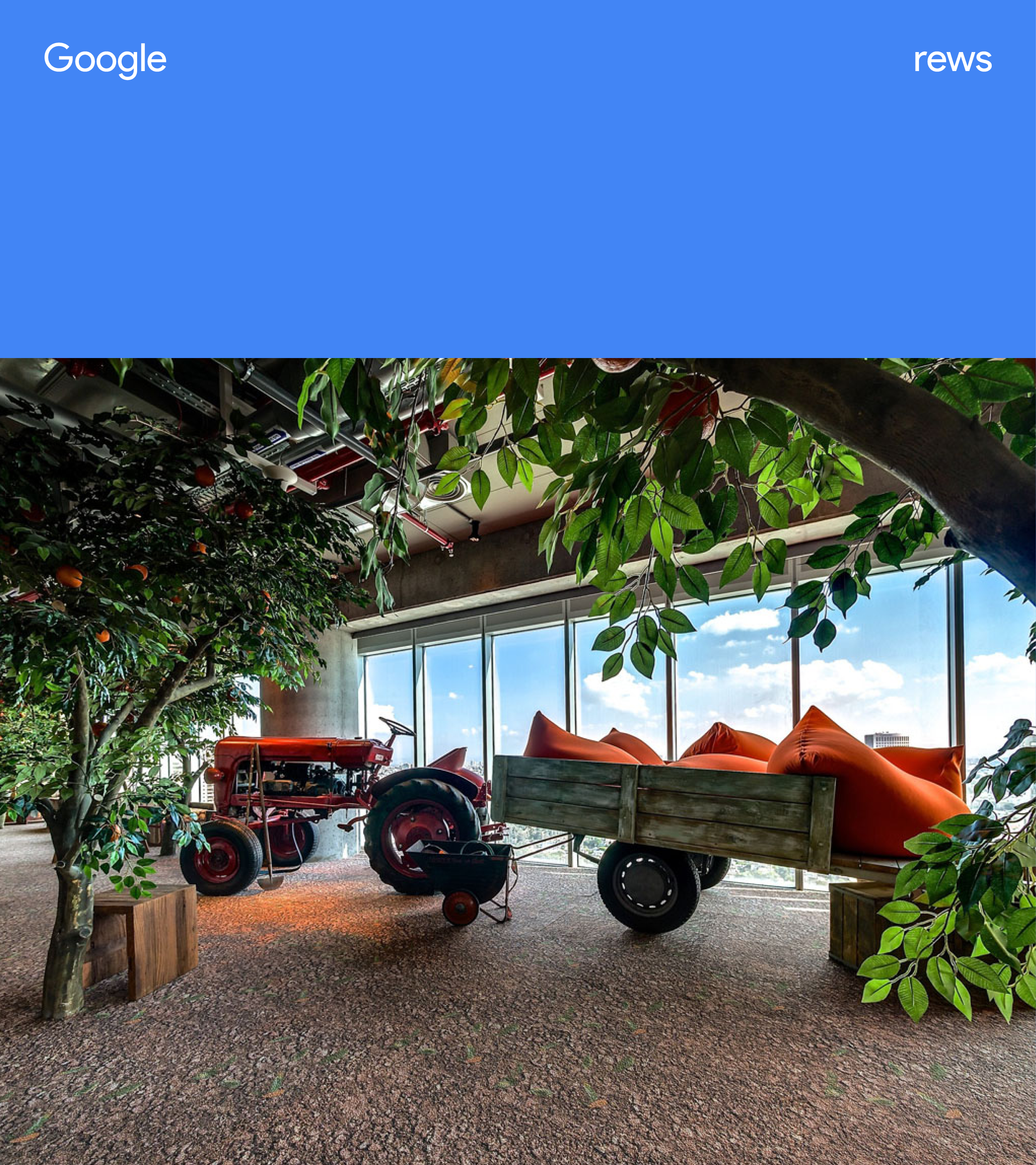
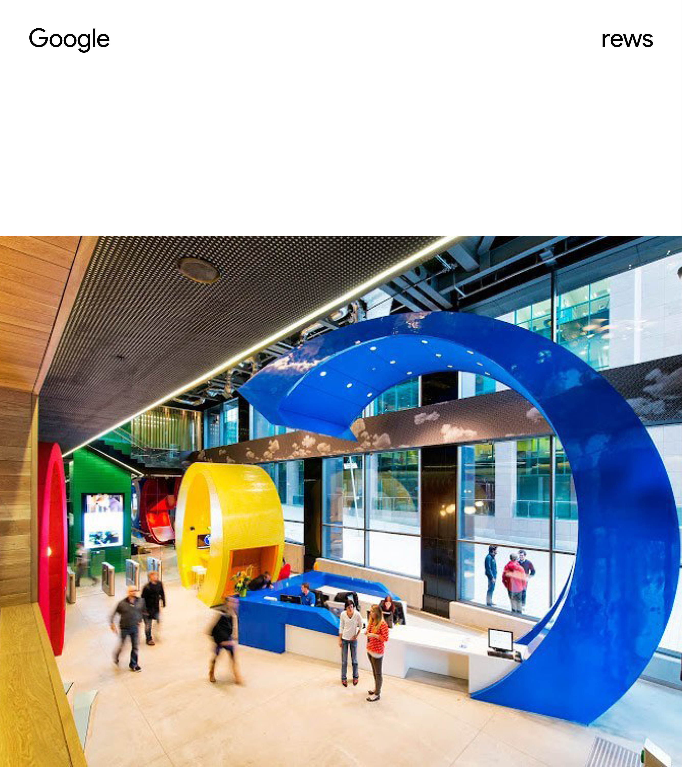
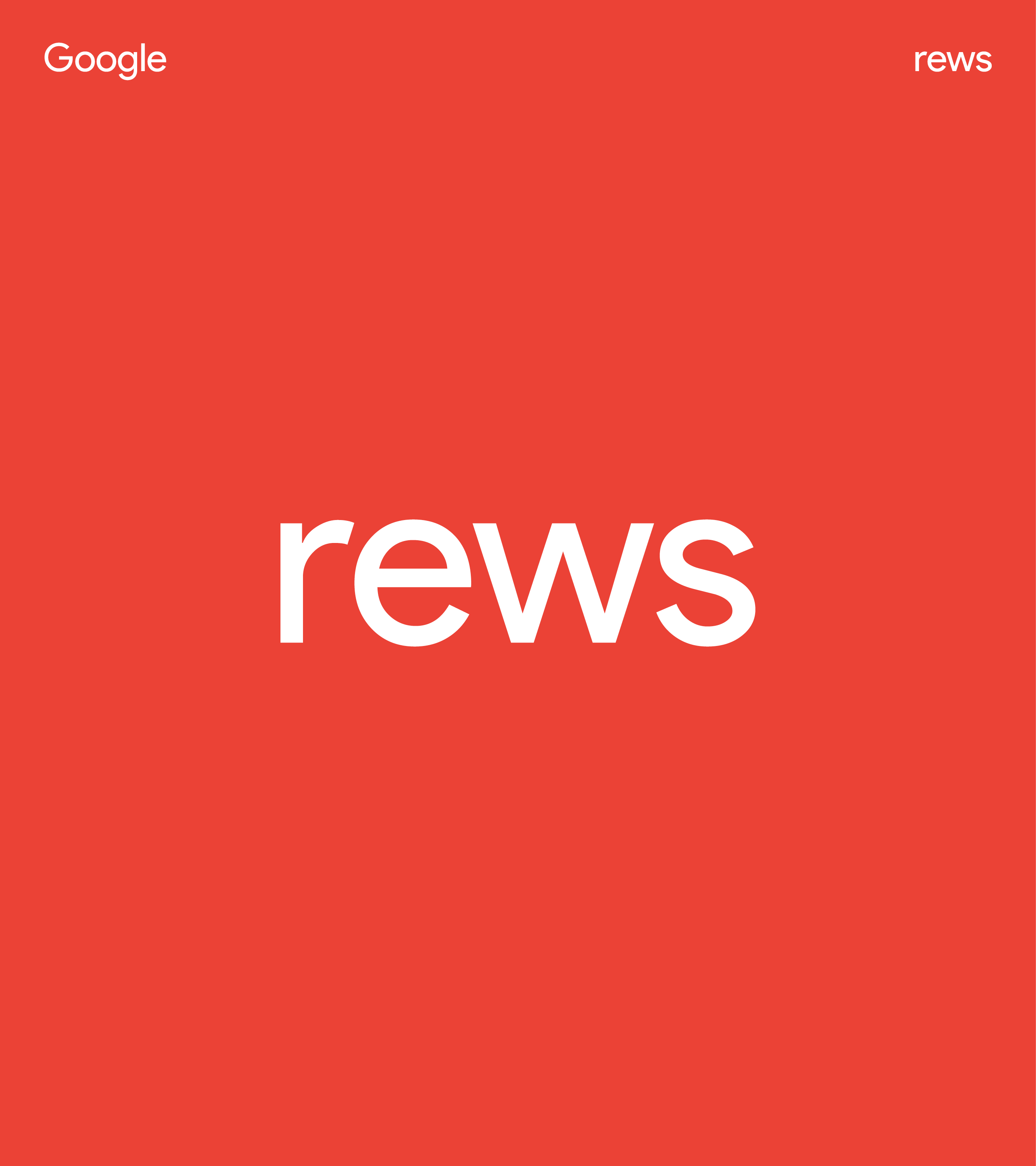
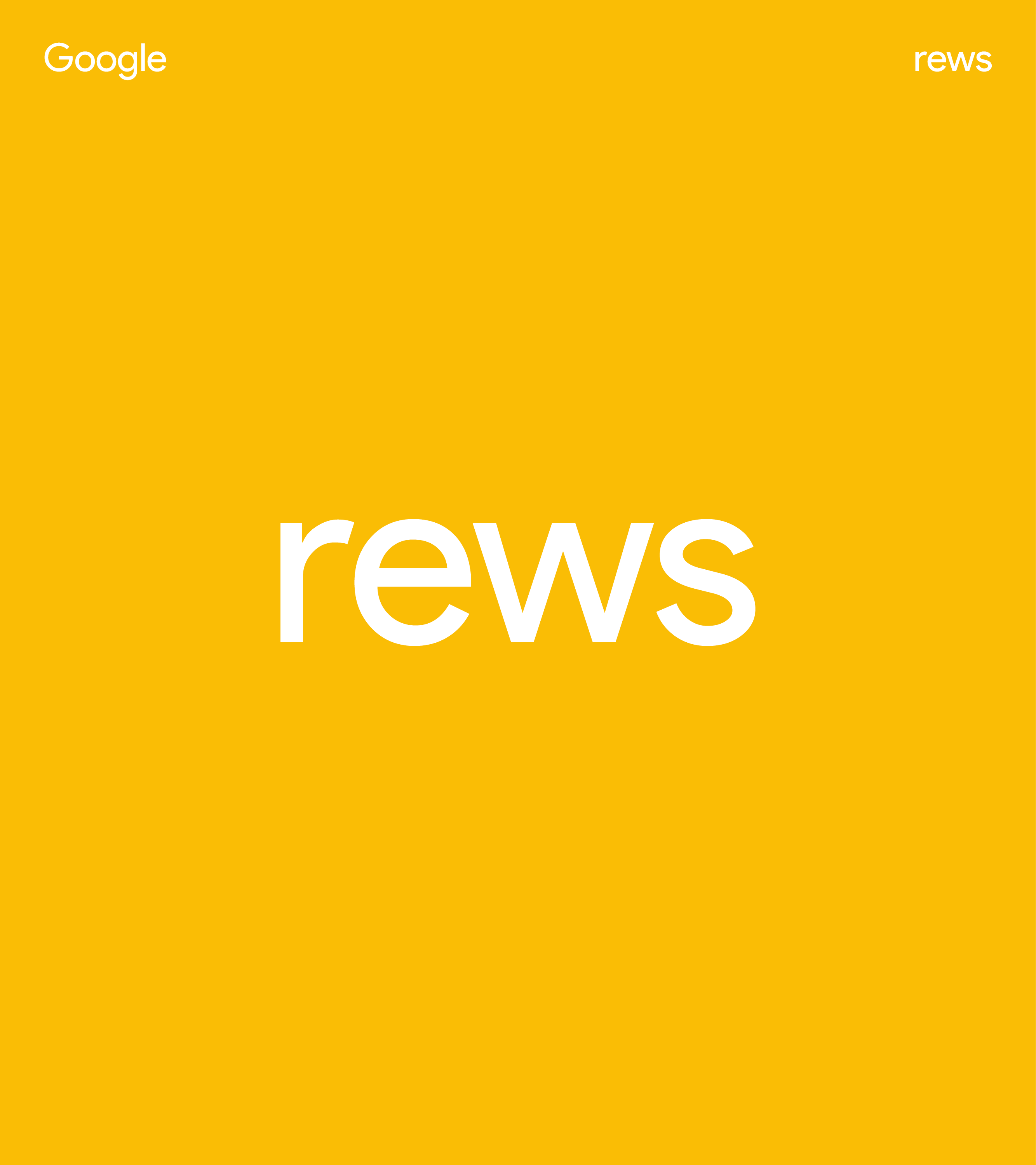
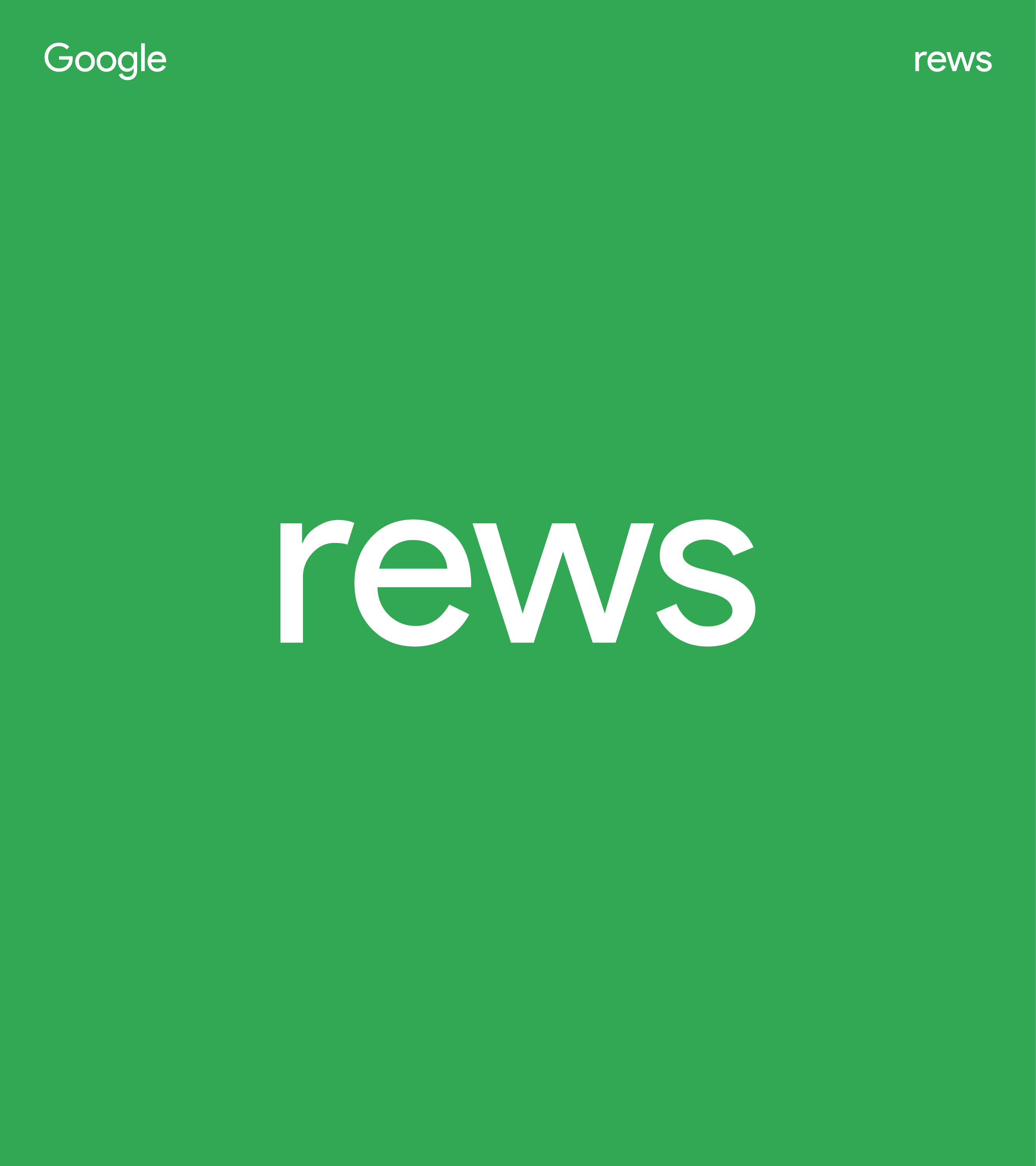
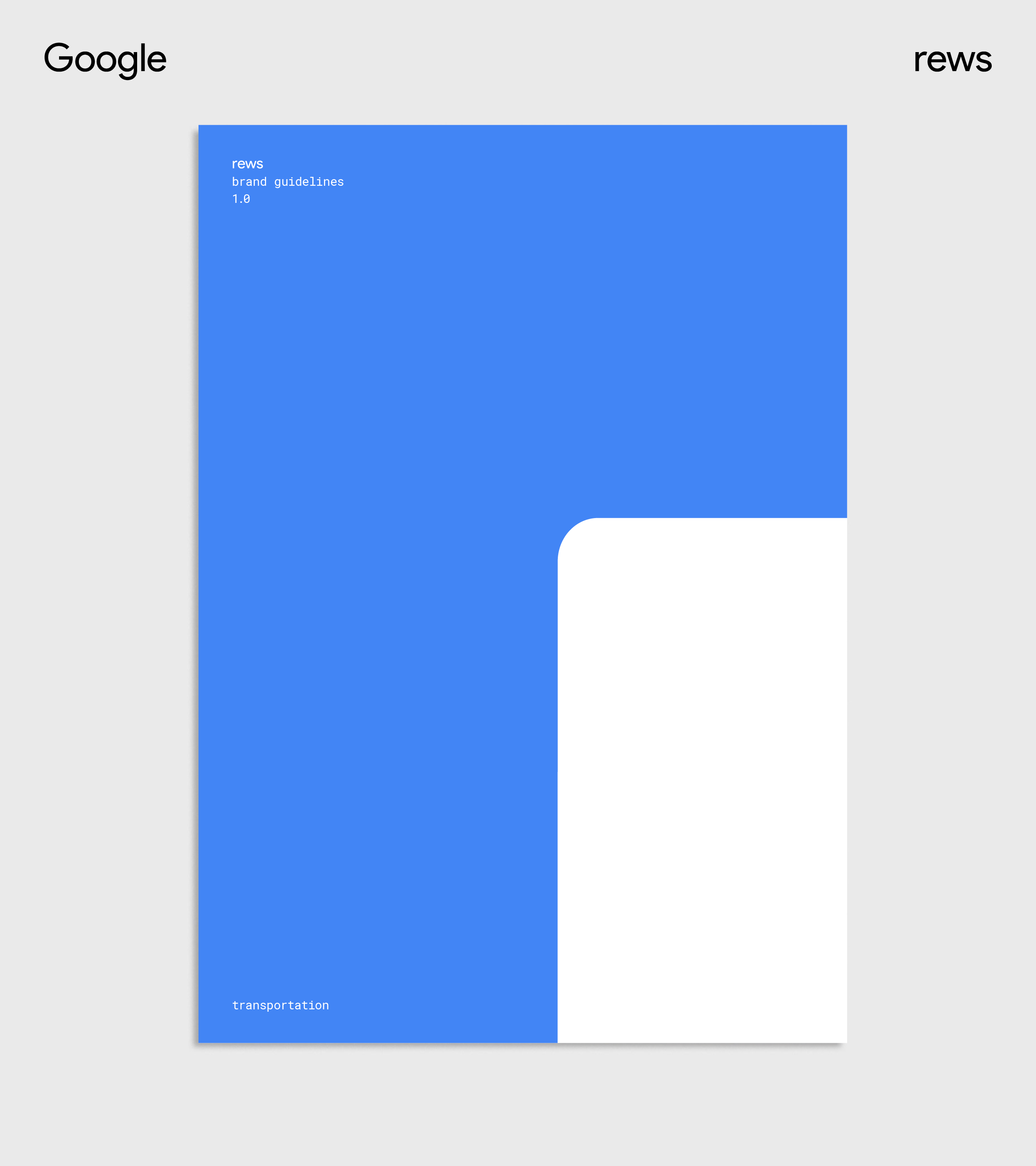
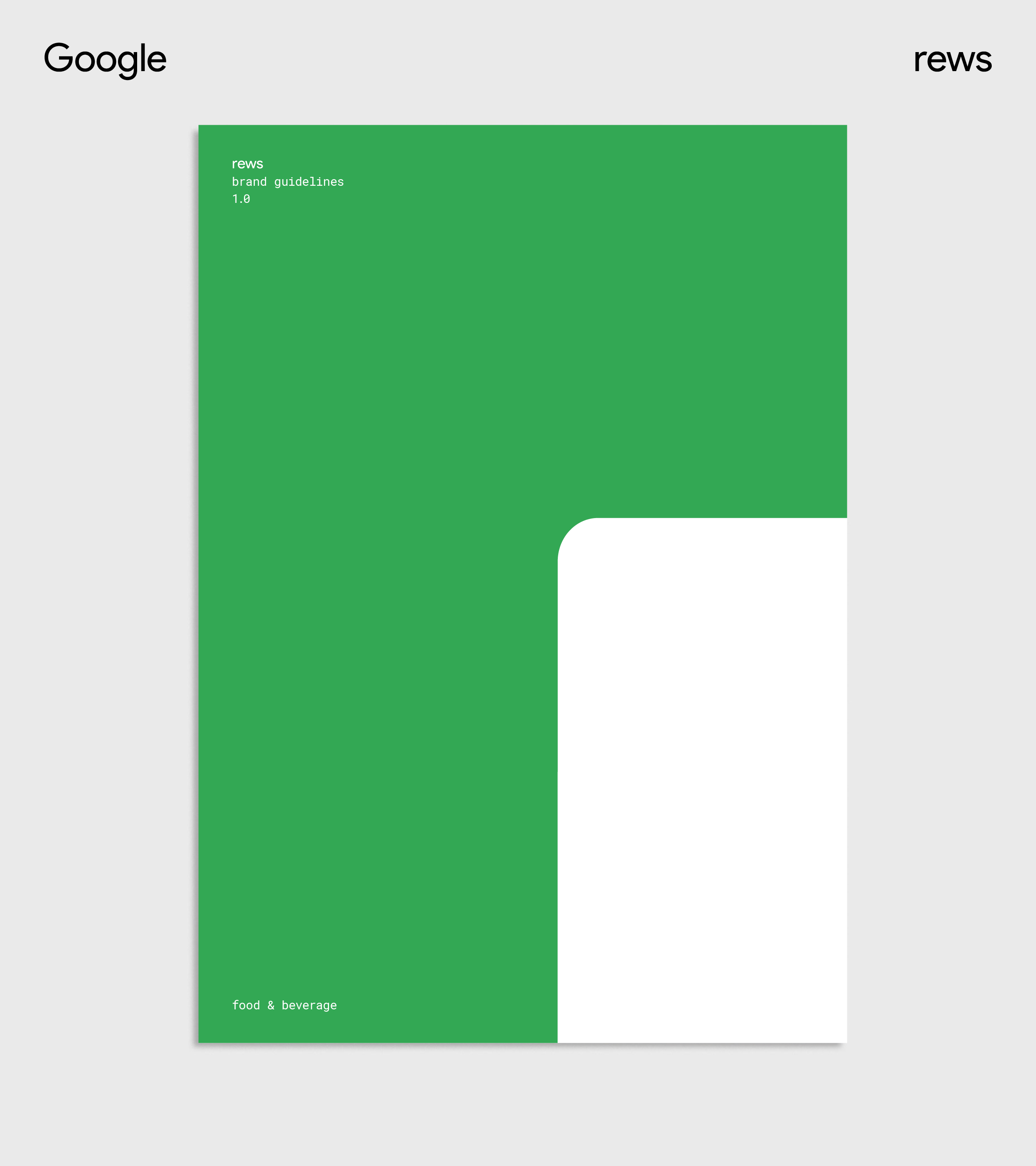
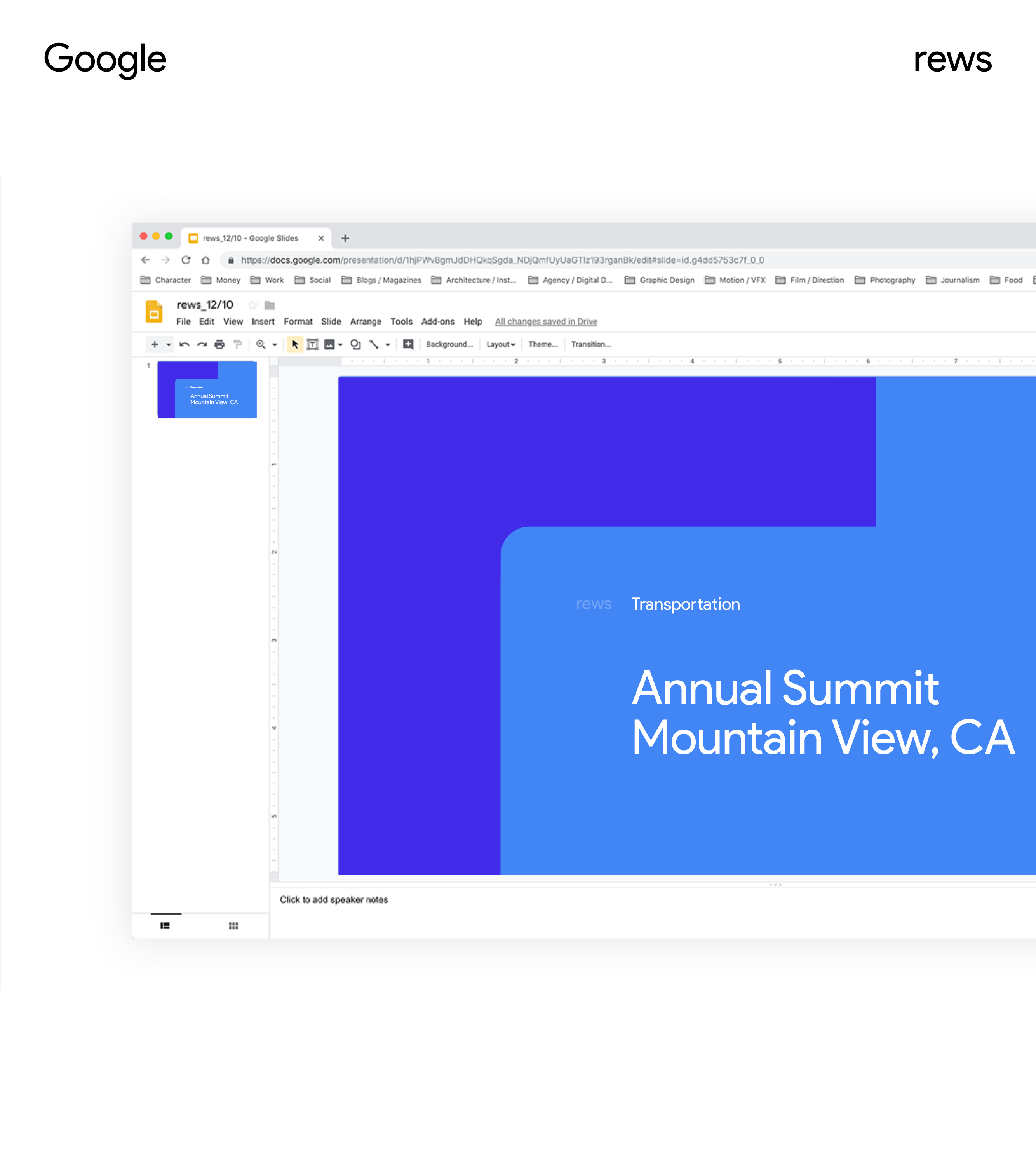
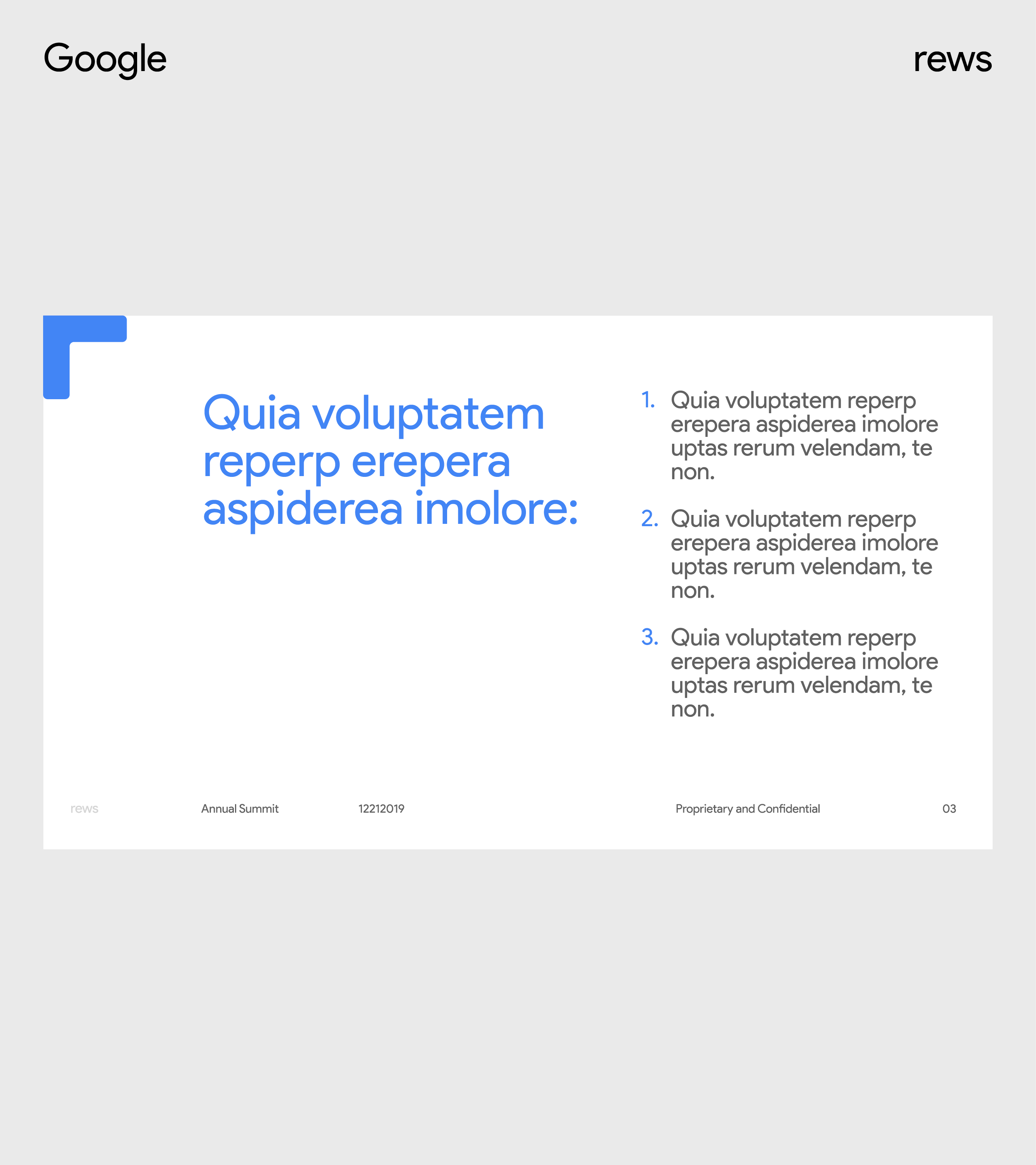
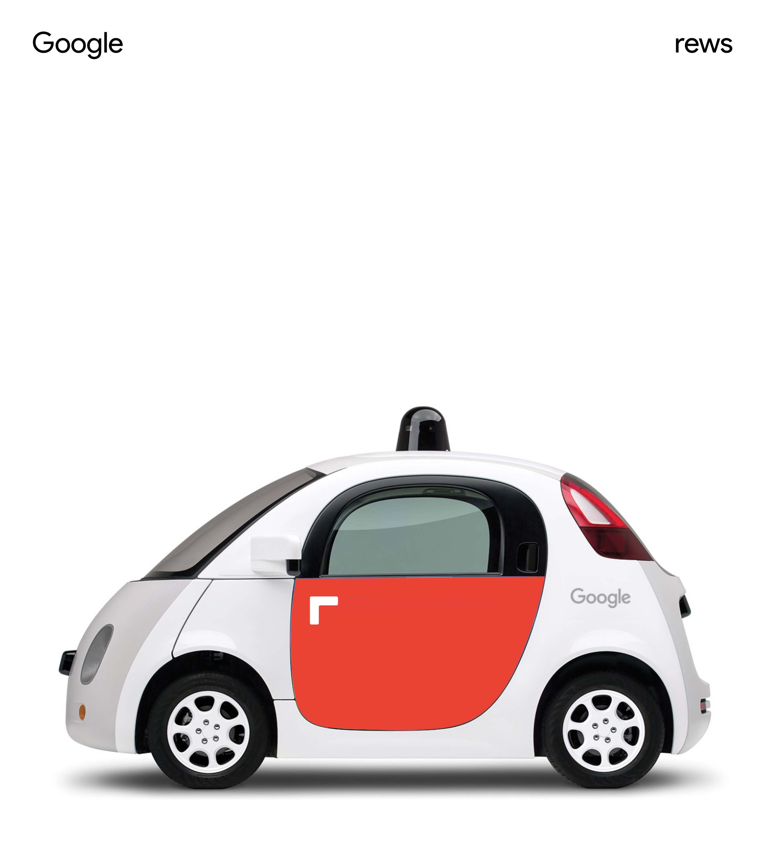
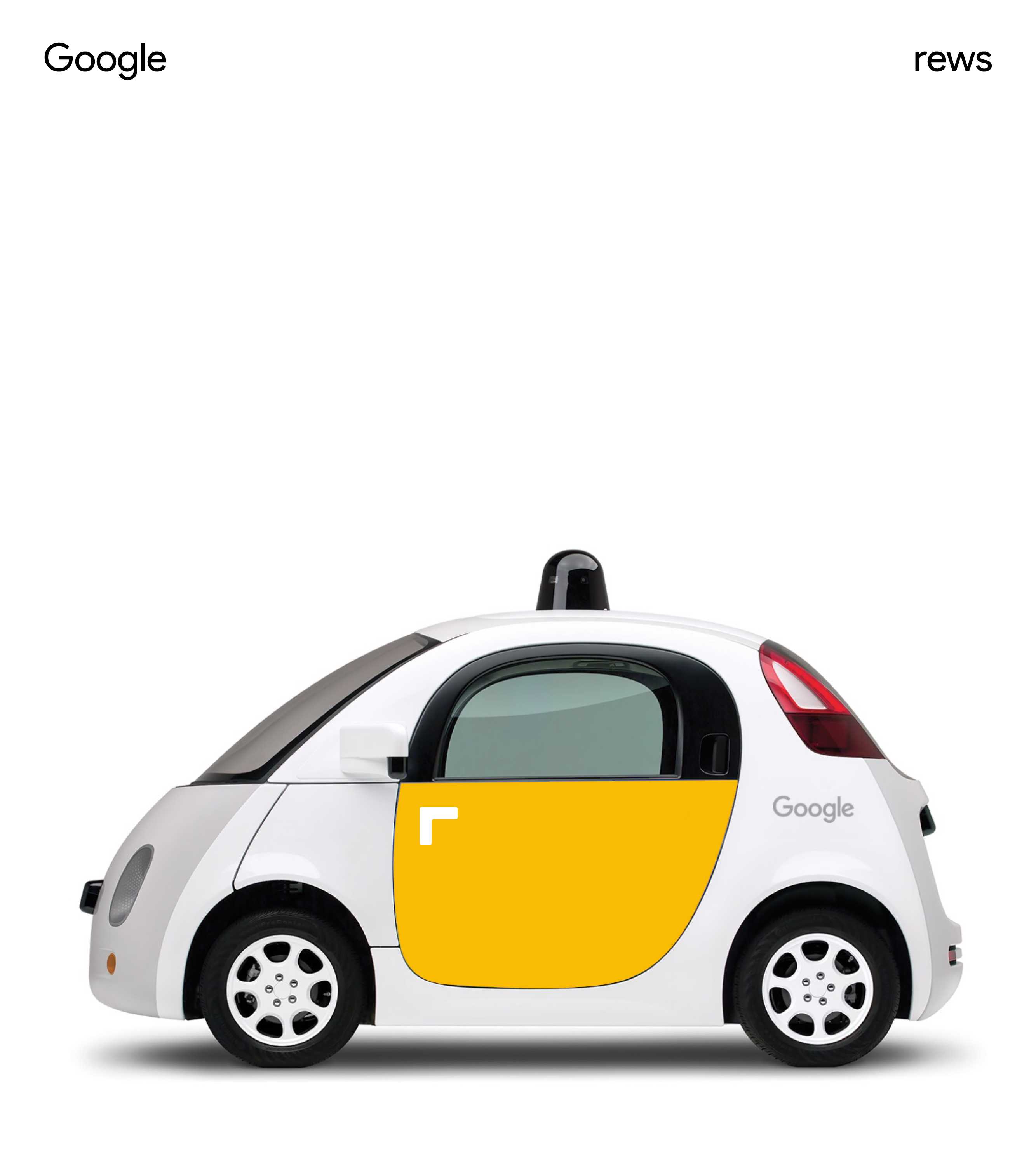
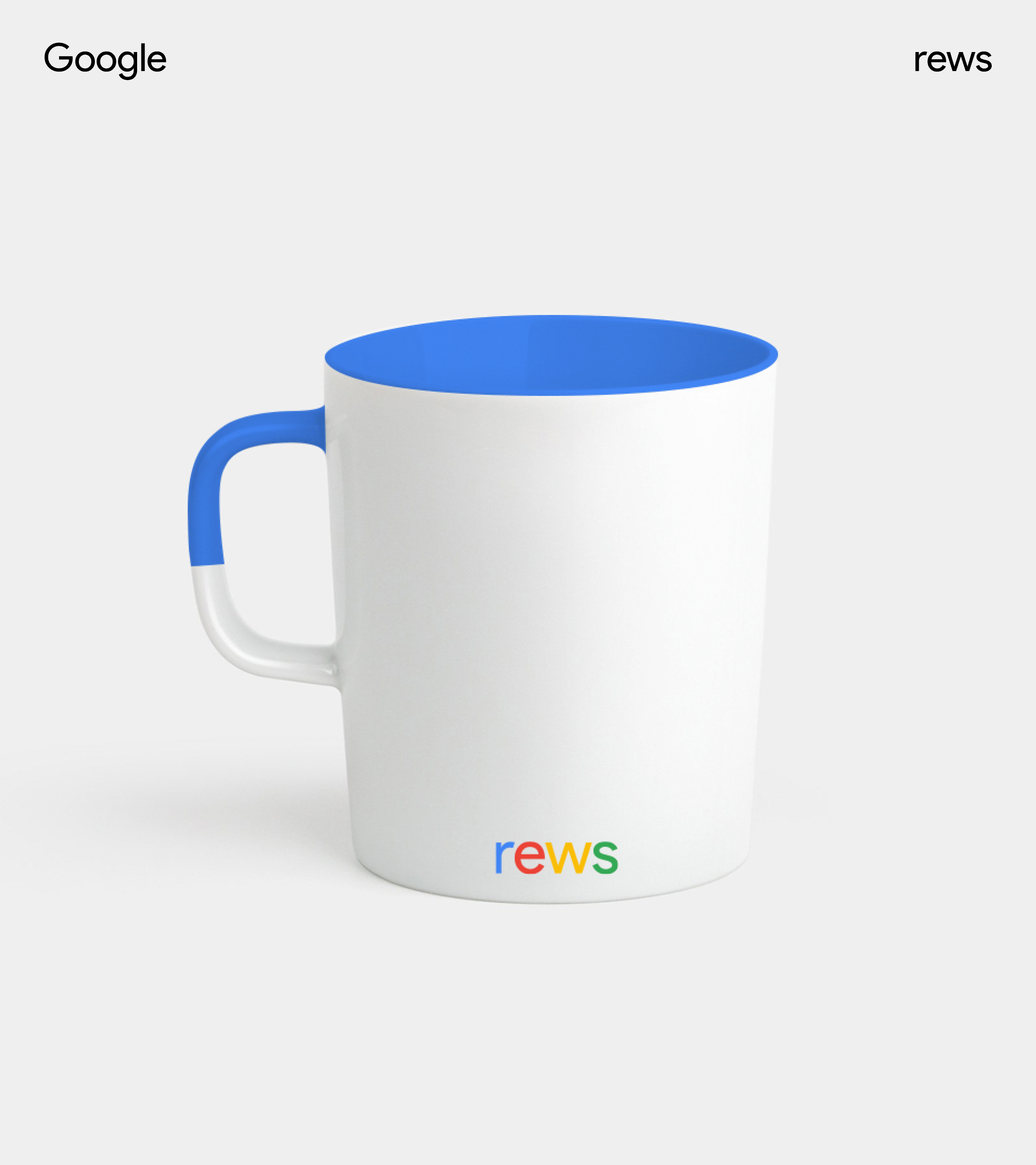
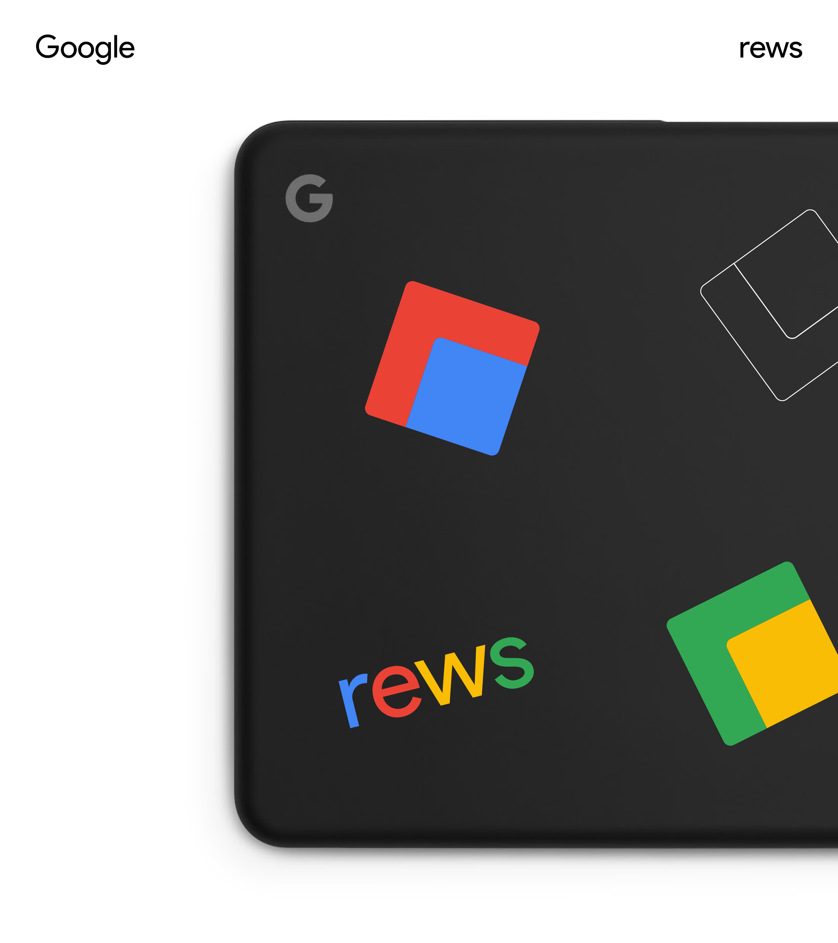
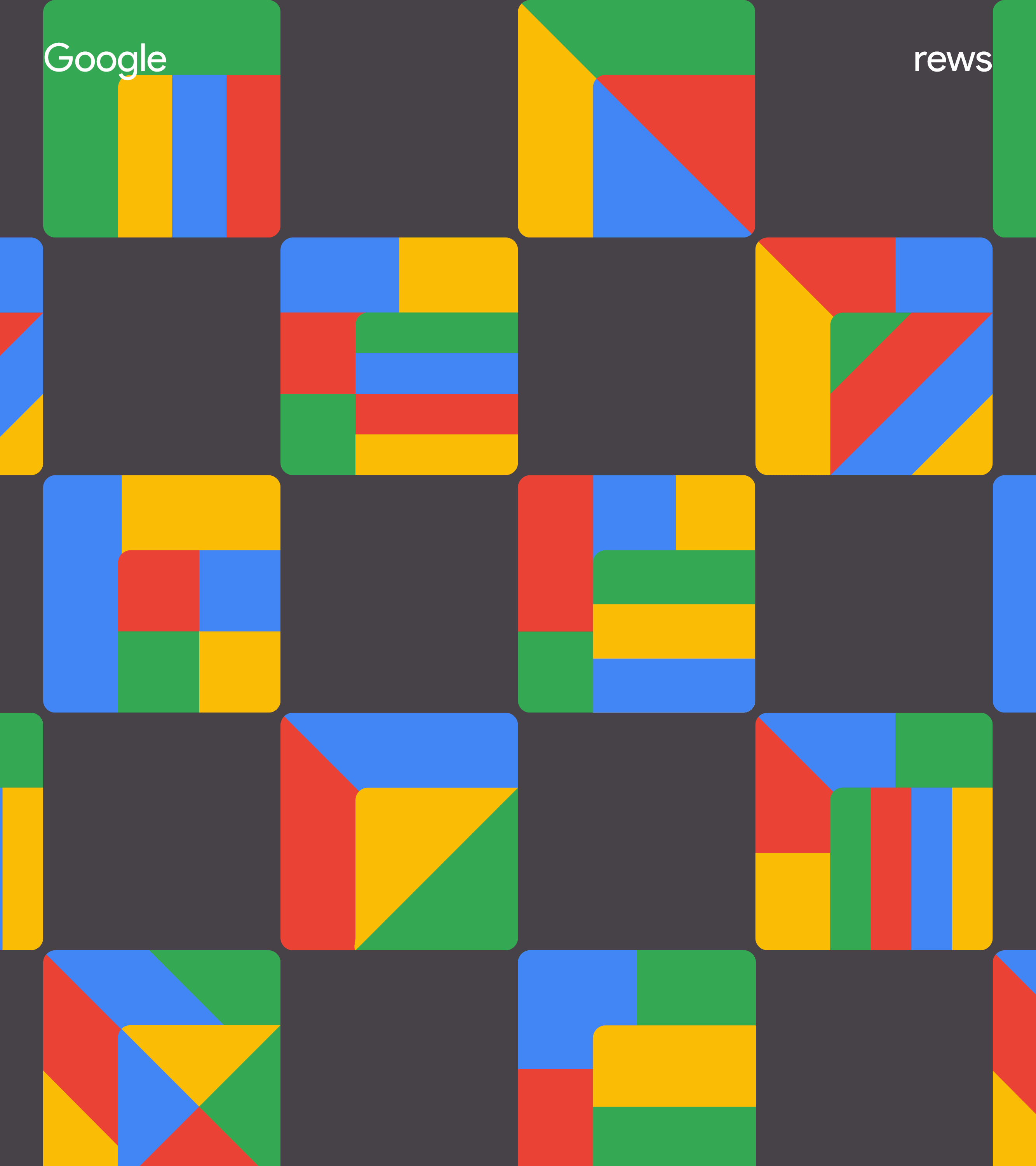
Google REWS (Real Estate and Workplace Services)
↳ 018-019
↳ 018-019
Studio
↳ Character (NY)
↳ Character (NY)
Role
↳ Design Director
↳ Design Director
Work in Progress ︎
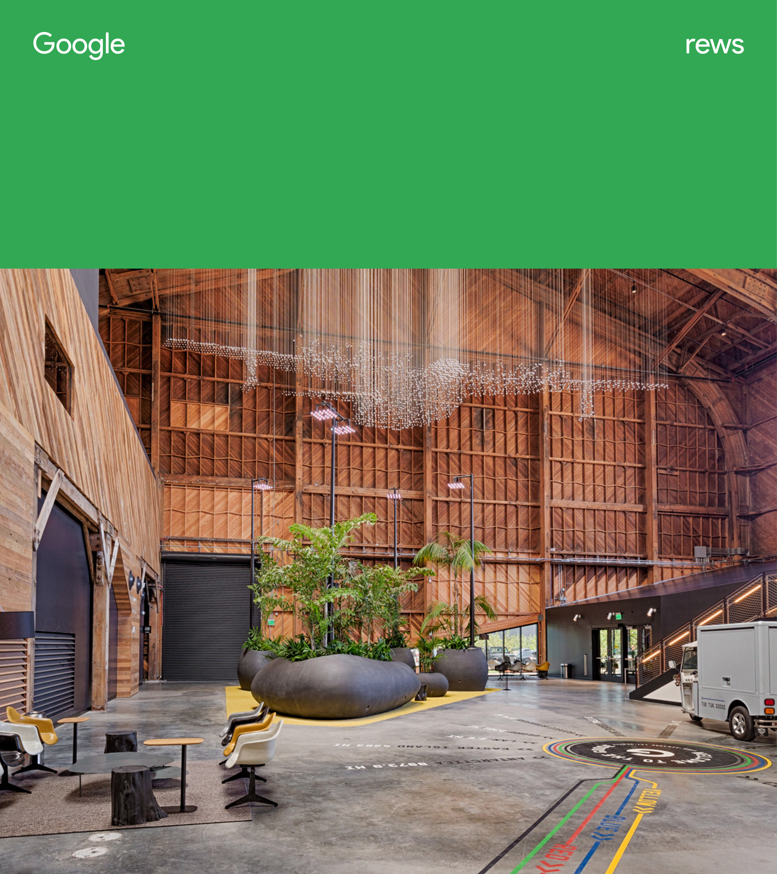
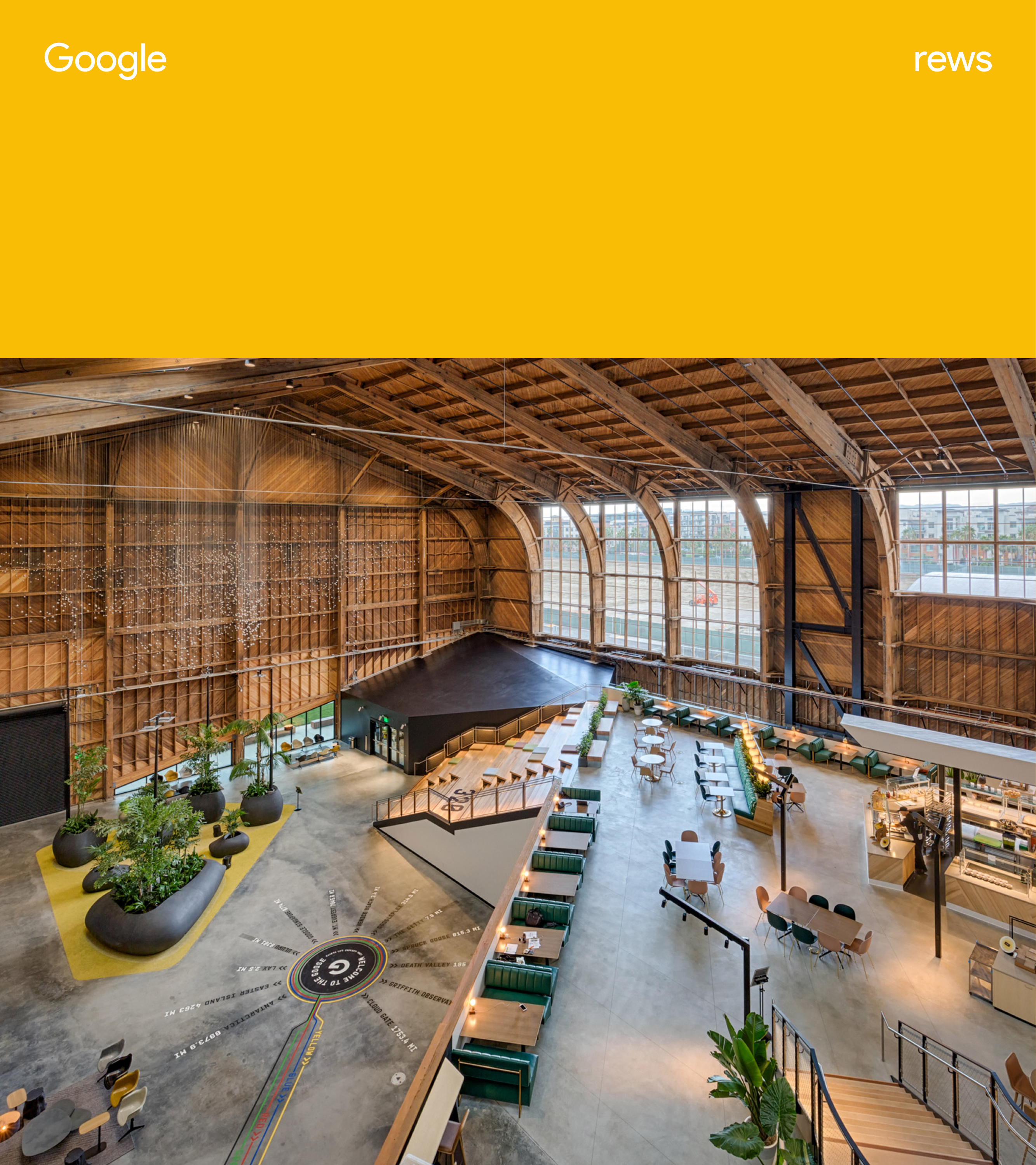
Google REWS delivers thoughtful and intentional spaces and services to create the right environment for Googlers to do their best work, and to empower and enable Google to thrive in the long-term.
However, as it predominantly operates “under the hood” its role can be overlooked, preventing REWS from building its brand and demonstrating its influence within Google.
To help overcome this challenge, we developed a simple, responsive identity that could modulate it’s emphasis depending on the time, context, and audience.
![]()
Google REWS delivers thoughtful and intentional spaces and services to create the right environment for Googlers to do their best work, and to empower and enable Google to thrive in the long-term.
However, as it predominantly operates “under the hood” its role can be overlooked, preventing REWS from building its brand and demonstrating its influence within Google.
To help overcome this challenge, we developed a simple, responsive identity that could modulate it’s emphasis depending on the time, context, and audience.

Our first step was to work with REWS’ in translating their overarching brand mission into a set of actionable principles that would guide our design strategy.
—
What REWS says
↓
What REWS does
—
What REWS says
↓
What REWS does
Intentional Experiences
Every decision we make is made with the best of intention - from the cafe menus down to the color of the conference room walls, there is a purpose behind everything we do. And while we may not always get it right, we learn from experience and use and work on making it better.
↓
Inform
What if at right time and in the right context, the REWS identity can inform how something was created?
![]()
![]()
Every decision we make is made with the best of intention - from the cafe menus down to the color of the conference room walls, there is a purpose behind everything we do. And while we may not always get it right, we learn from experience and use and work on making it better.
↓
Inform
What if at right time and in the right context, the REWS identity can inform how something was created?
Fostering Performance
Making sure Googlers are able to reach their highest level of performance is why we do what we do. This also means punctuating the experience with occasional surprises to keep things fresh and exciting.
↓
Guide
What if the REWS identity can guide people to certain places and experiences?
Making sure Googlers are able to reach their highest level of performance is why we do what we do. This also means punctuating the experience with occasional surprises to keep things fresh and exciting.
↓
Guide
What if the REWS identity can guide people to certain places and experiences?
Sense of Belonging
Providing an inclusive experience is core to everything we offer and communicate at Google. This means that not only do we need to ensure everyone feels like they belong, but we also reflect the uniqueness in local environments and celebrate the fact that we all have different needs.
↓
Invite
What if the REWS identity can invite audiences to participate into the experience?


Magic Moments
We work hard to make sure Googlers have everything they need to work hard. Most of the time we stay out of the way to make things as seamless as possible, but it’s also important to surprise and delight when the moment is right.
↓
Delight
What if using technology and insights, REWS identity can surprise and delight audiences?
The Future of Workplace
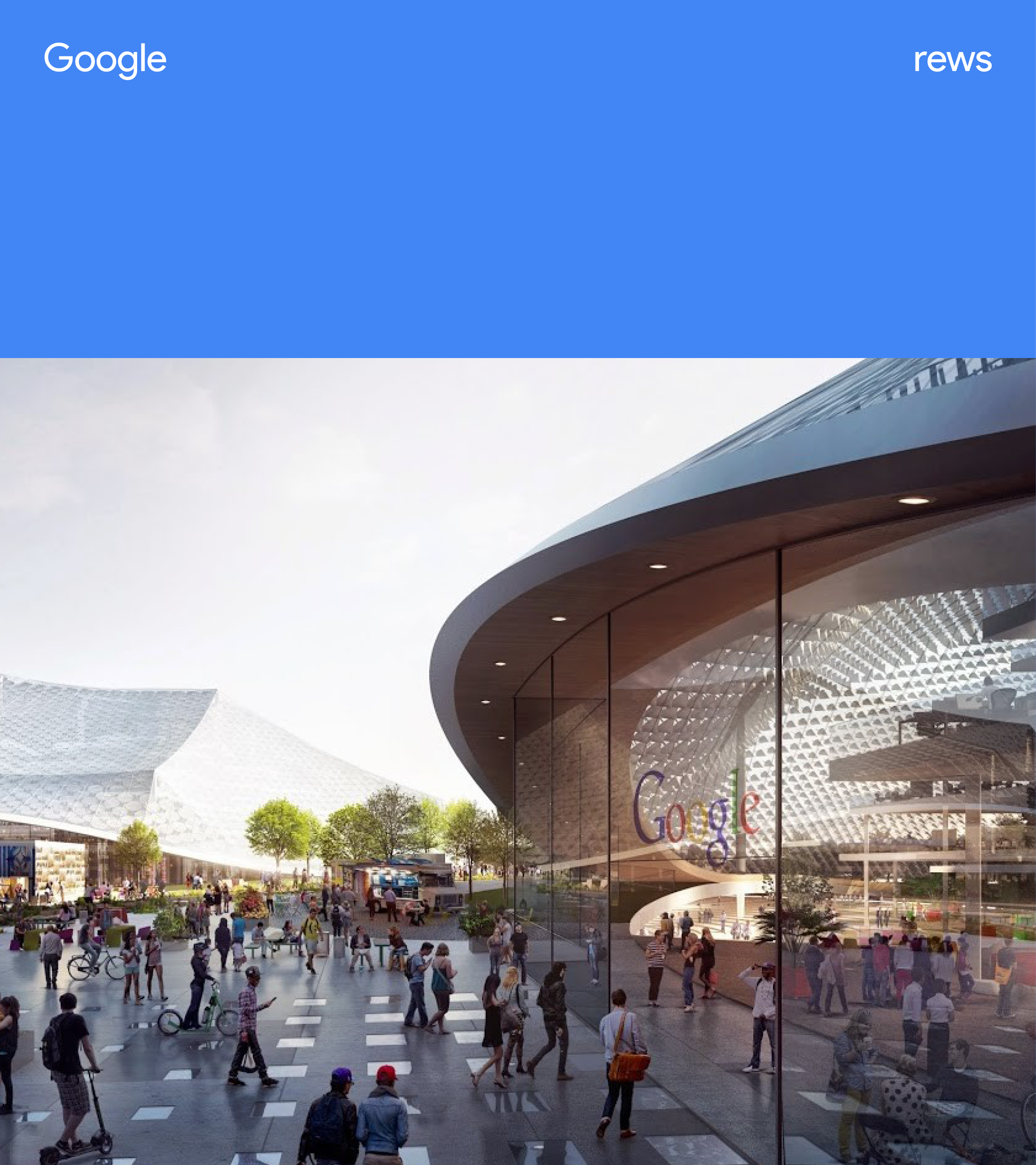
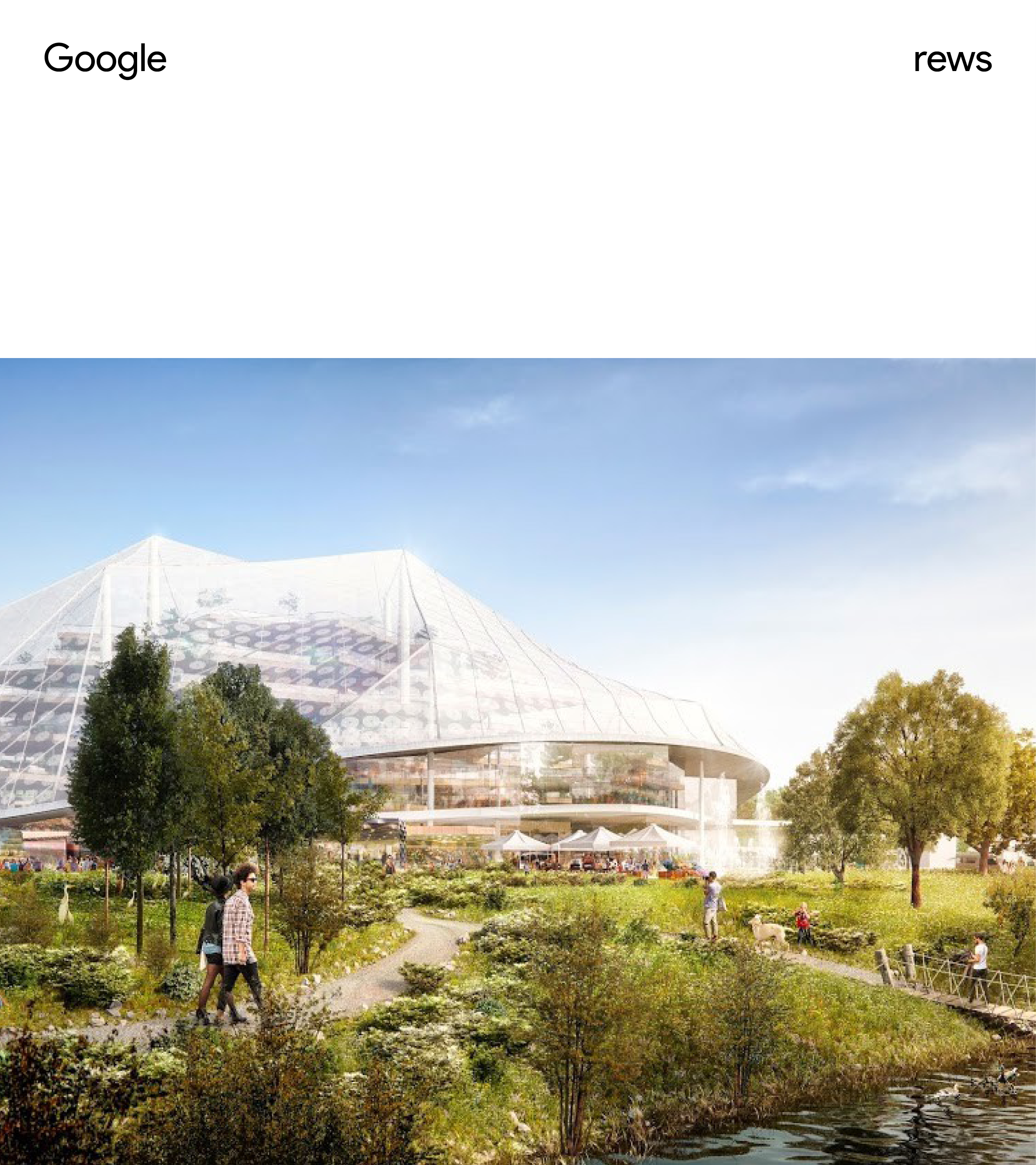
We are always innovating and pushing boundaries, it’s a part of our Google DNA. Within REWS, our sights are set on creating the future of the workplace - not only for Google, but also to demonstrate externally that world-changing ideas are possible and good ideas can scale. We never settle into the status quo, the next new thing is always in motion.
↓
Inspire
What if the REWS identity can inspire audiences to imagine and think of their workspace in a more inspirational way?
![]()
![]()
We are always innovating and pushing boundaries, it’s a part of our Google DNA. Within REWS, our sights are set on creating the future of the workplace - not only for Google, but also to demonstrate externally that world-changing ideas are possible and good ideas can scale. We never settle into the status quo, the next new thing is always in motion.
↓
Inspire
What if the REWS identity can inspire audiences to imagine and think of their workspace in a more inspirational way?


↳ Wordmark
As a first step, we updated the REWS wordmark to incorporate Google’s Product Sans, so as to feel more cohesive with the brands broader identity.
Previous wordmark
↓
![]()
Previous wordmark
↓


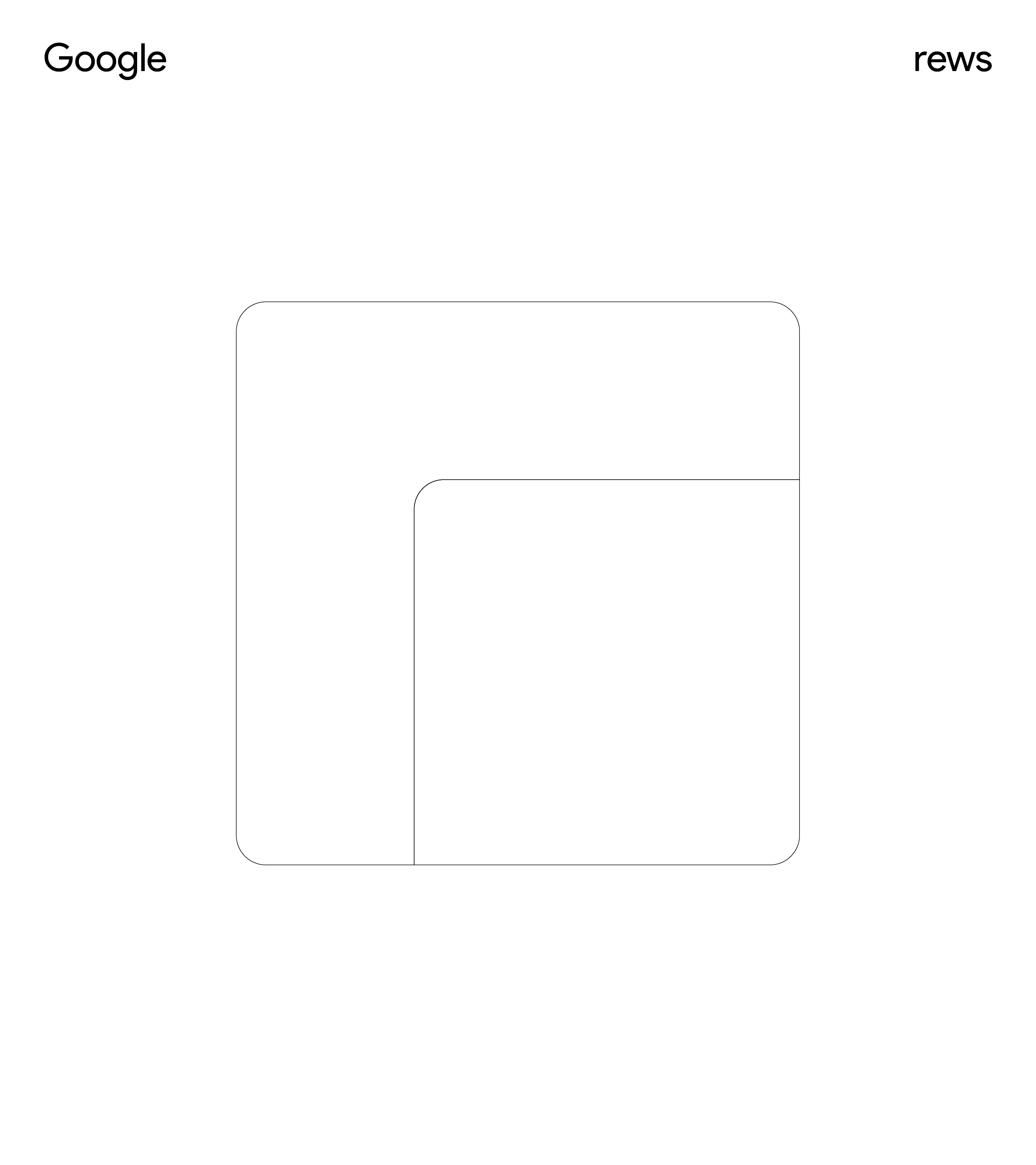
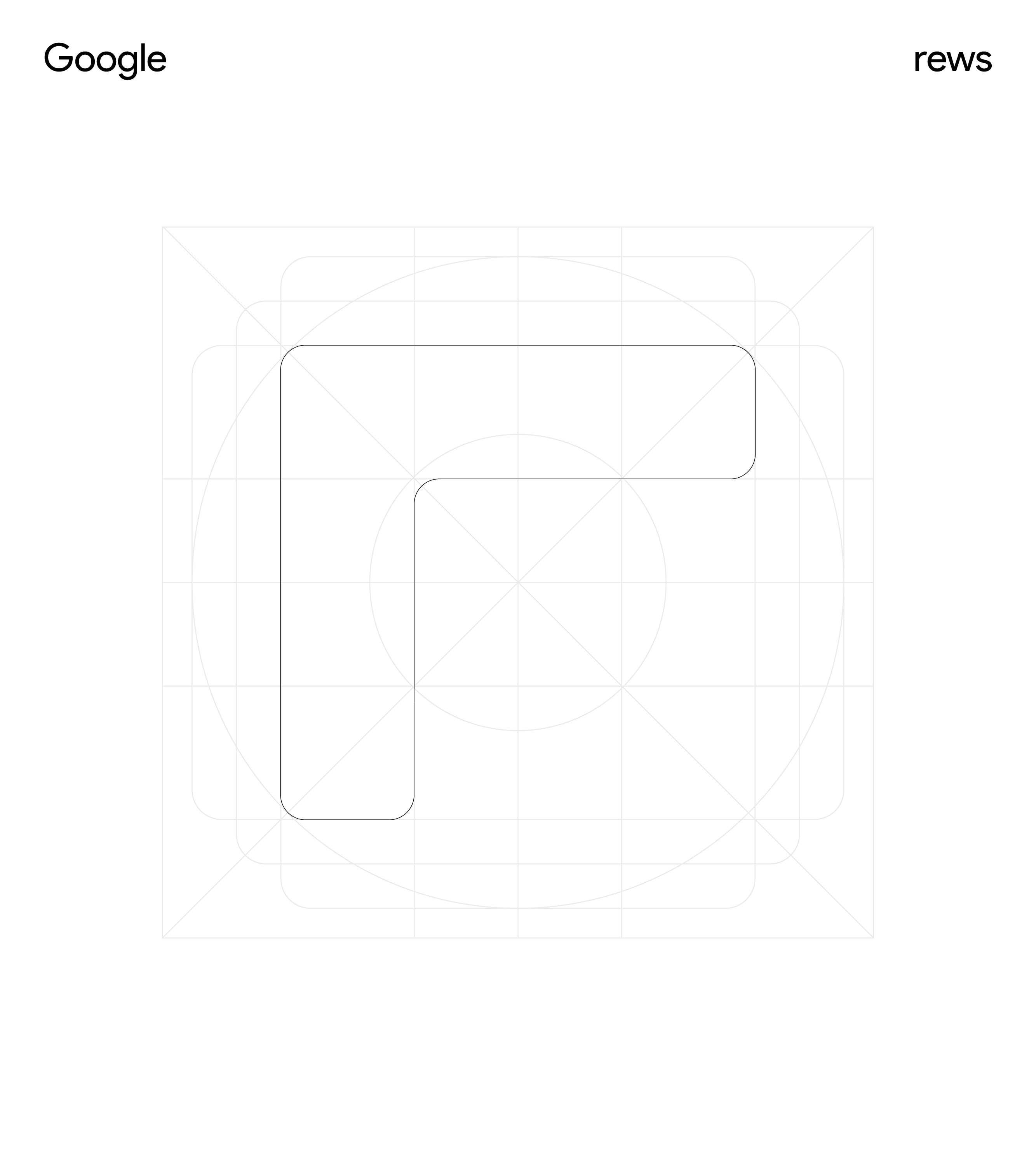
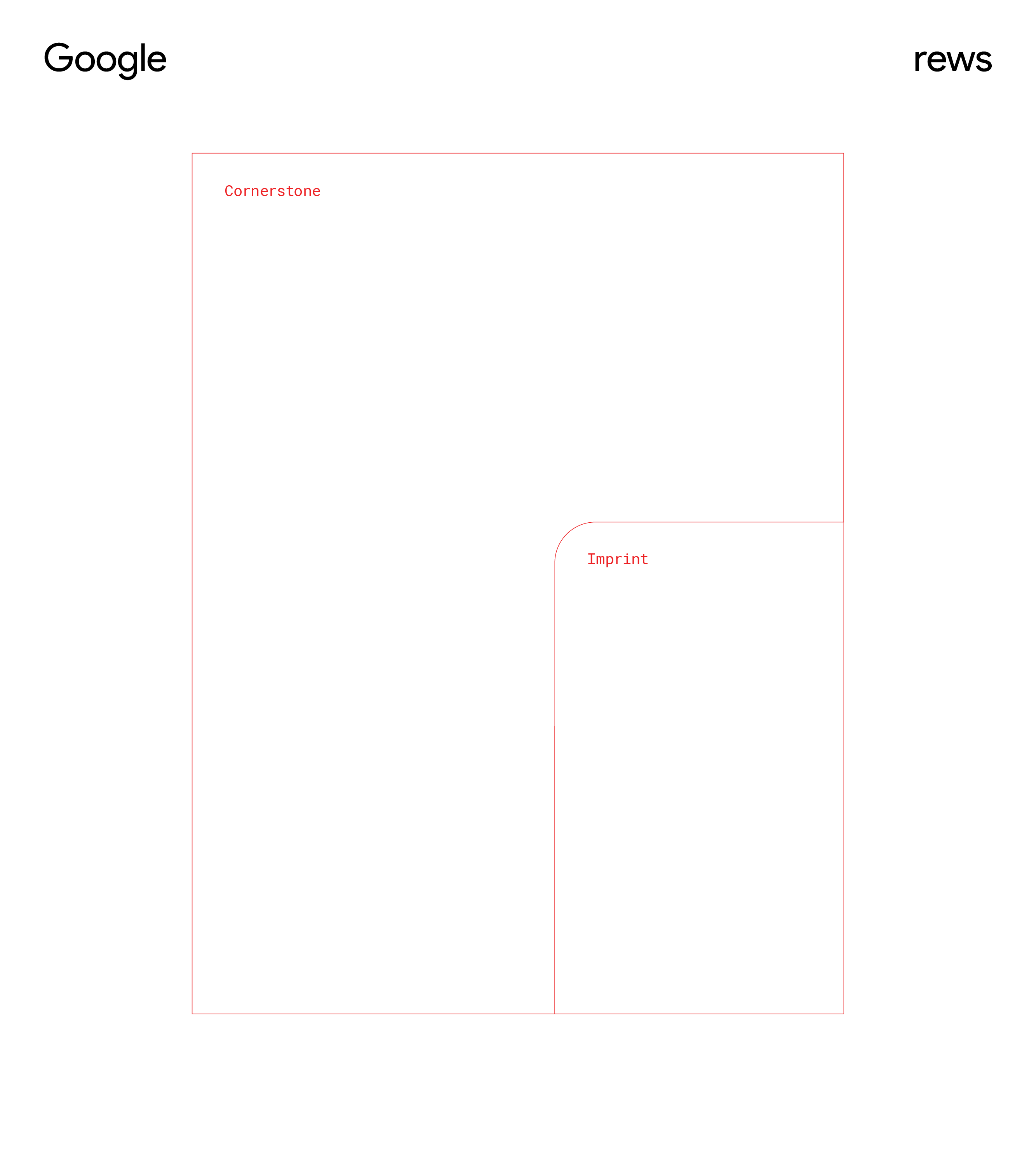
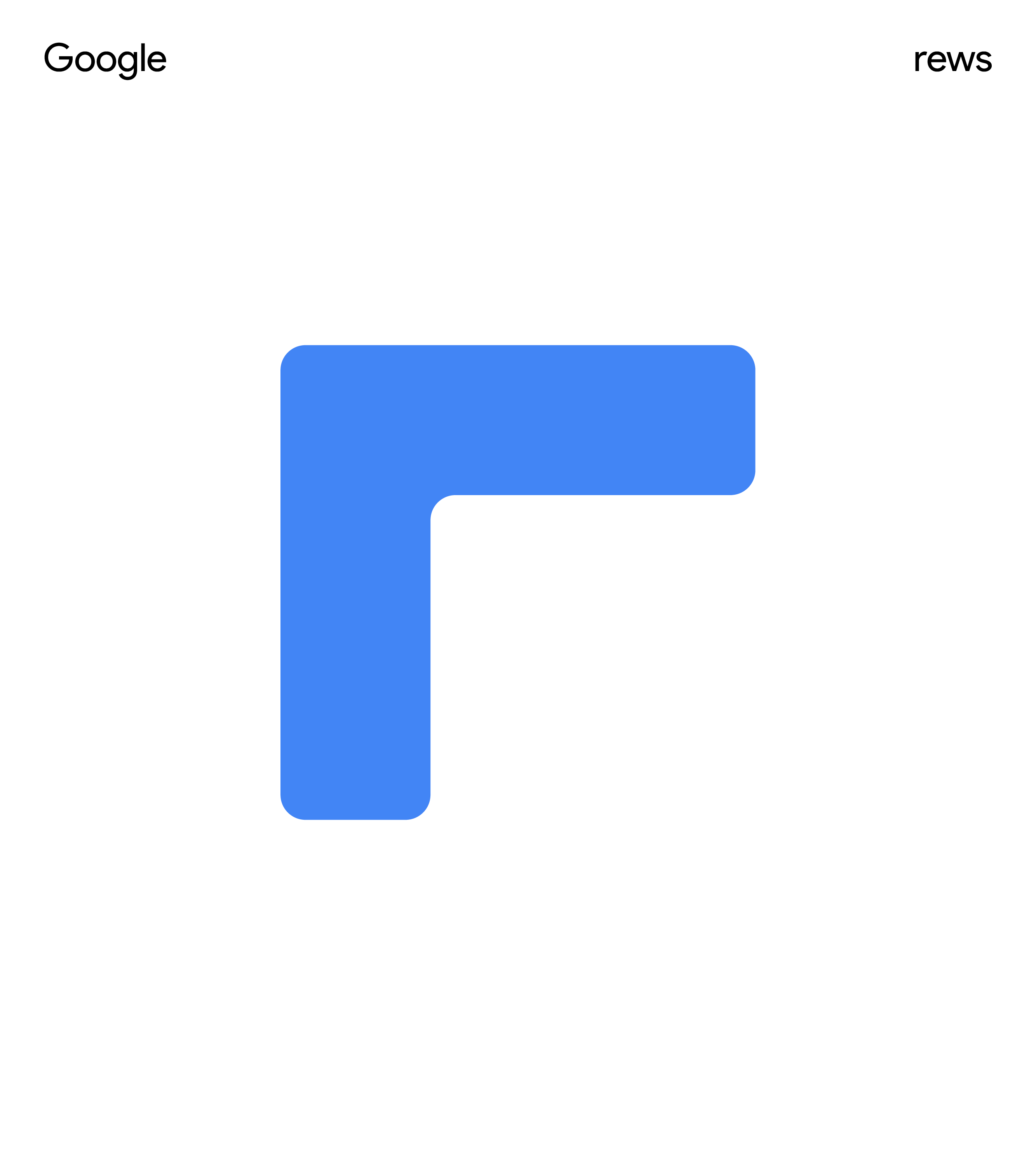
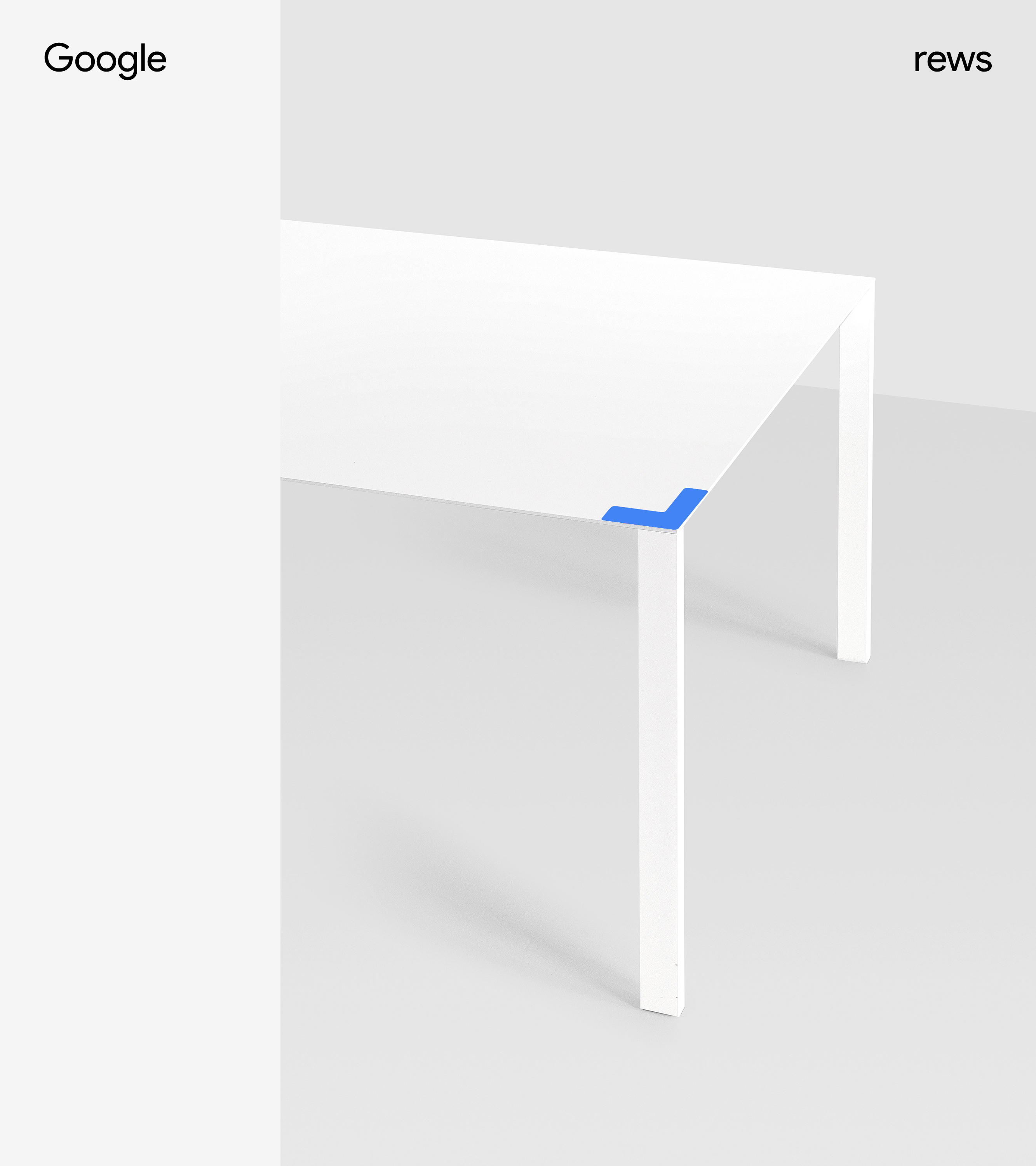
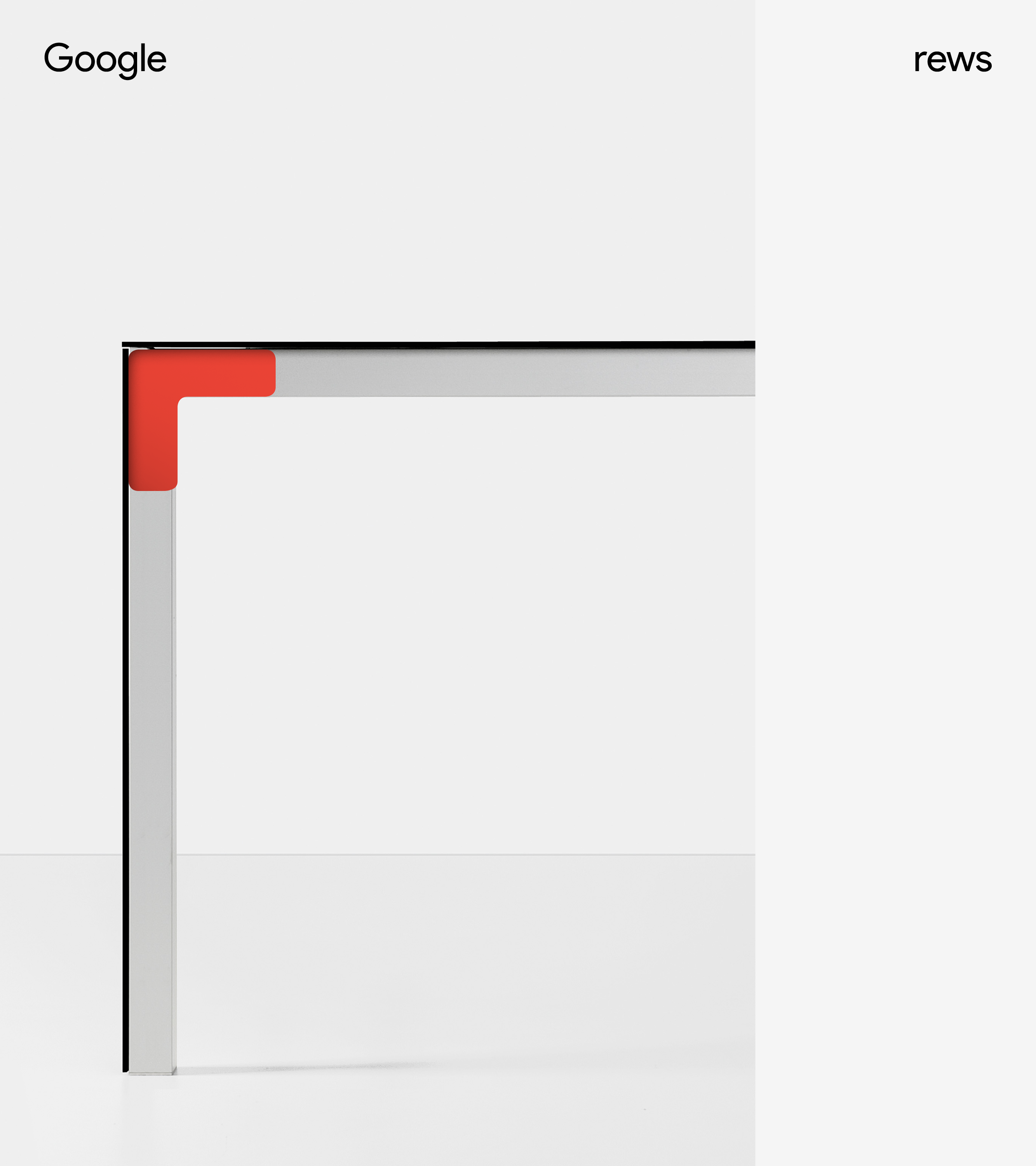
↳ Logo Anatomy — Cornerstone
REWS is the CORNERSTONE of Google.
Cornerstone — An important quality or feature on which a particular thing depends or is based.
—
REWS is the foundation that fosters performance.
REWS is a warm corner of inclusivity, creating a place that provides a sense of belonging.
The “corner” appears delightfully in magical moments across Google campuses.
The “corner” connects experiences with intention.
Cornerstone is the base that supports Google’s future workplace.

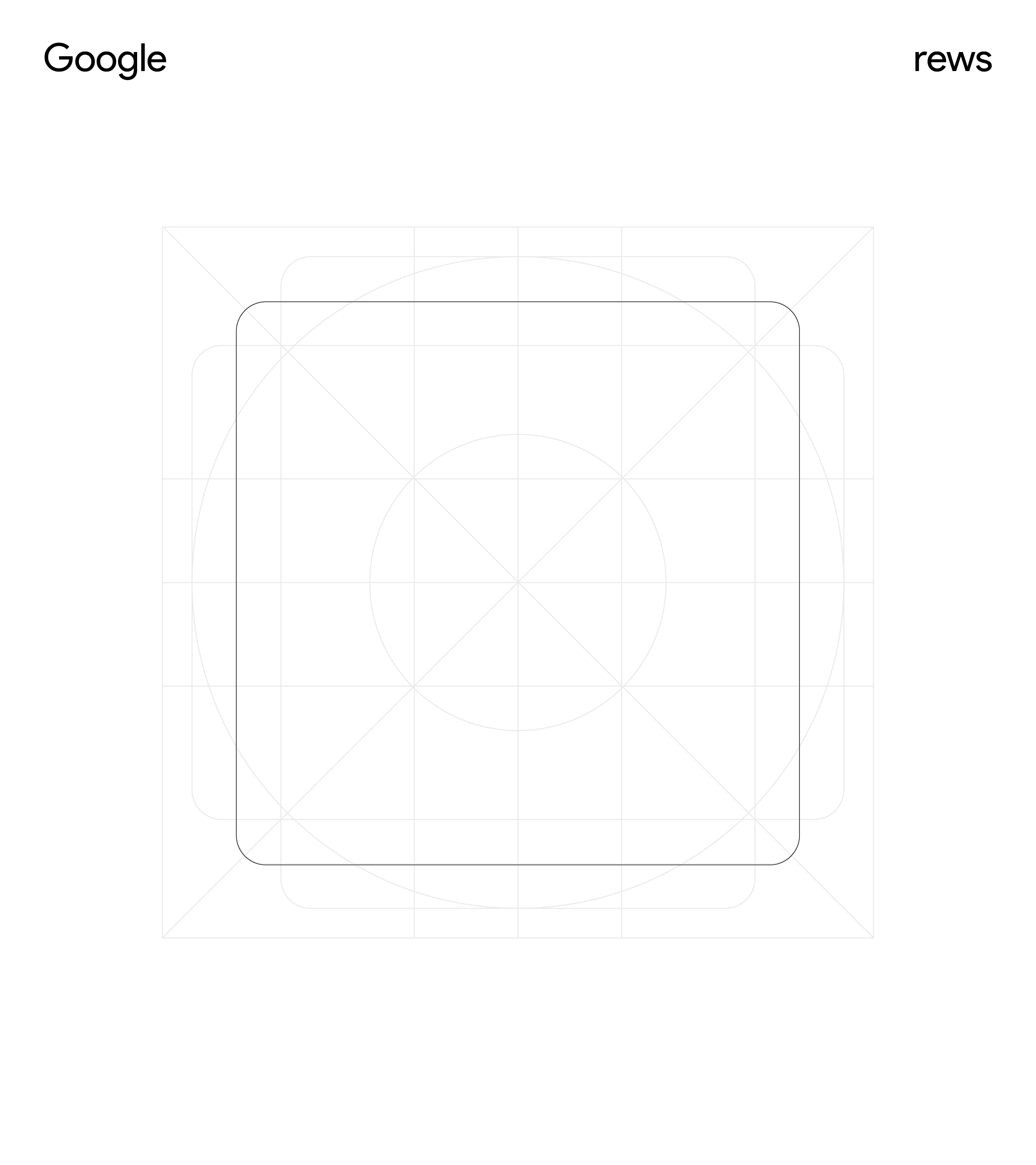
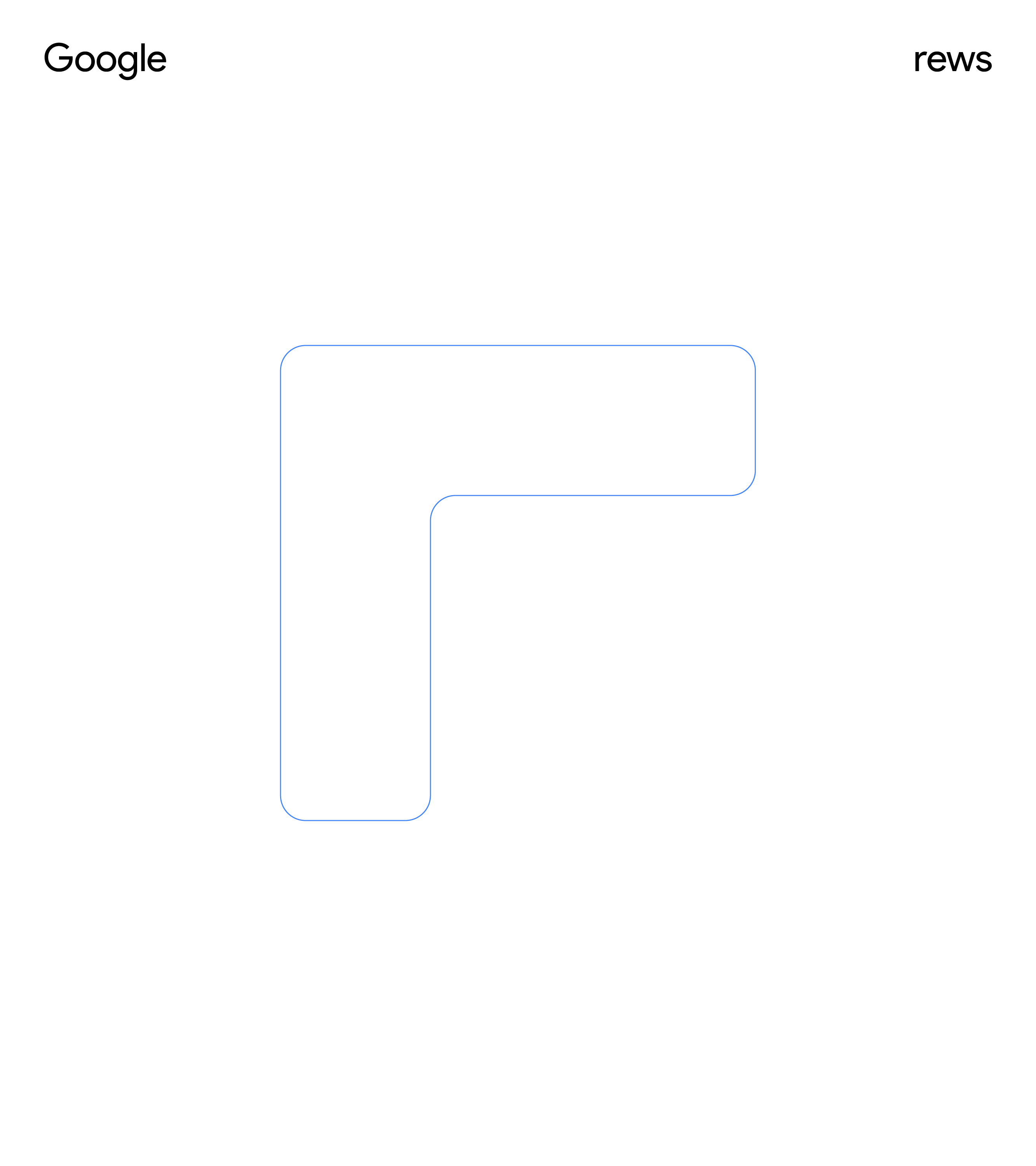
↳ Logo Anatomy — Imprint
REWS marks its IMPRINT in everything Google does.
Imprint — Impress or stamp (a mark or outline) on a surface or body. It also can refer to any kind of impression or influence.
—
REWSters leave an impression that fosters performance.
Each REWSter puts their own stamp, celebrating inclusivity, and providing a sense of belonging.
REWSters' “imprints” appears delightfully in magical moments across Google campuses.
The “imprint” is etched intentionally across experiences.
REWS’ “imprint” marks its lasting support of Google’s future workplace.

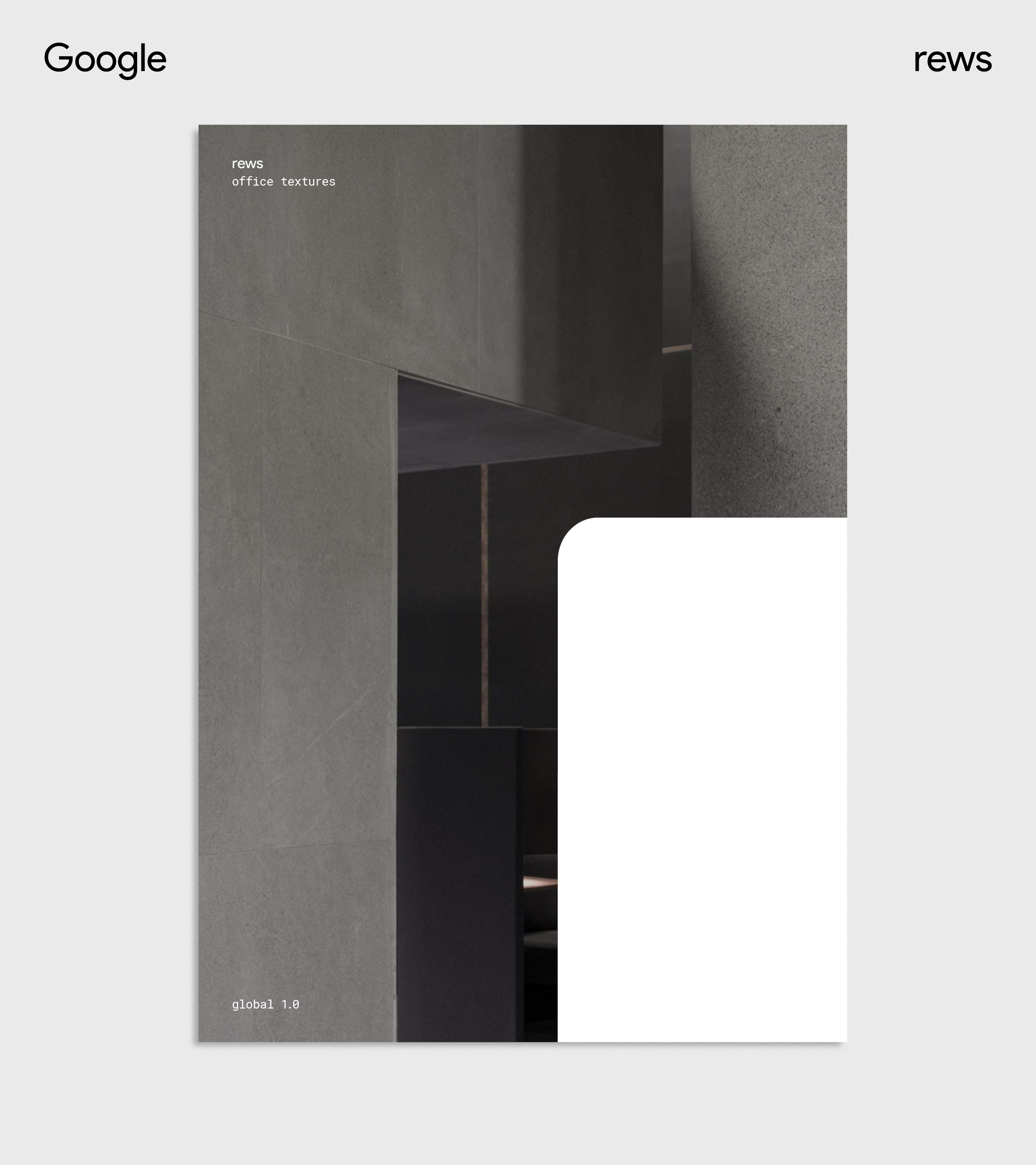
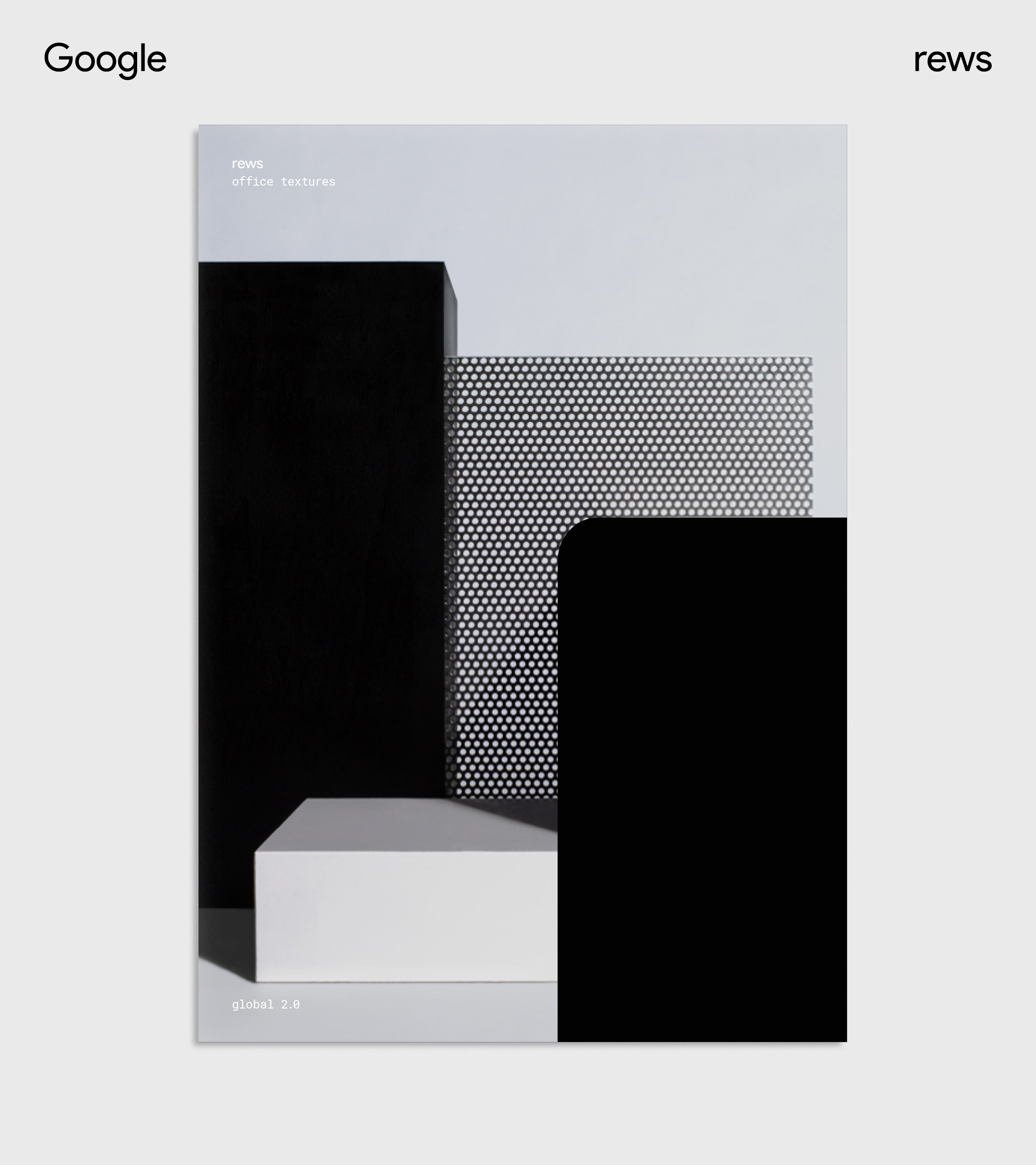
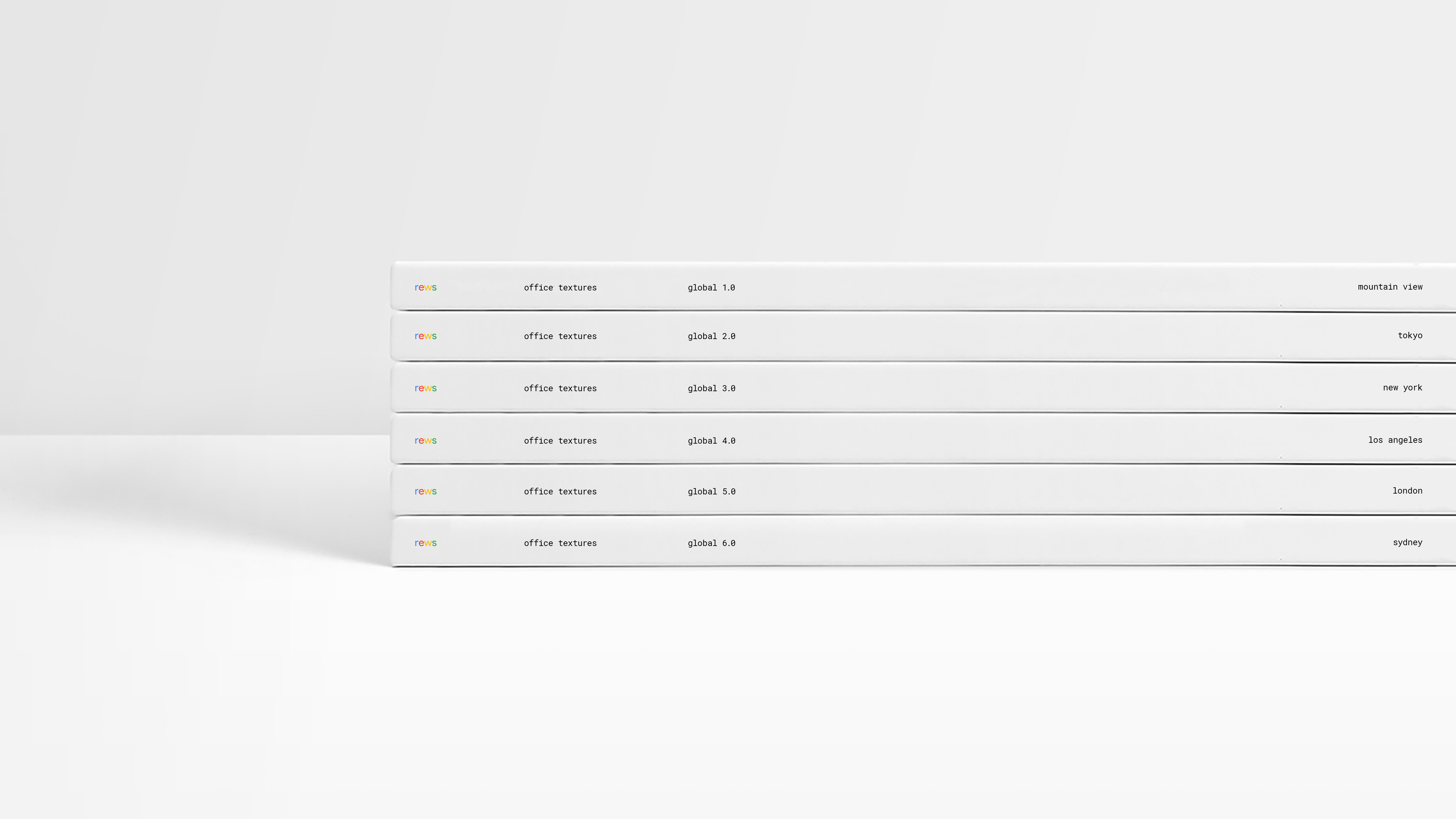
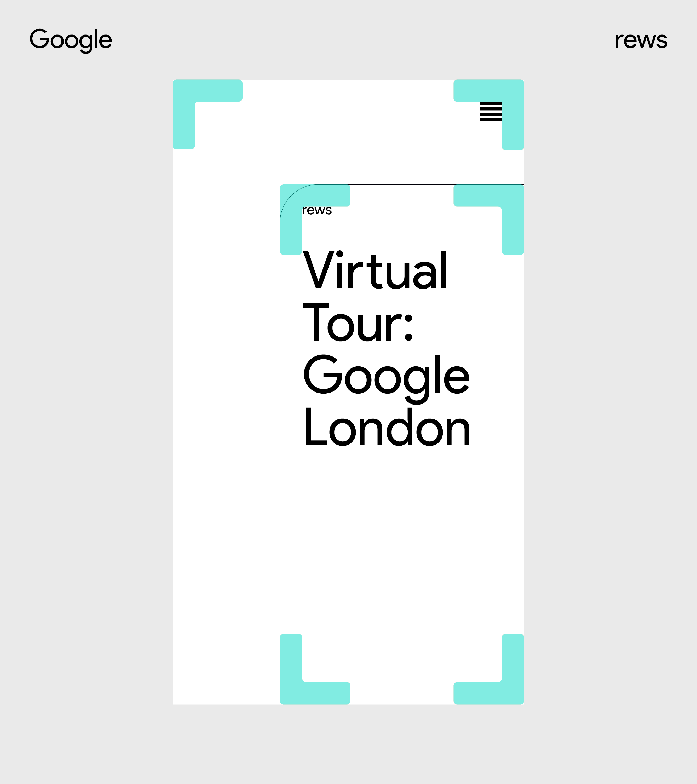
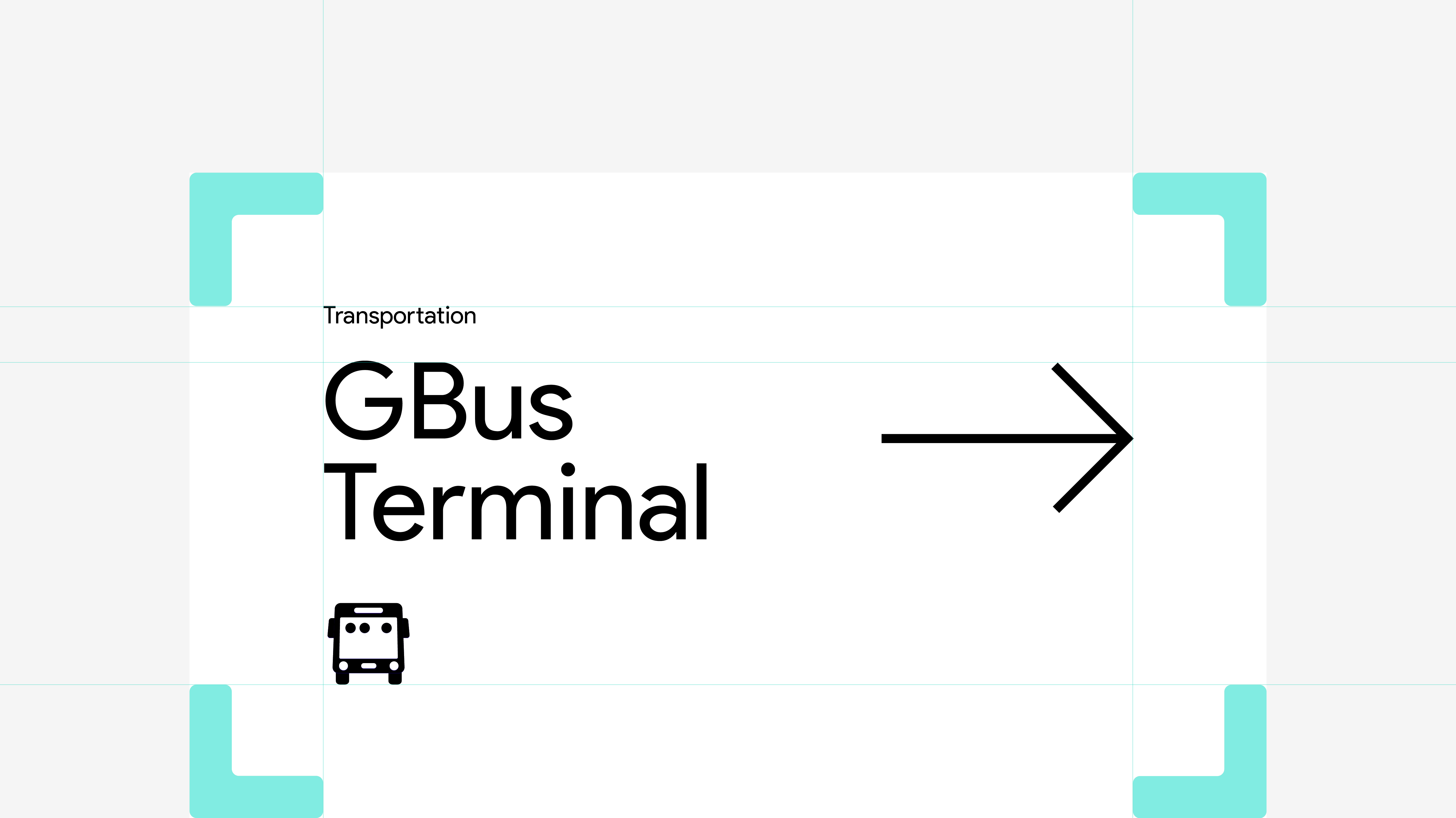
↳ Responsive Imprint
The REWS logo is the architectural framework for all mediums, layouts and compositions. To cater for this variety, the Imprint becomes a responsive stage for content that expands and contracts.
↳ Brand applications
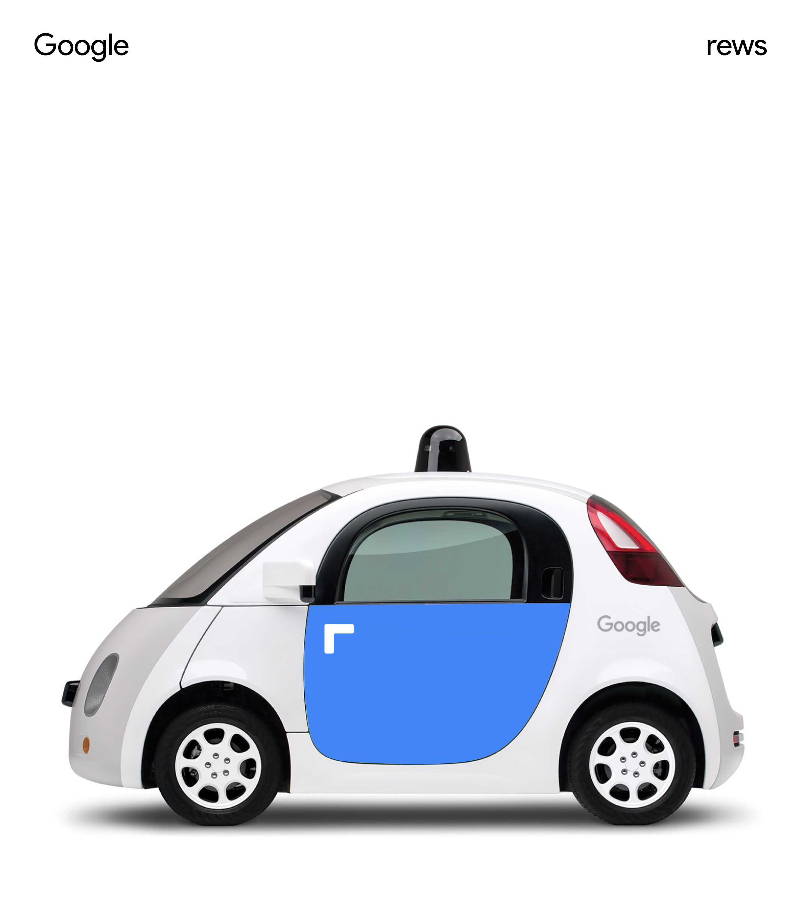
Finally, we created a range of brand applications that flex how the logo could be used to Inform, Guide, Invite, Delight and Inspire, and as an occasional wink reminding Googlers that REWS’ is on a mission to help them do their best work.


Team
↳ Virgilio Santos, Manuel Dilone, Shu-Yu Hsiao, Junki Hong, Jon Marsh, Cris Mascort, Teri Kaplan
↳ Virgilio Santos, Manuel Dilone, Shu-Yu Hsiao, Junki Hong, Jon Marsh, Cris Mascort, Teri Kaplan
4
Samsung Collections
↳ 016
↳ 016
Agency
↳ R/GA
↳ R/GA
Role
↳ Art + Design Director
↳ Art + Design Director
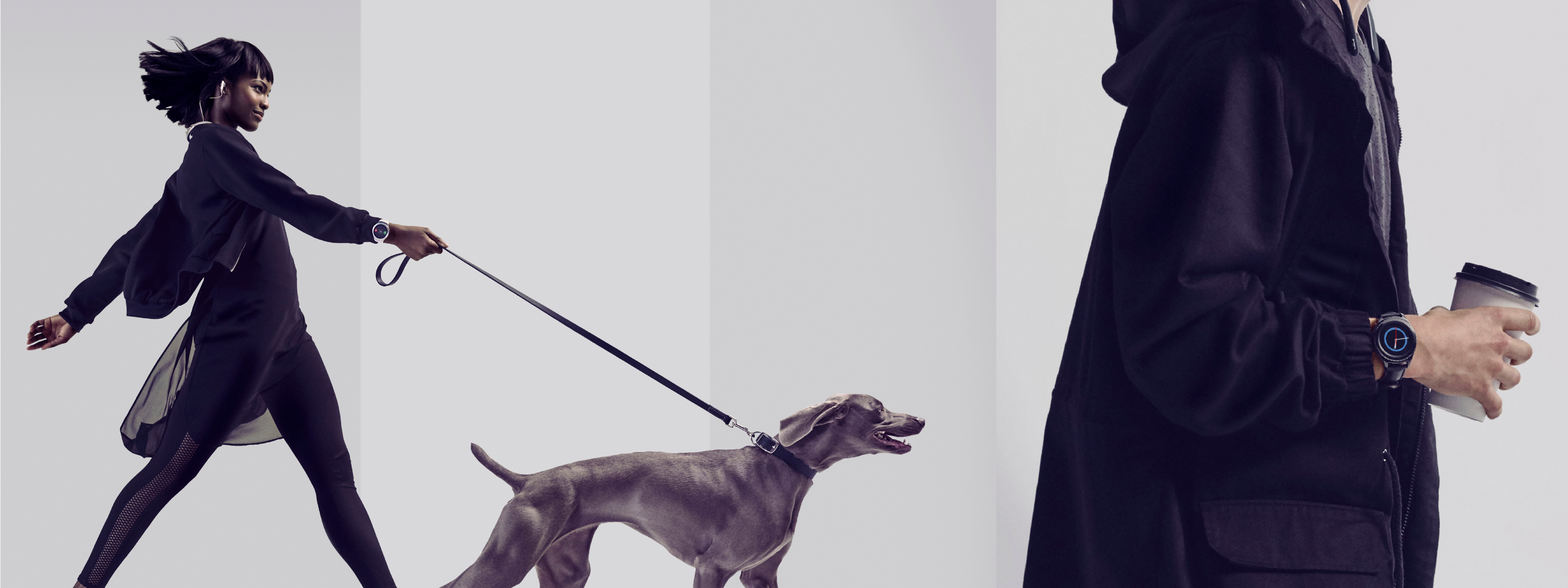
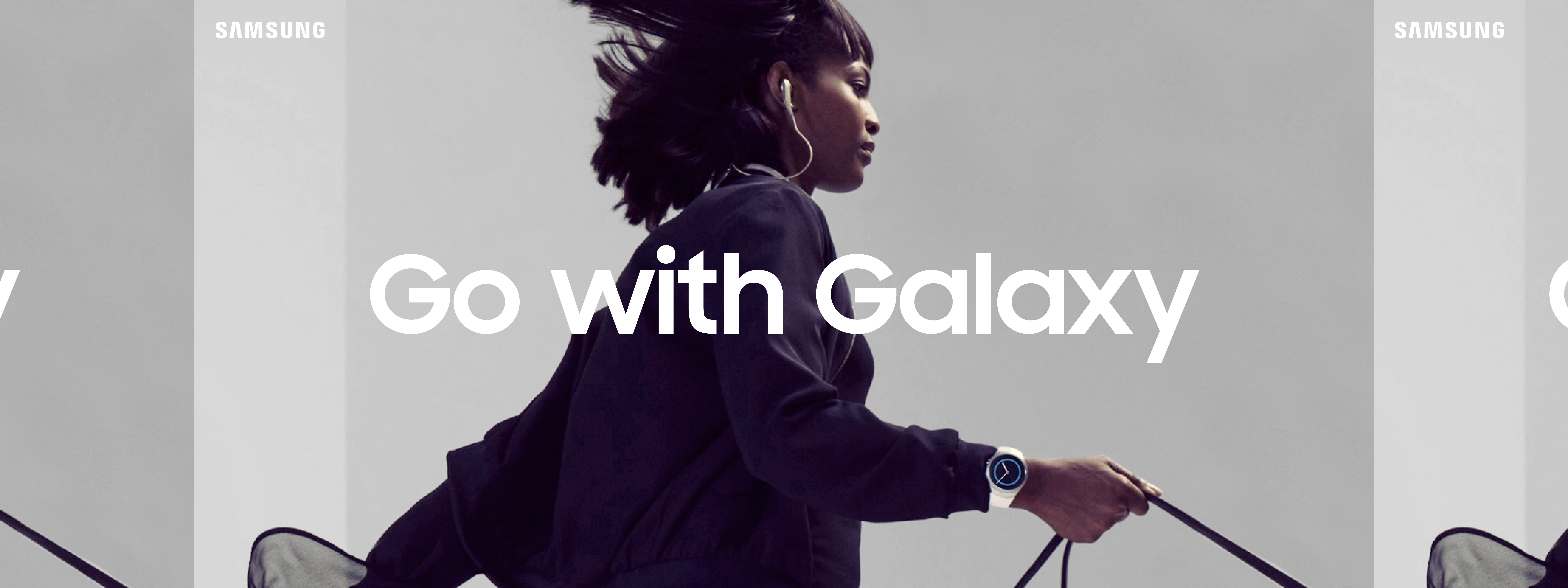
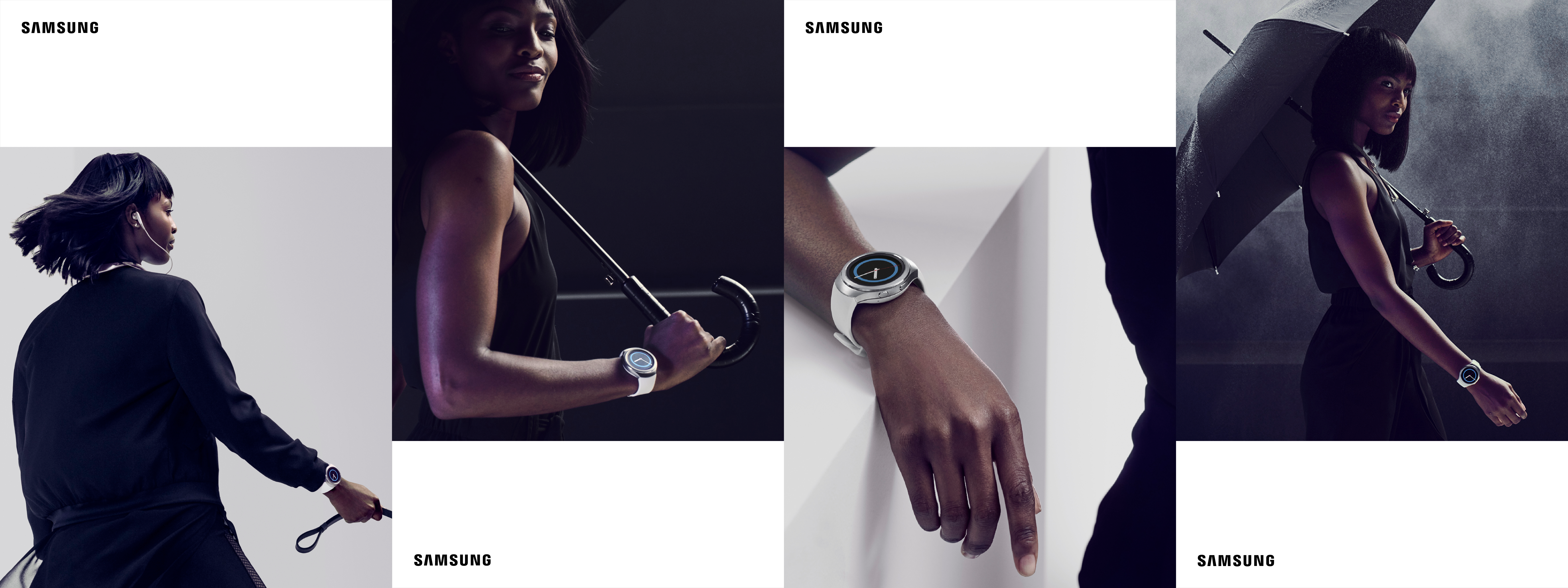
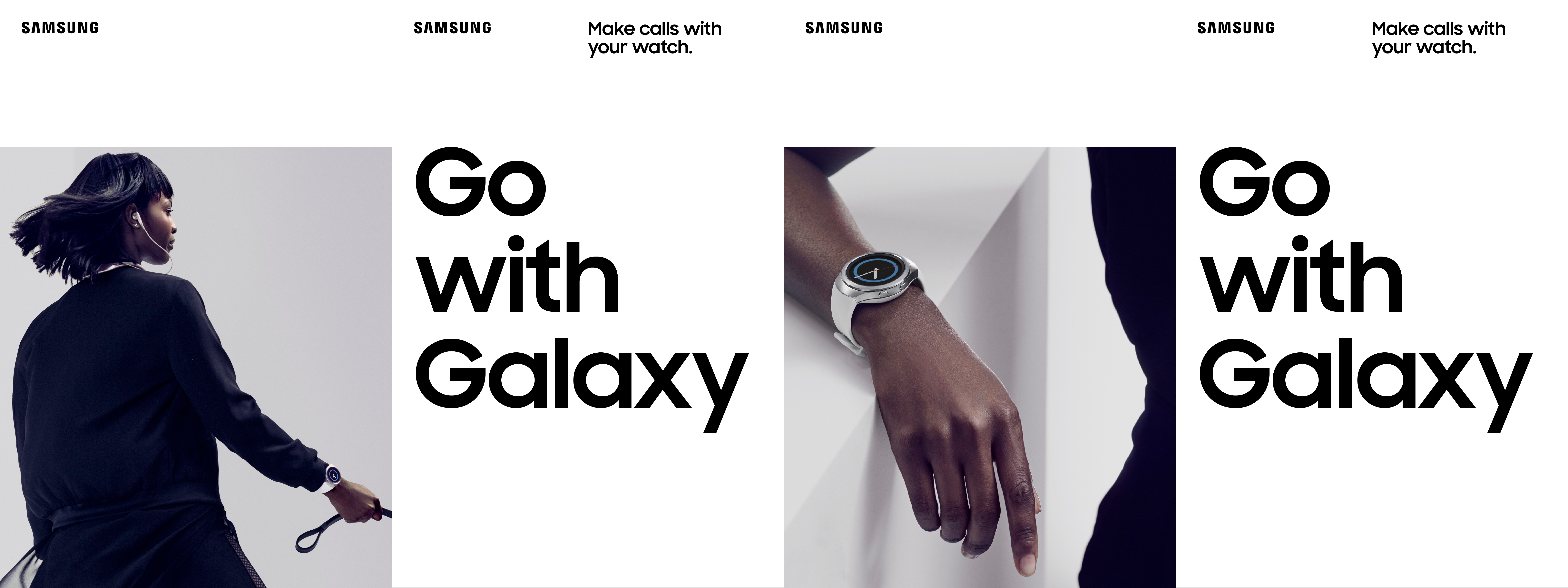
A Galaxy of Possibility: When you connect your Galaxy phone with Samsung's latest devices, the possibilities are endless. To show this, we developed a series of lifestyle Collections: a set of curated product ecosystem stories and use cases, offering people unique benefits to solve their problems with experiences that unlock their passions.
Lifestyle stills, video, and product photography were later implemented in various executions across multiple channels including TVC, OOH, digital, retail and Samsung.com. Shot by Carlos Serrao, styling led by Turner Turner.
Lifestyle stills, video, and product photography were later implemented in various executions across multiple channels including TVC, OOH, digital, retail and Samsung.com. Shot by Carlos Serrao, styling led by Turner Turner.
Art Direction
We opted to work in an expansive studio-based environment with minimal set design, giving us greater flexibility and control over how we brought each collection story to life, and setting the stage for our talent to perform on. Wardrobe was kept bold, clean and monochromatic so as not to distract from the product.
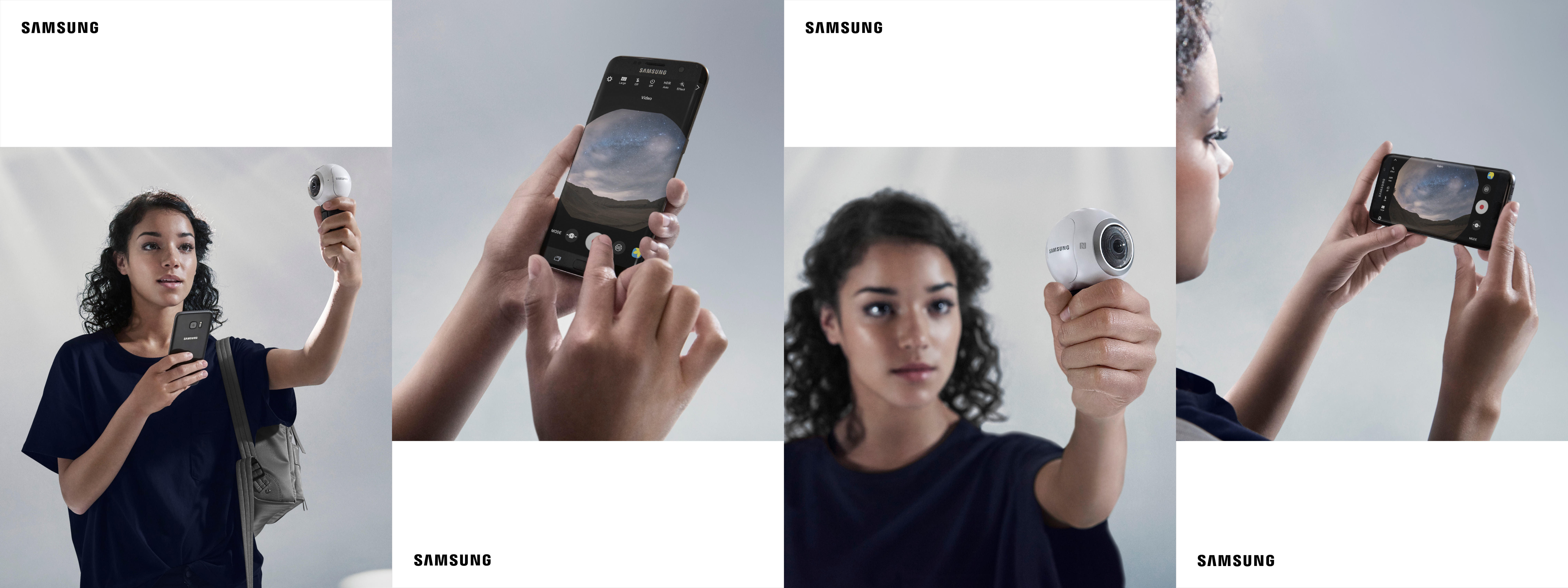
Feeling / Function
Photography is divided into two categories:
Feeling: shots which convey the spirit of the use case and the products as part of it.
Function: product centric shots that show the feature that makes each use case possible. As a principle, the phone is always at the center of the experience, coupled with with 1-2 products, and a service that provides a new or better consumer experience through innovation.
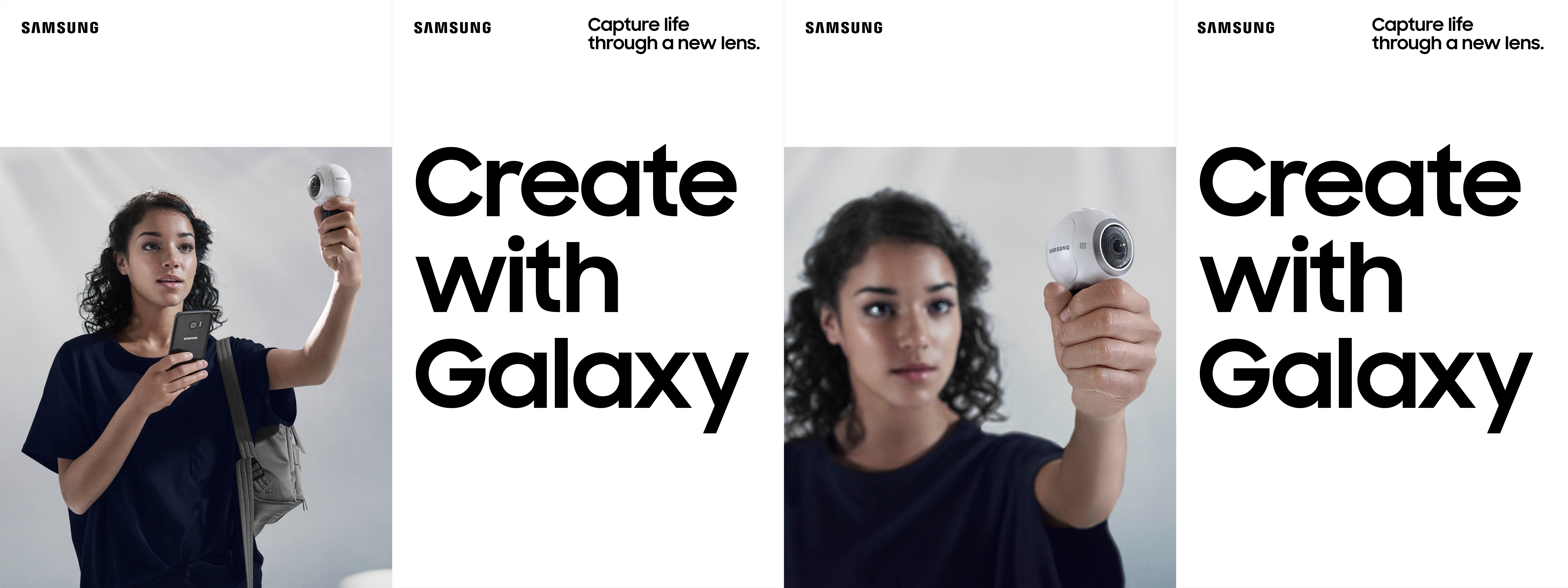
↳
Below is an overview of each of the four Collections — Go, Move, Create and Explore — including a summary of the collection's spirit, feeling and function shots, and layout exploratory.
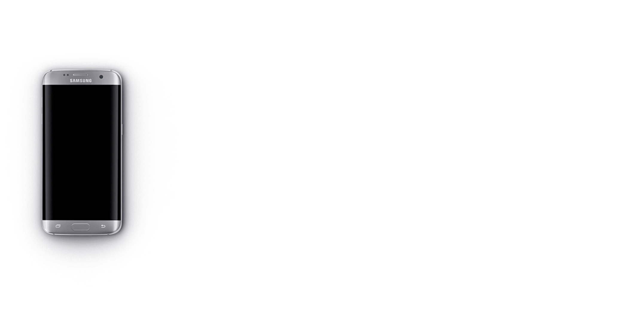
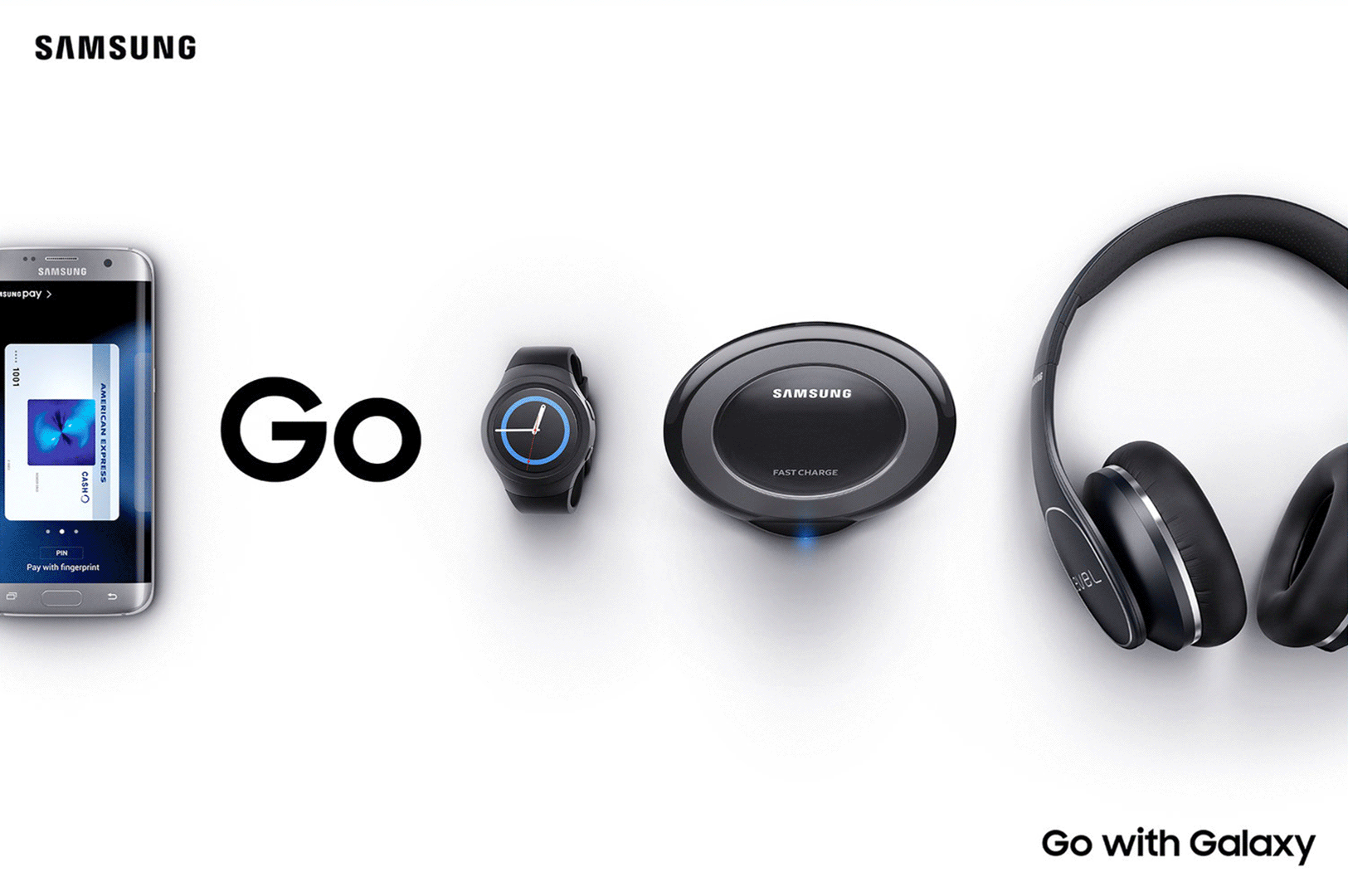
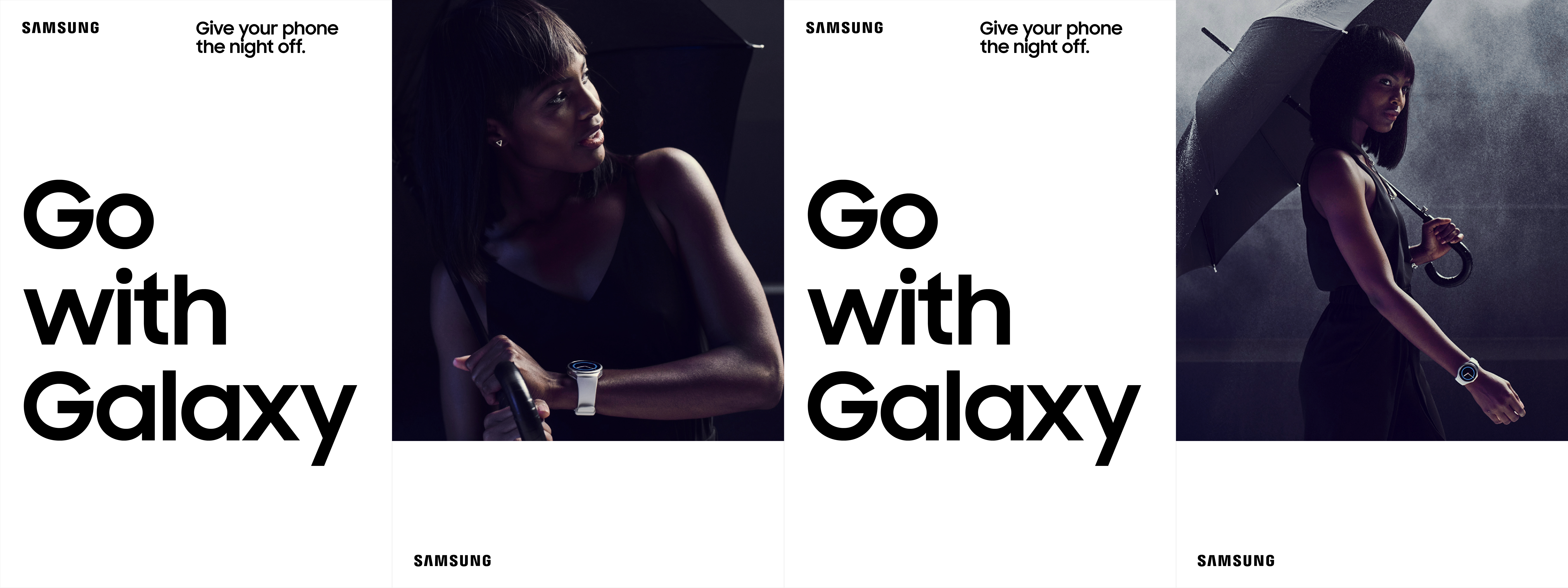
Go with Galaxy
Stay connected. Never tied down.
Connect your Galaxy S7 with the Gear S2, Level headphones and Samsung Pay, and live more freely.
Connect your Galaxy S7 with the Gear S2, Level headphones and Samsung Pay, and live more freely.

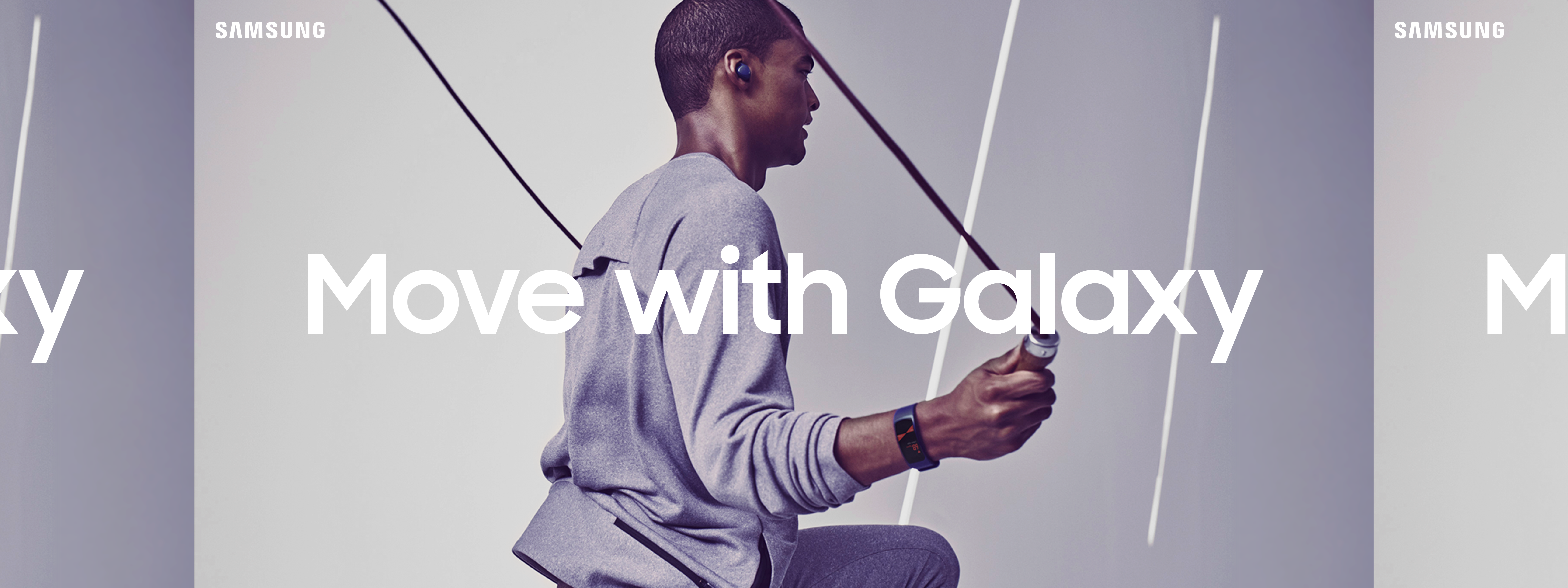
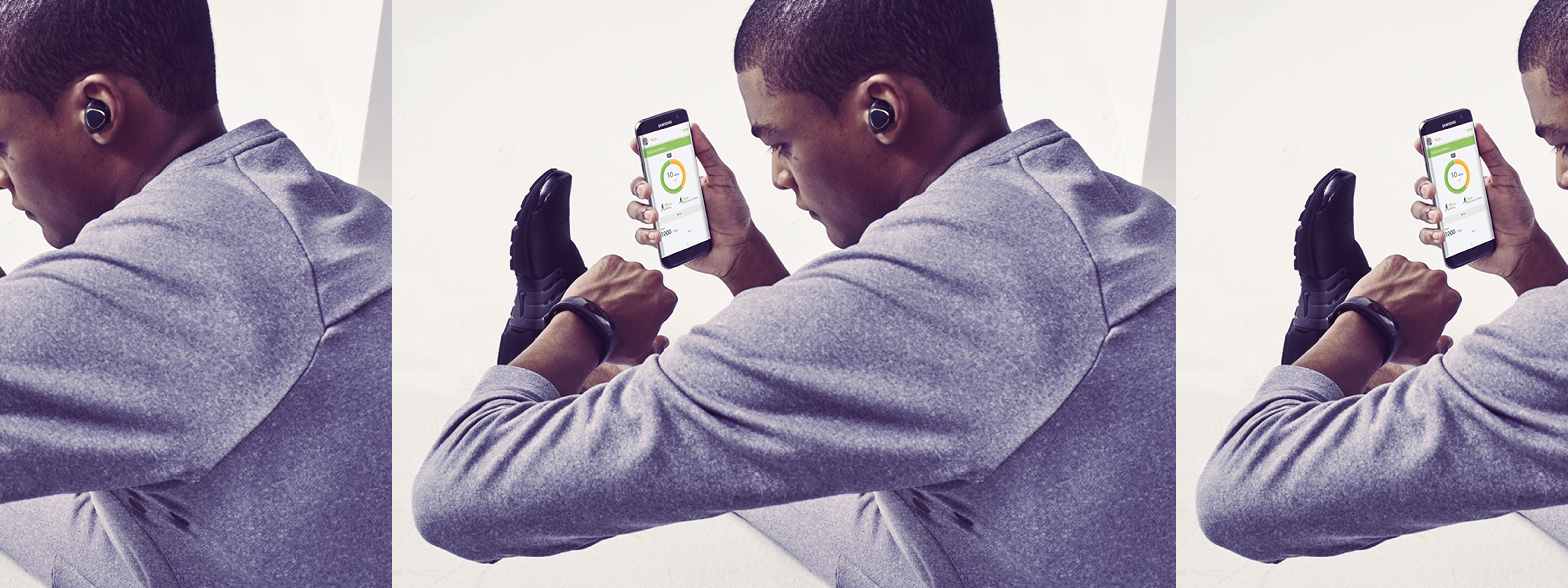
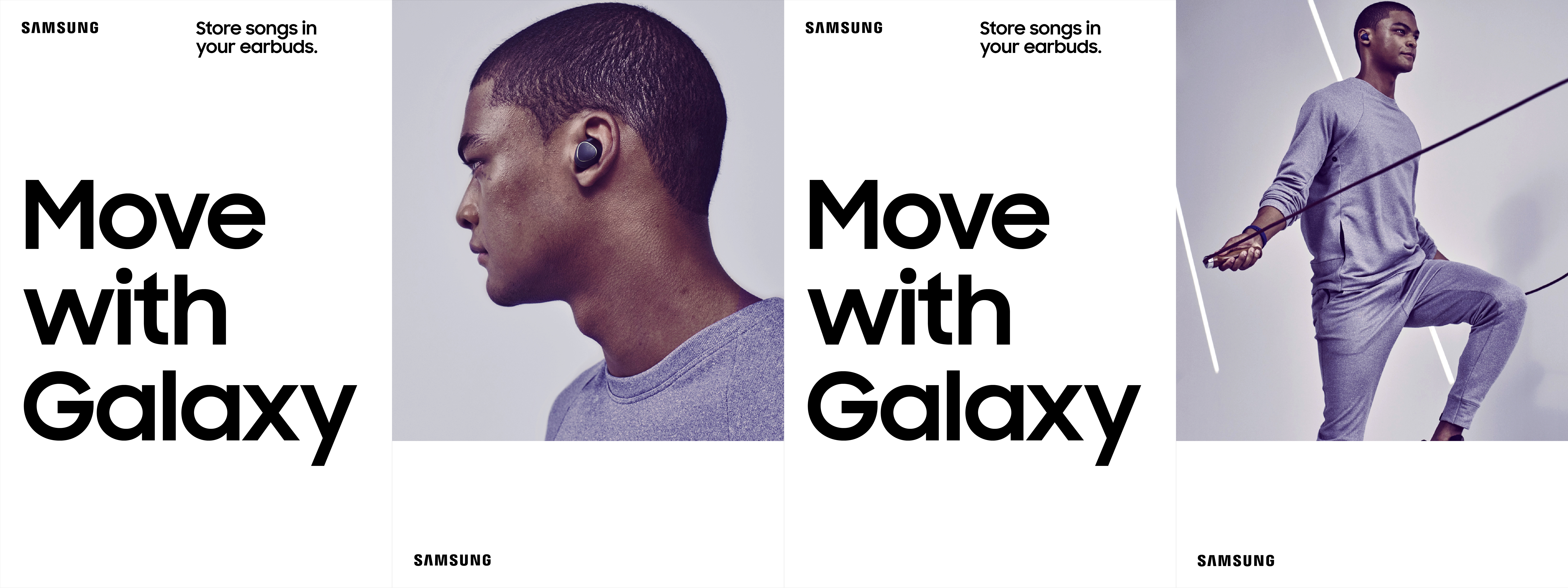
Move with Galaxy
Fitness that fits your life.
Connect your Galaxy S7 with S Health, the Gear Fit2, Gear IconX ear buds or Level Active headphones, and get smart about getting fit.
Connect your Galaxy S7 with S Health, the Gear Fit2, Gear IconX ear buds or Level Active headphones, and get smart about getting fit.


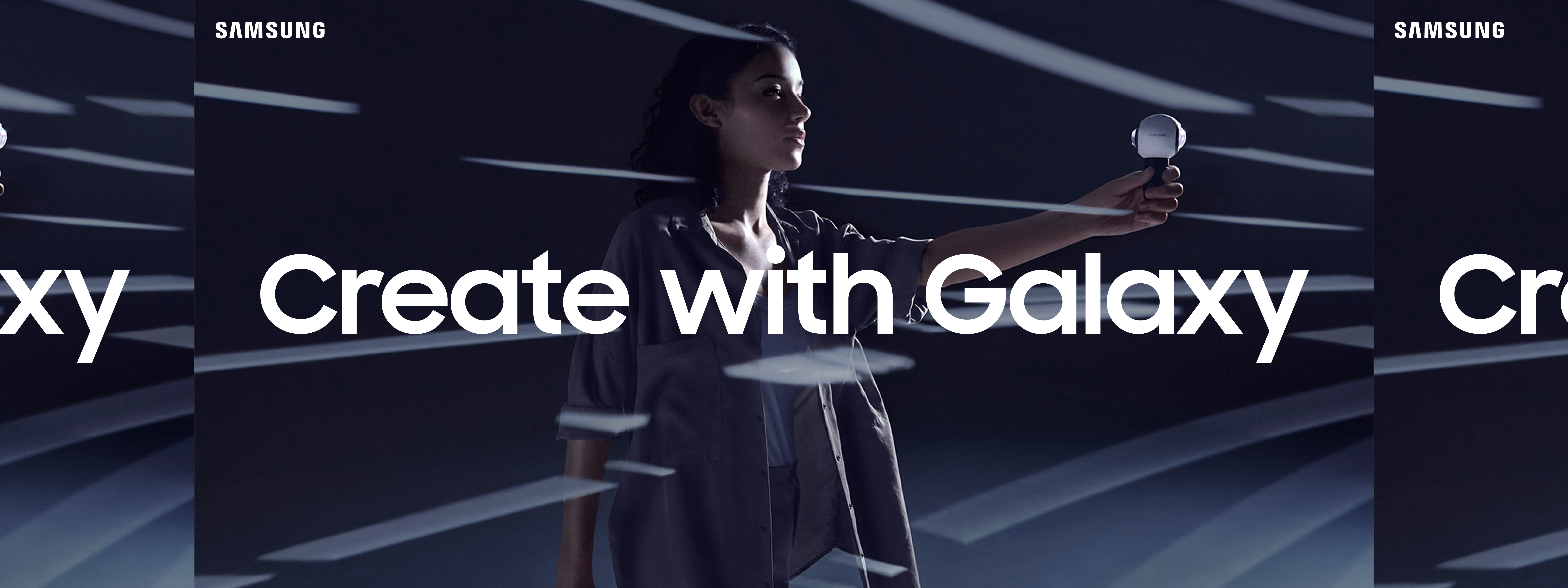
Create with Galaxy
Share the whole story.
Connect your Galaxy S7 edge with the Gear 360 camera and Gear VR headset to bring your vision to life in 360°.
Connect your Galaxy S7 edge with the Gear 360 camera and Gear VR headset to bring your vision to life in 360°.


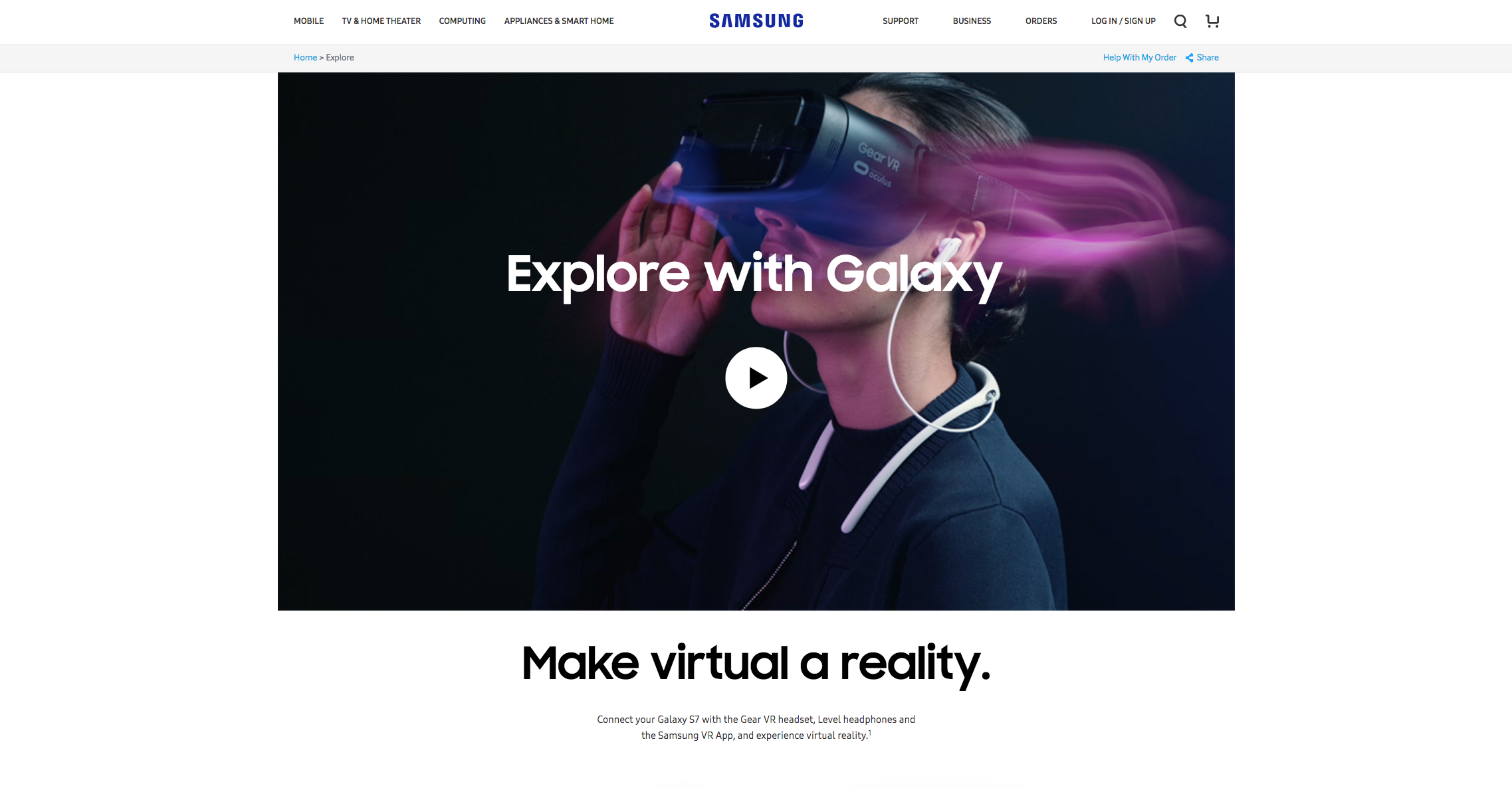
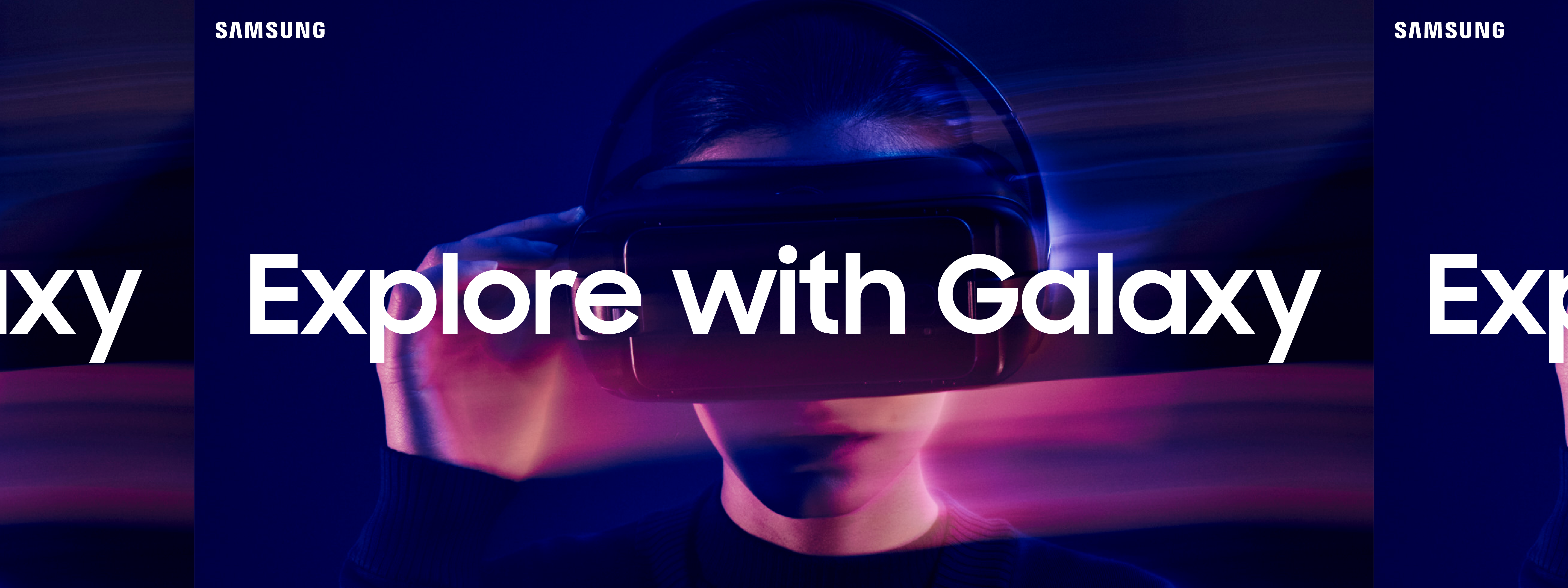
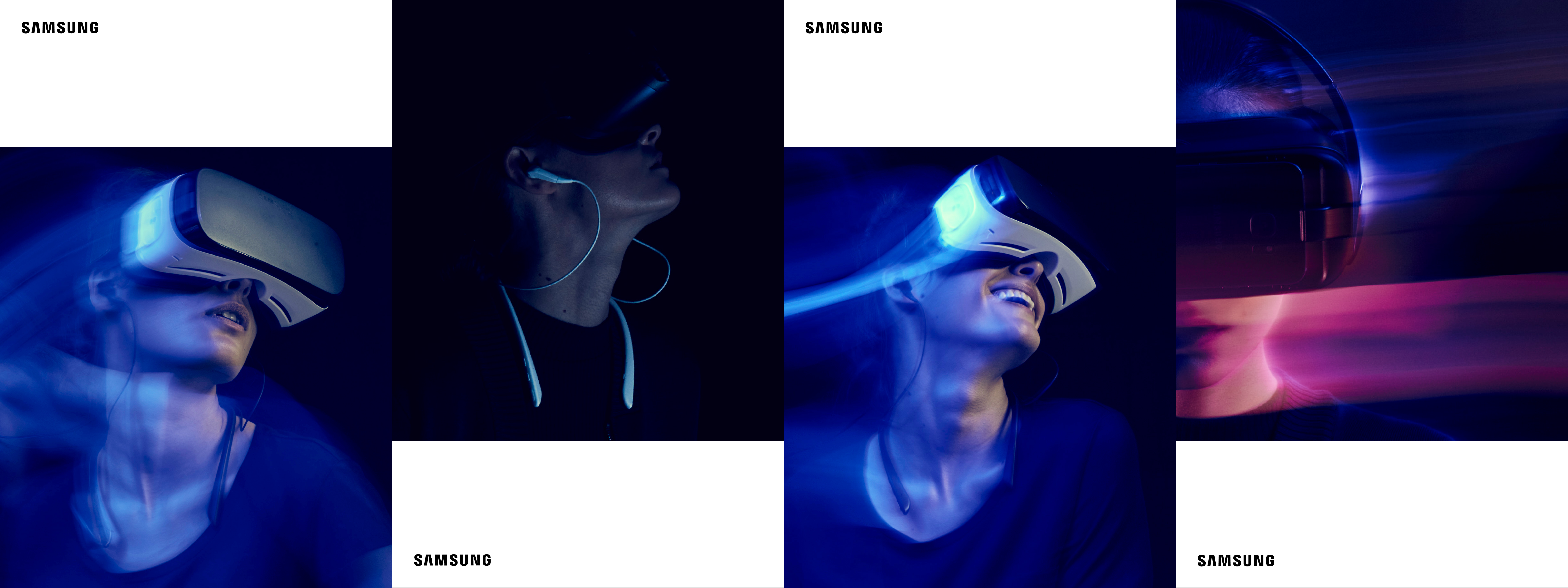
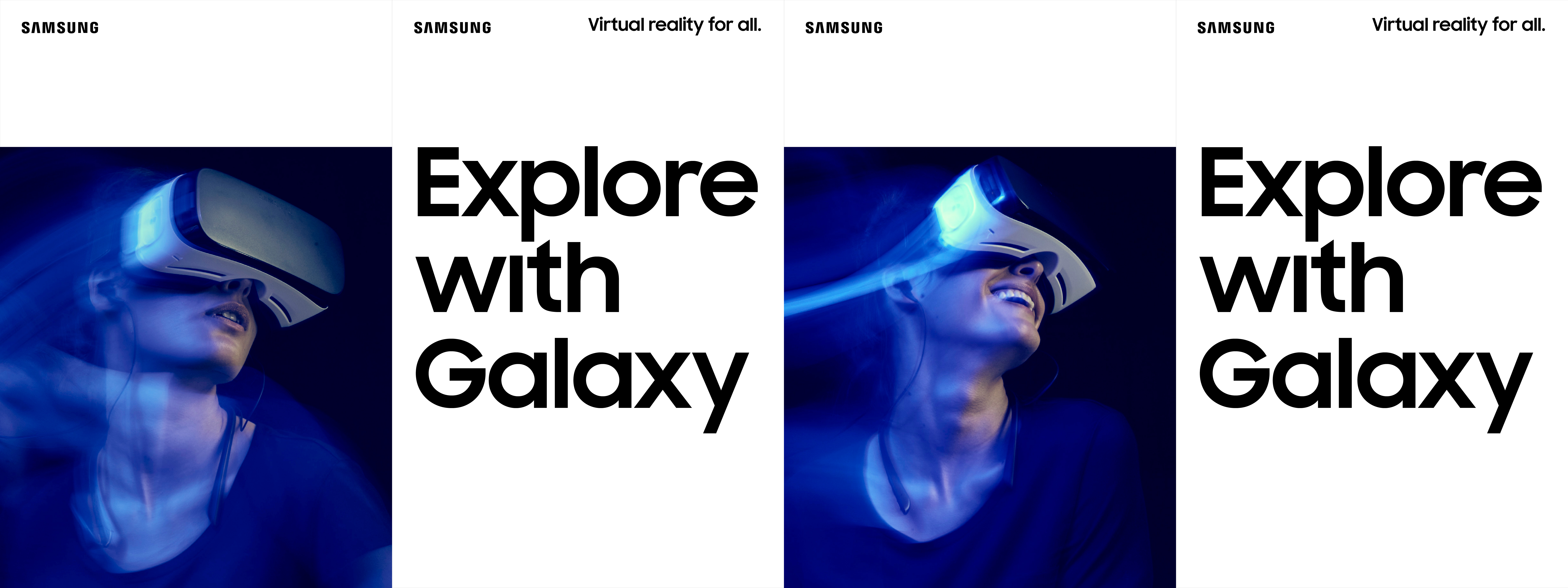
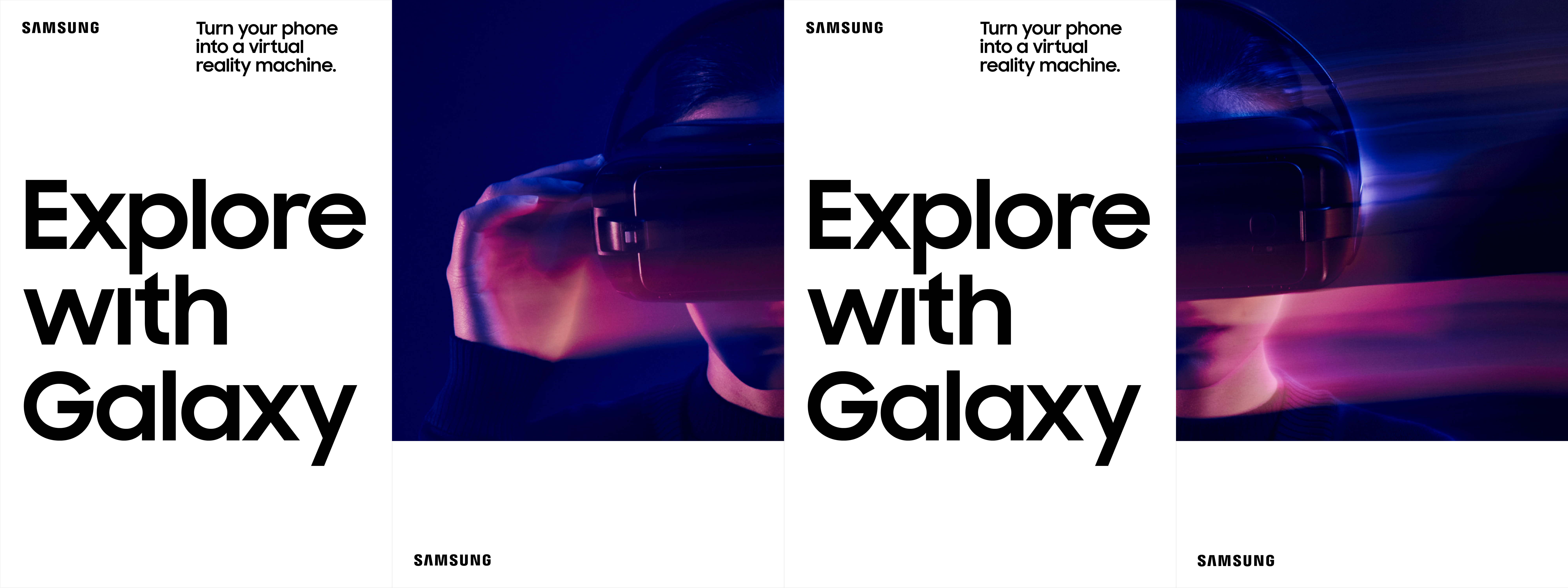
Explore with Galaxy
Try on the future.
Connect your Galaxy S7 with the Gear VR headset and Samsung VR, and experience virtual reality.
Connect your Galaxy S7 with the Gear VR headset and Samsung VR, and experience virtual reality.

Product Display
We developed a flexible product layout system that could work over various mediums and proportions, each key visual having both black and white background options.